Typeface Film Poster
1. Inspiration
2. Concept
3. Alternate Designs
Project goals were to design an 18" x 24" film poster for the fictitious documentary on a randomly assigned typeface.
I was randomly assigned the typeface Times New Roman, and I did have the opportunity to swap typefaces for another random selection, but something about Times New Roman really began to inspire me from the get-go. Being quite new to graphic design, I did quickly discover there is a distaste for certain typefaces and Times New Roman falls into that category. I felt sticking with a less than desirable option could be a great creative challenge and bring out some unique ideas and concepts.
I was randomly assigned the typeface Times New Roman, and I did have the opportunity to swap typefaces for another random selection, but something about Times New Roman really began to inspire me from the get-go. Being quite new to graphic design, I did quickly discover there is a distaste for certain typefaces and Times New Roman falls into that category. I felt sticking with a less than desirable option could be a great creative challenge and bring out some unique ideas and concepts.
Inspiration
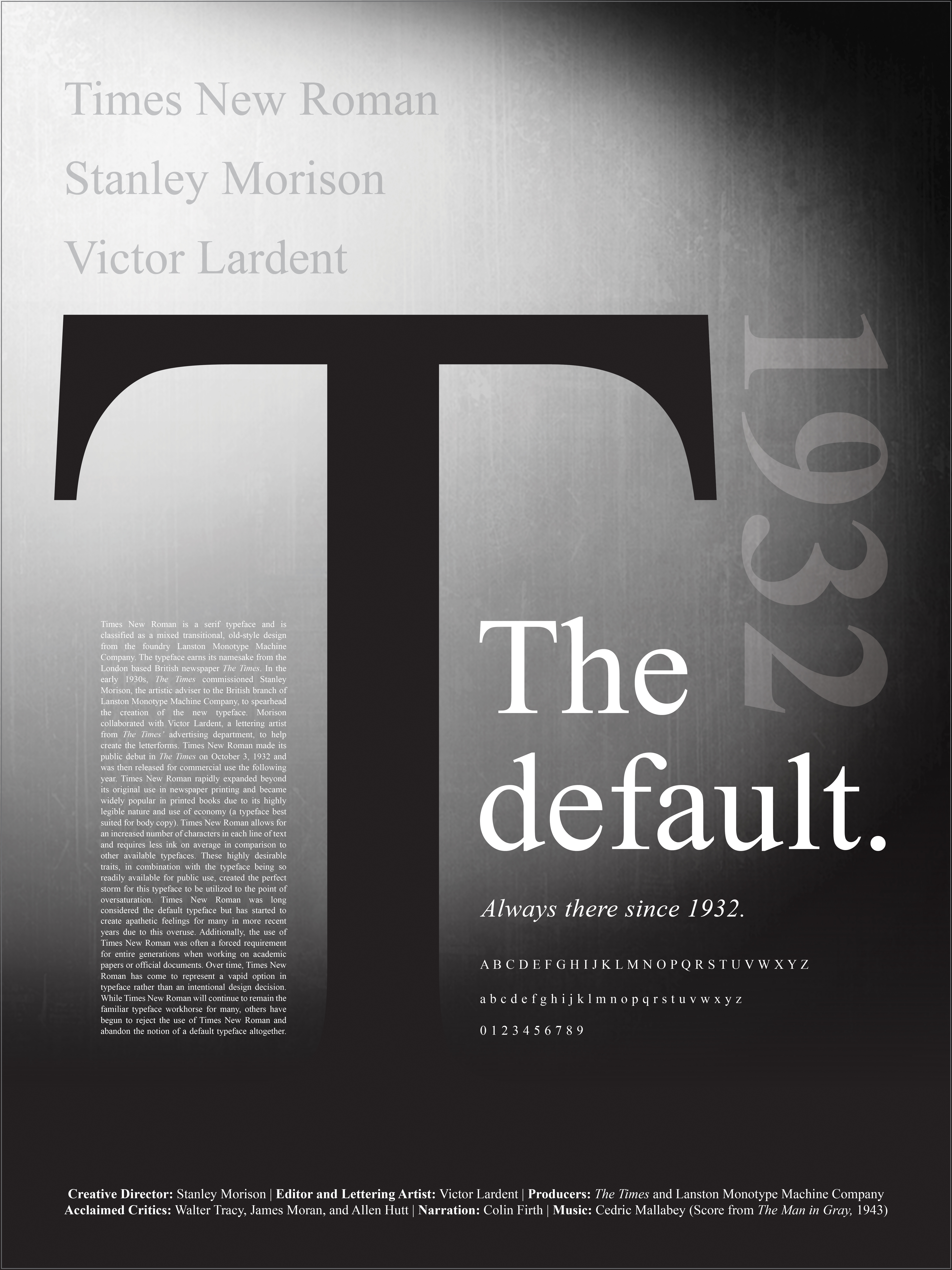
I was very inspired by the notion that Times New Roman was a long-standing default option (loved and used by many for decades) but has dramatically waned in popularity over the years and is now avoided by graphic designers as well as everyday users in lieu of more modern options. This idea of falling from grace inspired me to design the poster with an homage to the visual look of Film Noir.
Film Noirs often feature the main character coming into unforeseen circumstances which cause the protagonist to deteriorate from their morals or spiral into a forced situation that leads to their downfall and often death. I feel these parallels between the protagonist in Film Noir and Times New Roman was very fitting as neither can control the occurrences that ultimately lead to their defeat. Film Noir was also highly popular during the 1940s and 1950s which would have been a period when Times New Roman was still highly in demand and in constant use.
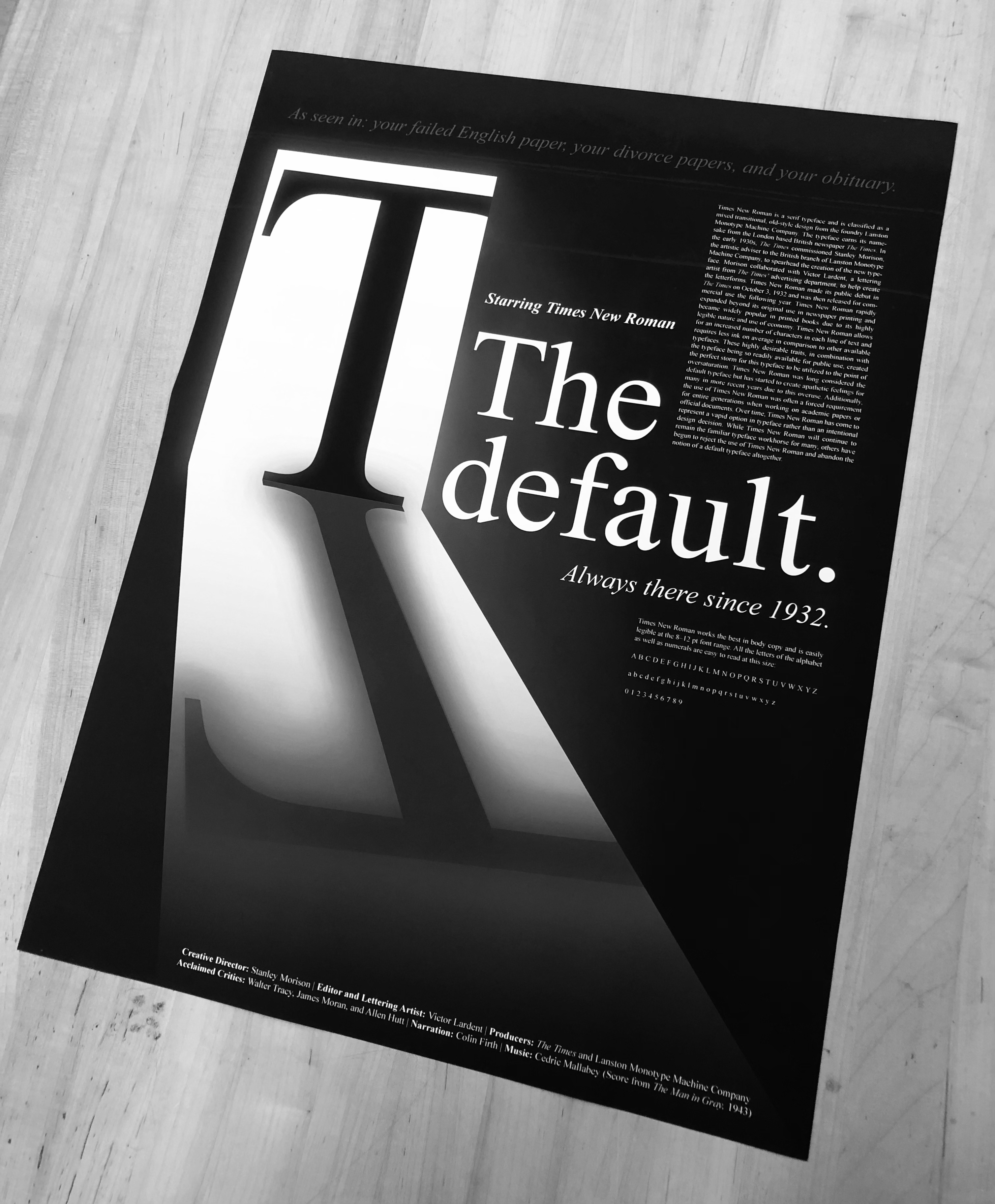
 Final 18" x 24" Poster Design
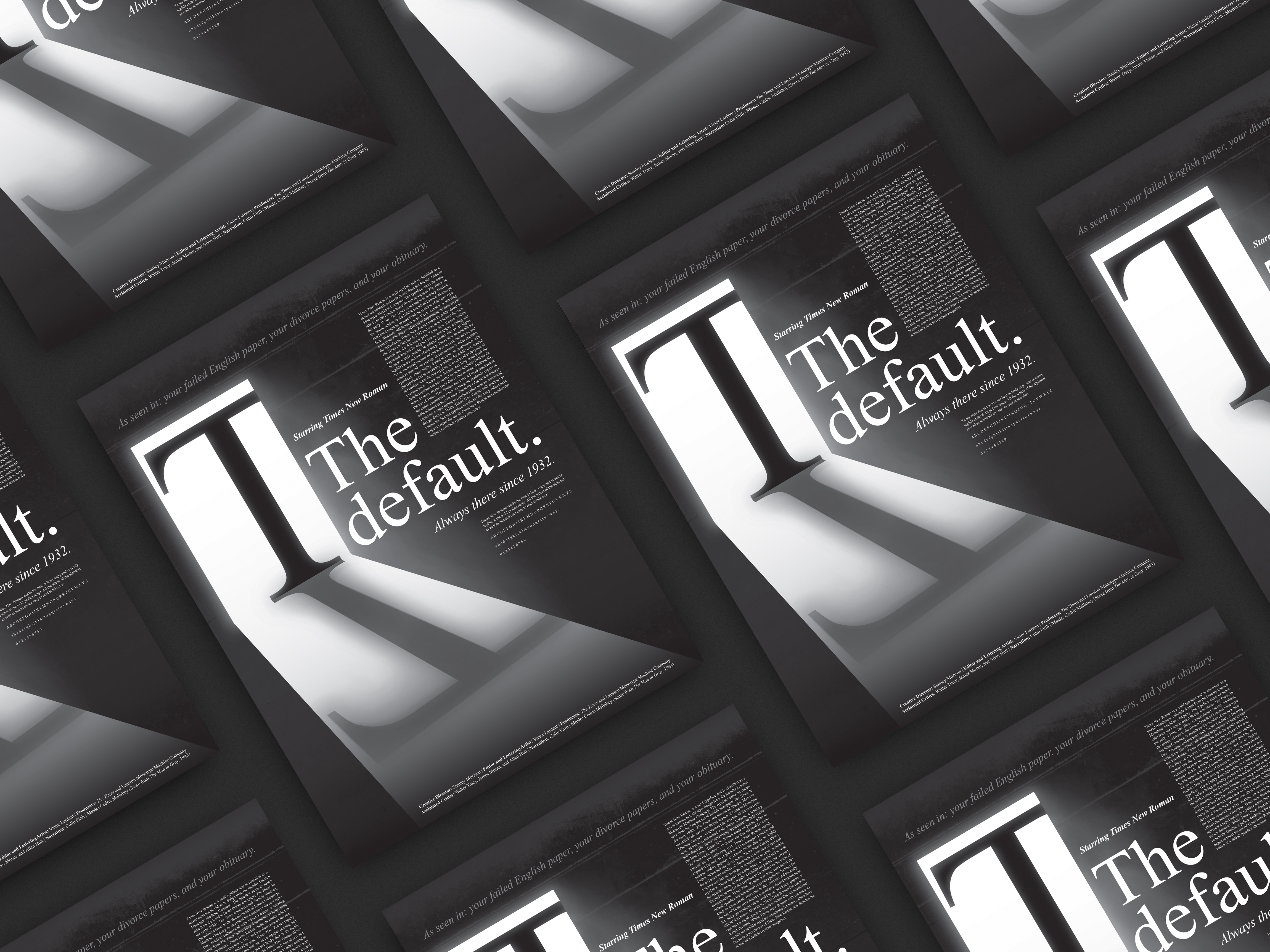 Digital Mockup: Final Design
Concept
By using the concept of Film Noir, I was able to keep a very restrained palette utilizing only white, black, and grays. This palette ties into how Times New Roman has traditionally always been used for print in newspapers and in books. I felt personifying the black letter “T” on a stark white ground created a menacing figure that appears to be lurking about or stalking the user. As much as some may go out of their way to avoid Times New Roman, the typeface can be found popping up almost anywhere one may have to read a book or an official document to this day. This turns the idea of Times New Roman being a safe default option on its head, and instead emphasizes the typeface as an unavoidable force to be reckoned with that many actively fight to defeat or erase (Times New Roman is no longer the default typeface option in Microsoft applications and has been replaced by other typefaces in many courts of law around the United States when creating official documents in recent years). For many, using Times New Roman represents a vapid choice in typeface (deemed by some as the typeface of least resistance), but for this poster design I chose to represent Times New Roman as quite the opposite— ominously unapologetic and looming.
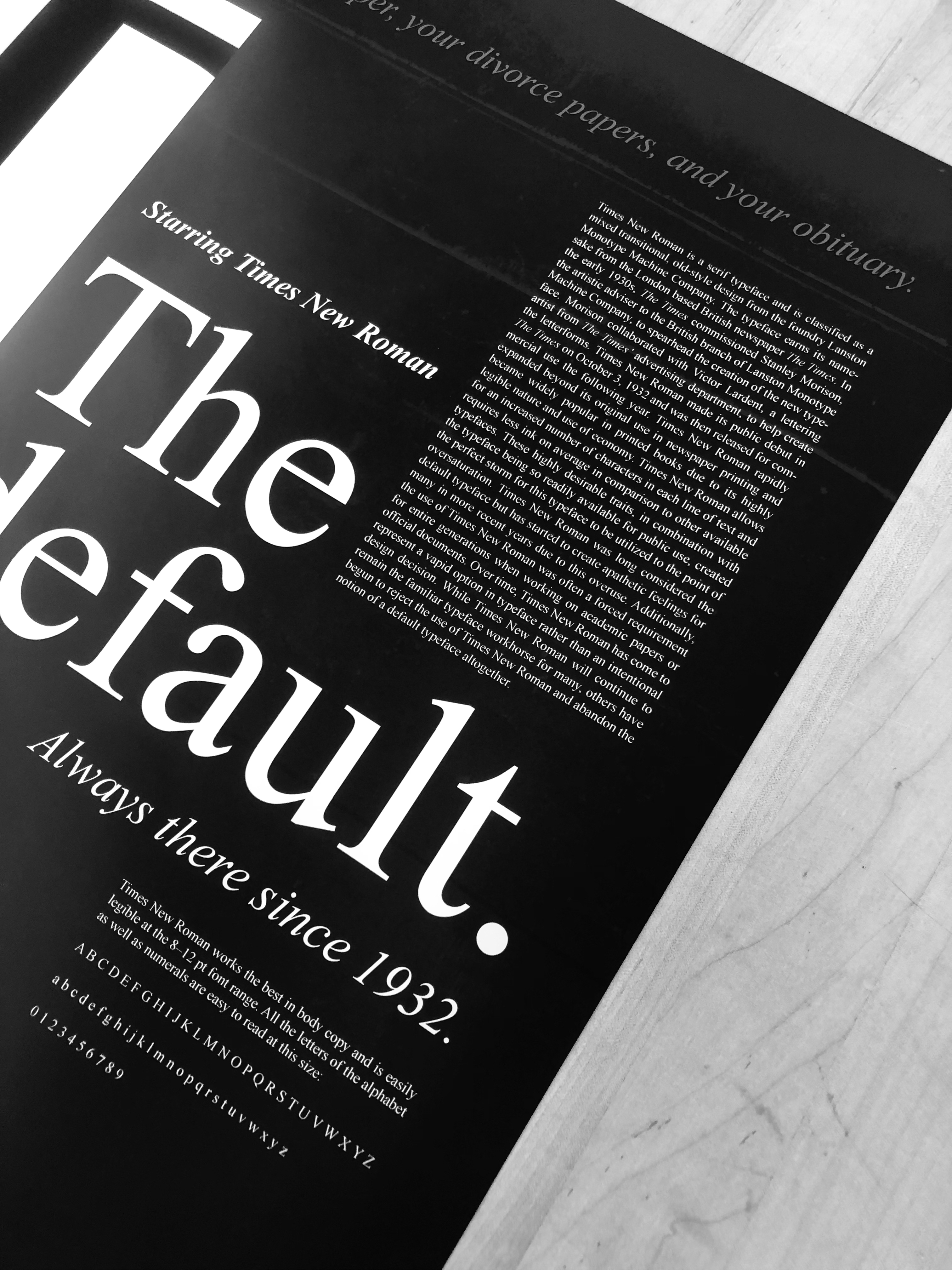
Poster Photography: Overall + Detail
Alternate Designs
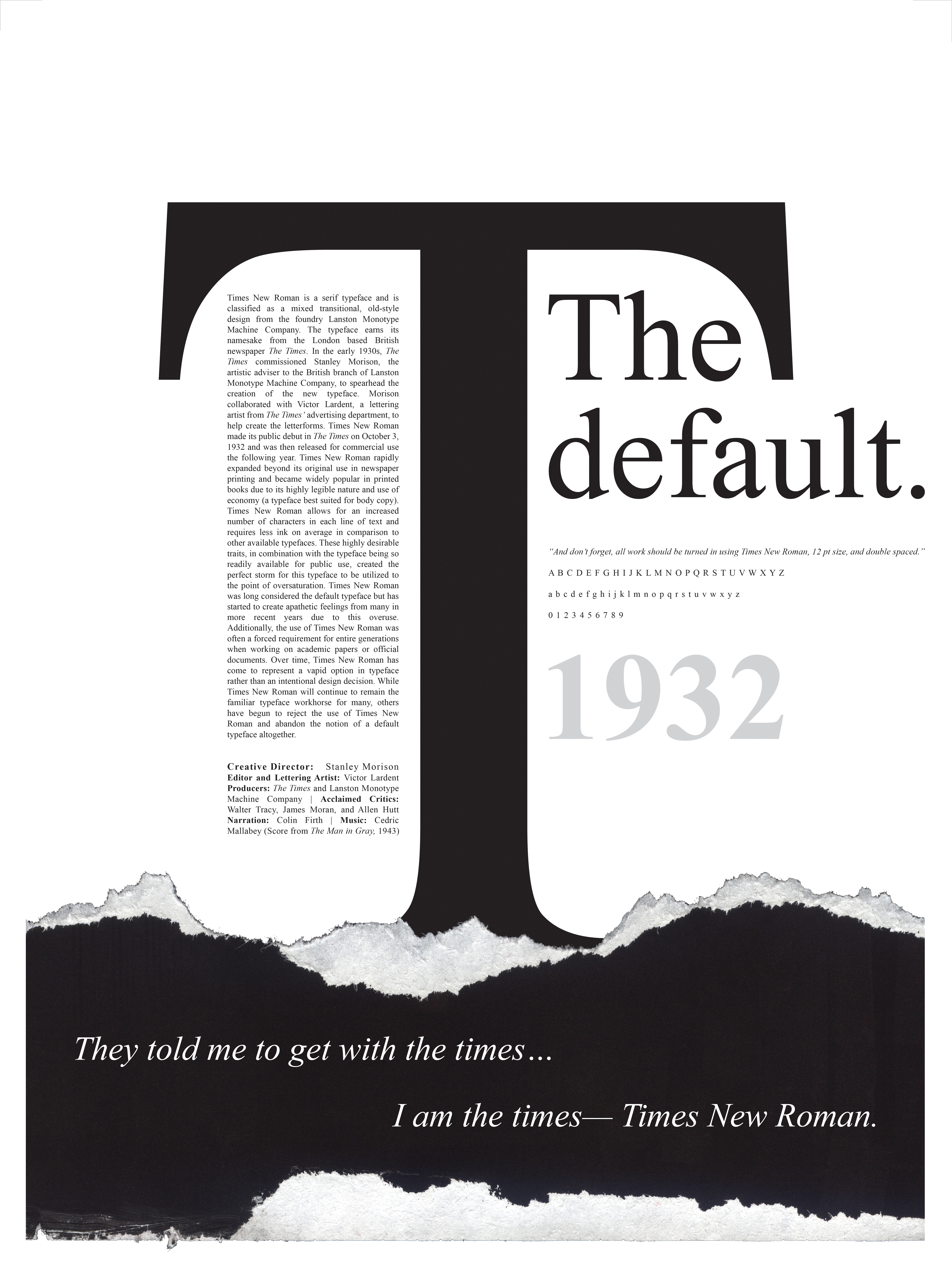
I had also created two additional poster options that are not part of the final submission but felt would be beneficial to showcase here as well. The poster on the right is another iteration of the Film Noir concept (a dark figure lurking in a misty spotlight or streetlight) and the poster on the left takes inspiration from newspaper and book printing more so than Film Noir. The “T” figure is kept forebodingly large in scale, but the incorporation of torn paper and a narrow column of black body text on a white ground brings the concept closer to newspaper and book applications where Times New Roman can often be found. Exploring the three poster designs somewhat equally helped me to hone in on what elements should be emphasized the most to create an attention-grabbing design. Stark contrast, scale, and visual hierarchy help to draw the viewer from afar with the inescapable “T” figure and cause the viewer to approach and linger when reading the smaller body copy.
 Alternate Poster Designs
 Final Design:
Film Noir Concept
Alternate Design:
Newspaper/ Print Concept
 Alternate Design:
Film Noir Concept