Santé Wines of France
1. Project Background
2. Brand Standards
3. Posters
4. Website
5. Instagram
6. Environmental Applications
7. Mockups & Extras 8. Credits & Tools
9. Accolades
Project goals were to create a unique brand identity for a fictional company and develop a cohesive identity system that works across a variety of applications. Assignment requirements included creating a brand logo, brand standards, a product poster, an event poster, website home page with two internal pages, Instagram posts, environmental applications, and any additional extras that would serve to enhance the overall identity of the brand.
I chose to create a brand identity for a wine company:
Santé Wines of France or simply Santé for short.
I chose to create a brand identity for a wine company:
Santé Wines of France or simply Santé for short.
Project Background
Product / Service:
Beverage Company, Wines of France
Company Name: Santé (Cheers)
Overview / Drivers
Create a line of French wines catered to US audiences. The wines will provide an excellent learning opportunity for wine drinkers to begin gaining knowledge about the specifics of French wine (and the wine process in general) and give them a taste of French culture. This will be seen in the language used, the overall brand image, and the attitude of the wine packaging as well.
Mission:
The aim of the company is to not only create a product that can entice an audience through an artful label, but then begin to educate consumers on the different types of wine, what makes them unique, what region, what notes, what pairs well, and so on with the authentic French wine. The label is the stepping-stone into entering the larger world of French wine.
Read the entire Creative Brief here.
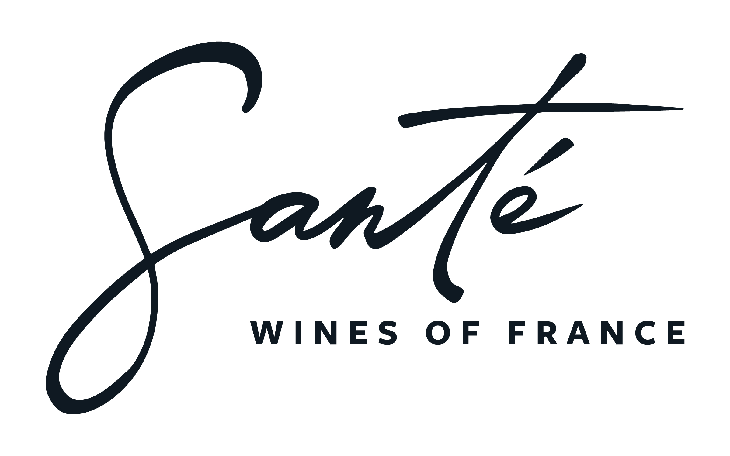
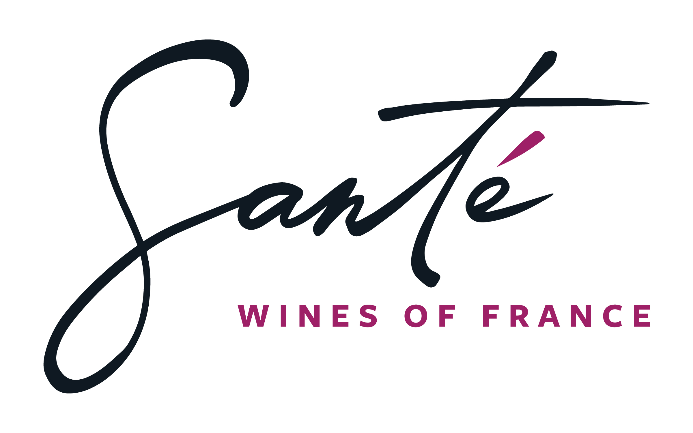
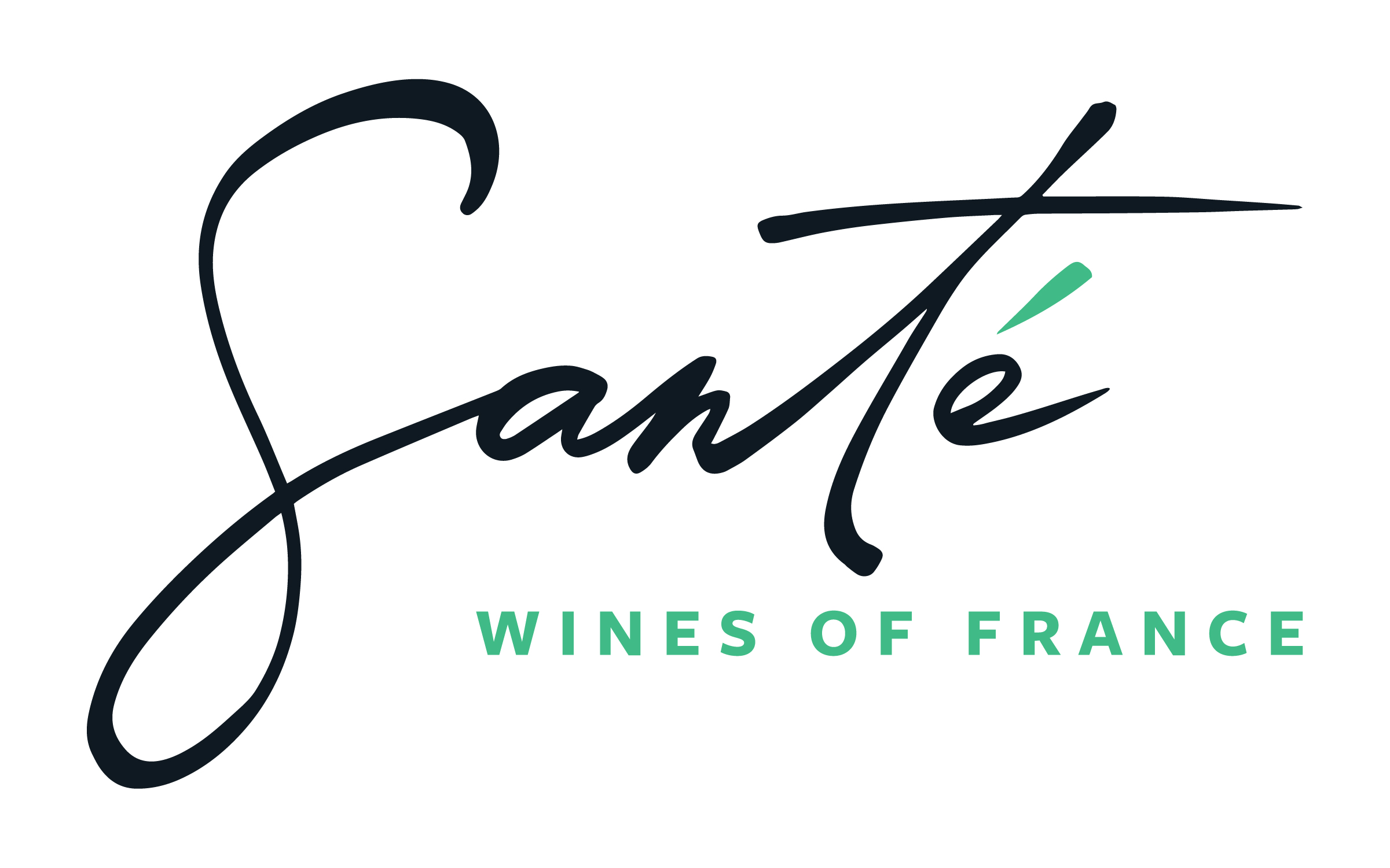
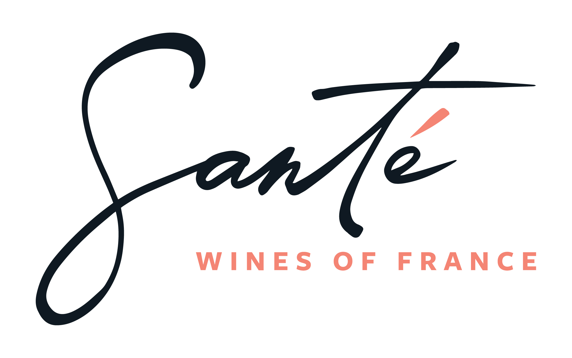
Final Logo: Color Variations
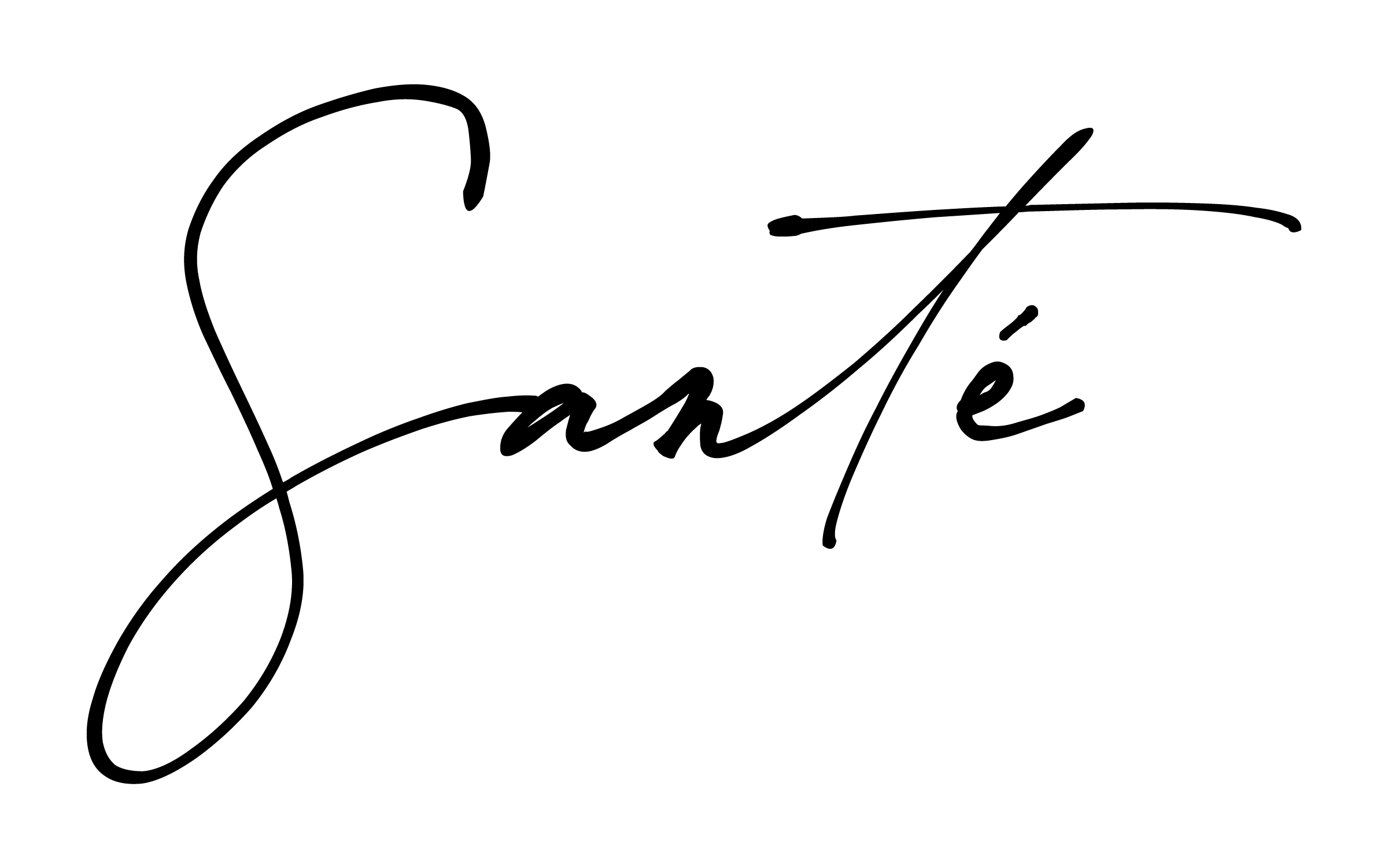
Typeface Precedent: the impressionist
The final Santé logo is a customized hand-drawn script based on the typeface the impressionist (shown above). The redrawn letters strengthen legibility with widened strokes, larger letterform counters, and increased emphasis to the l'accent aigu (acute accent) above the letter e.
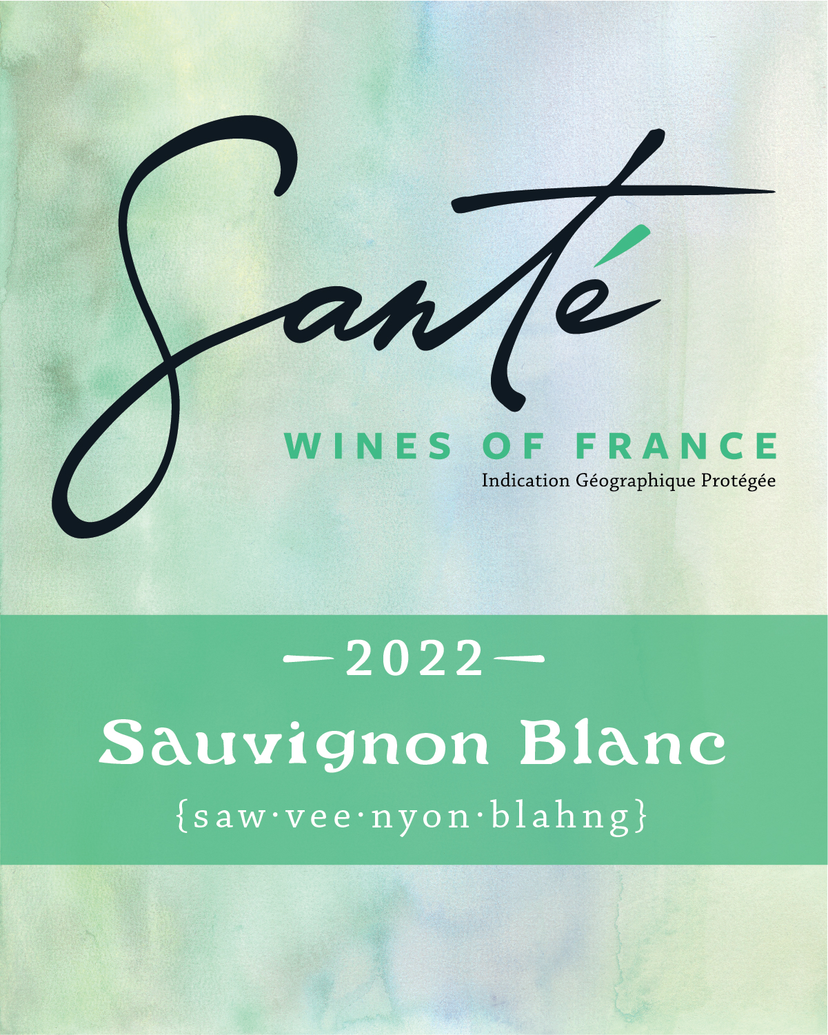
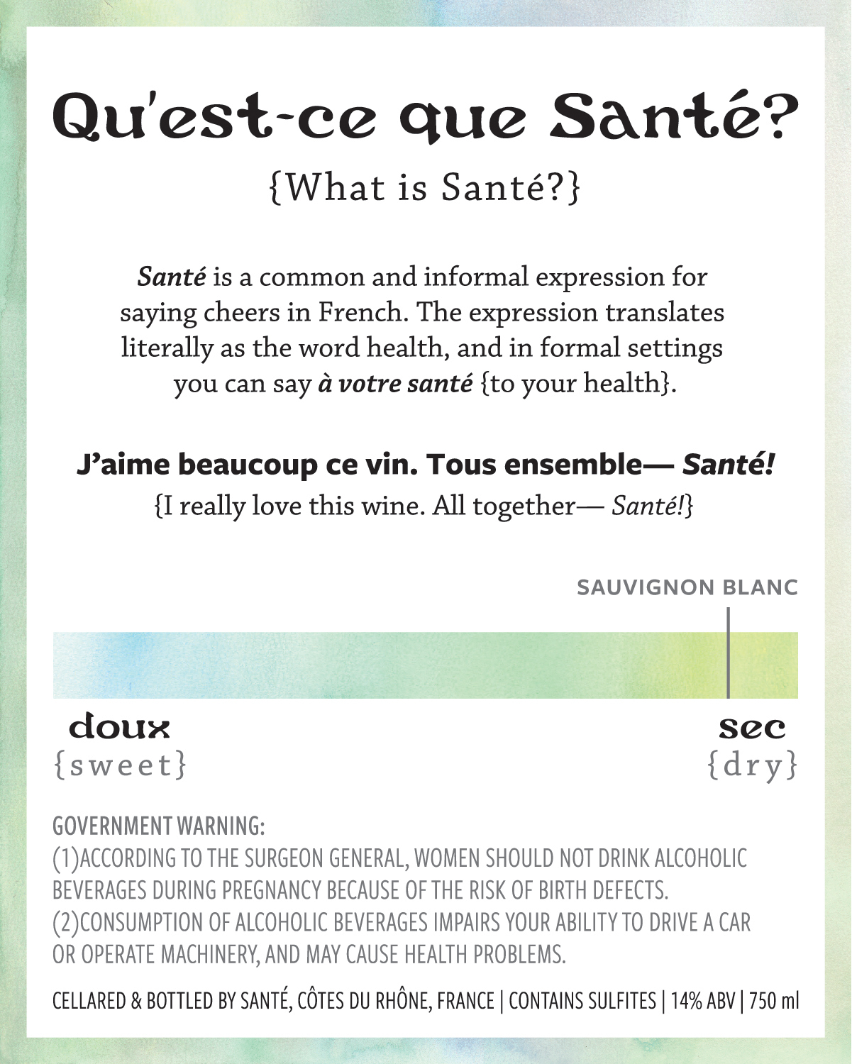
Santé Wine Labels: Front and Back
Brand Standards


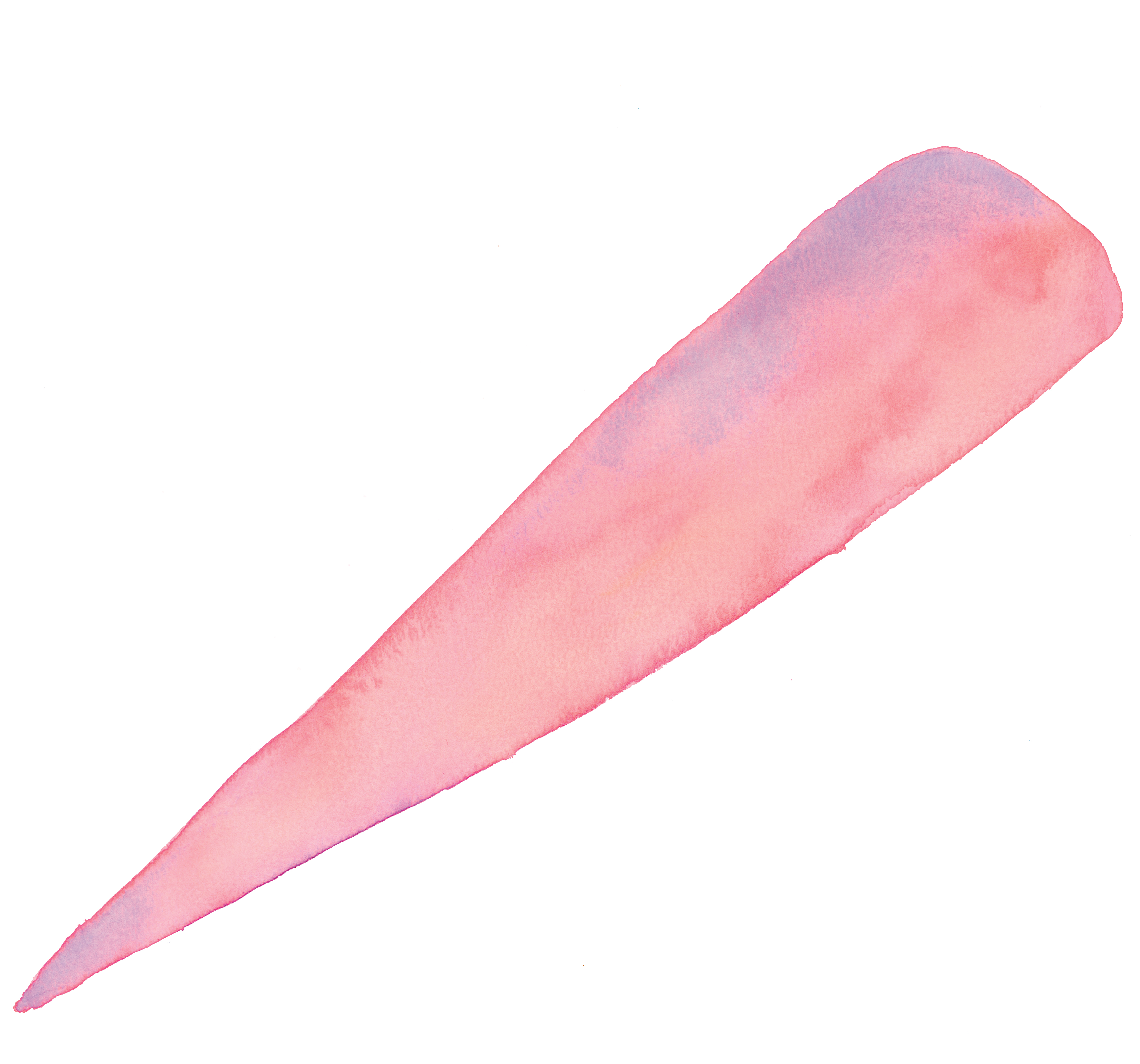

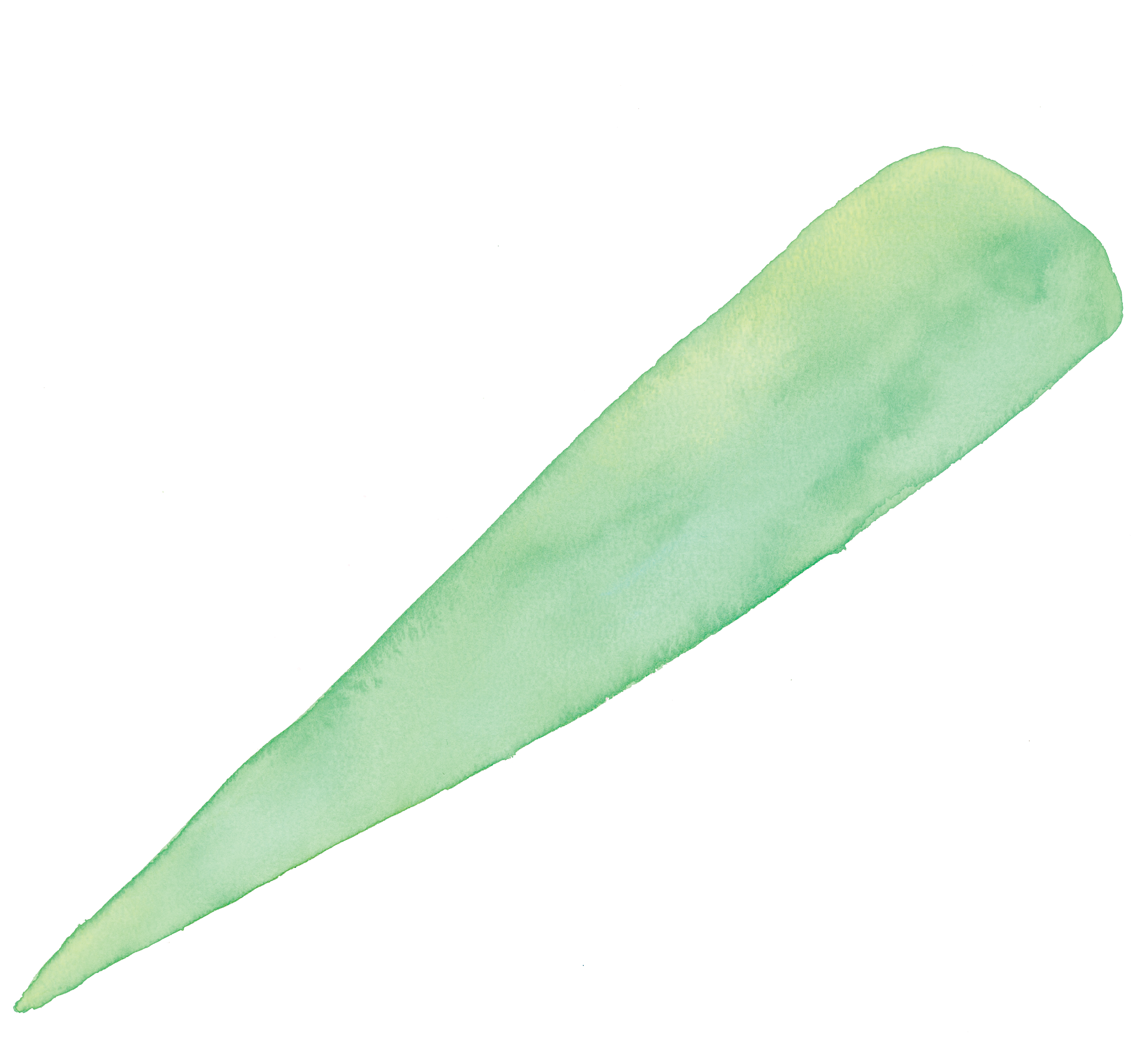
Santé Accents:
Plain and Expressive Options
Watercolor and Vintage Botanical Illustrations
Plain and Expressive Options
Watercolor and Vintage Botanical Illustrations
Posters
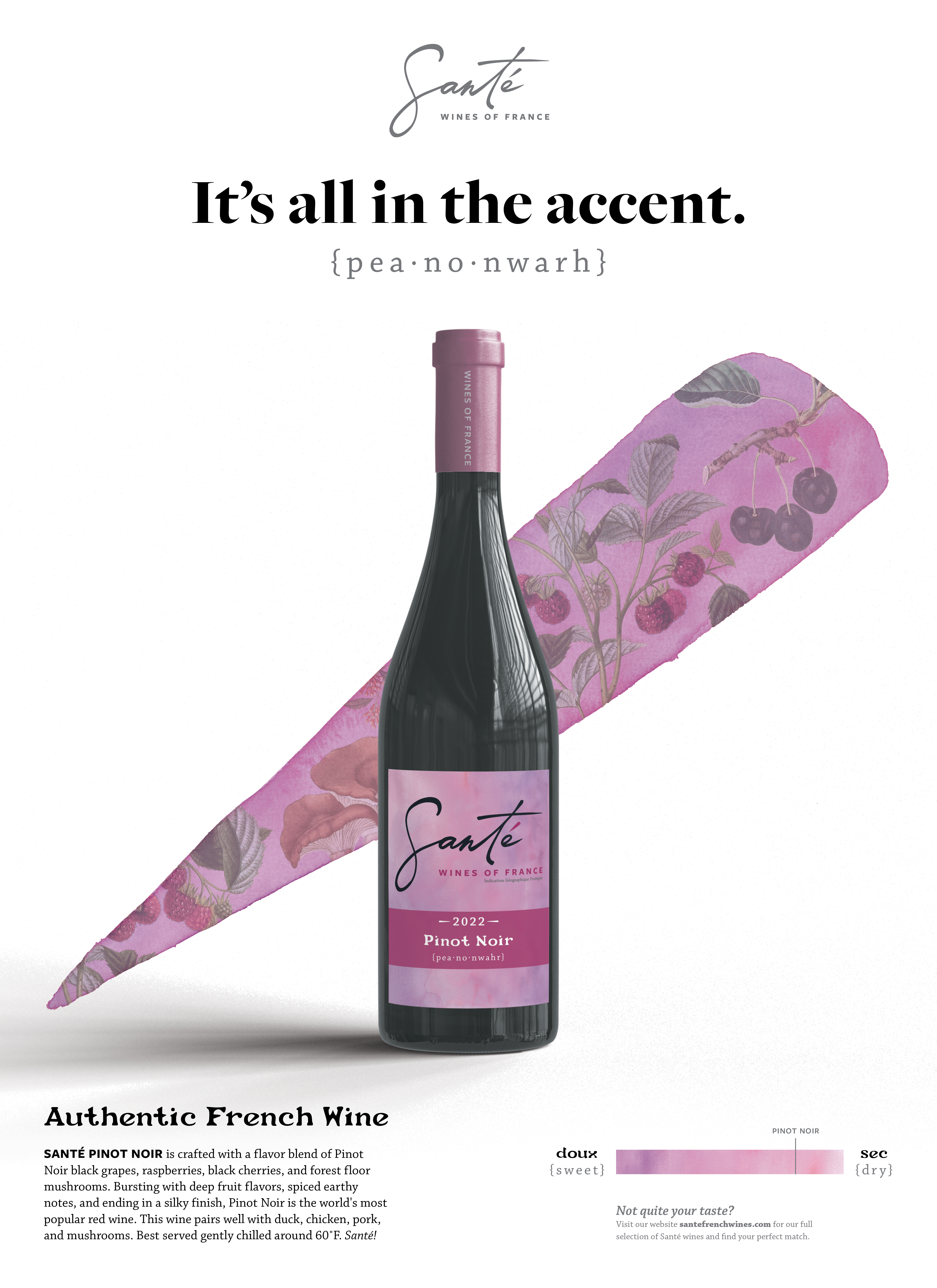
Santé Product Poster:
Rouge Motif
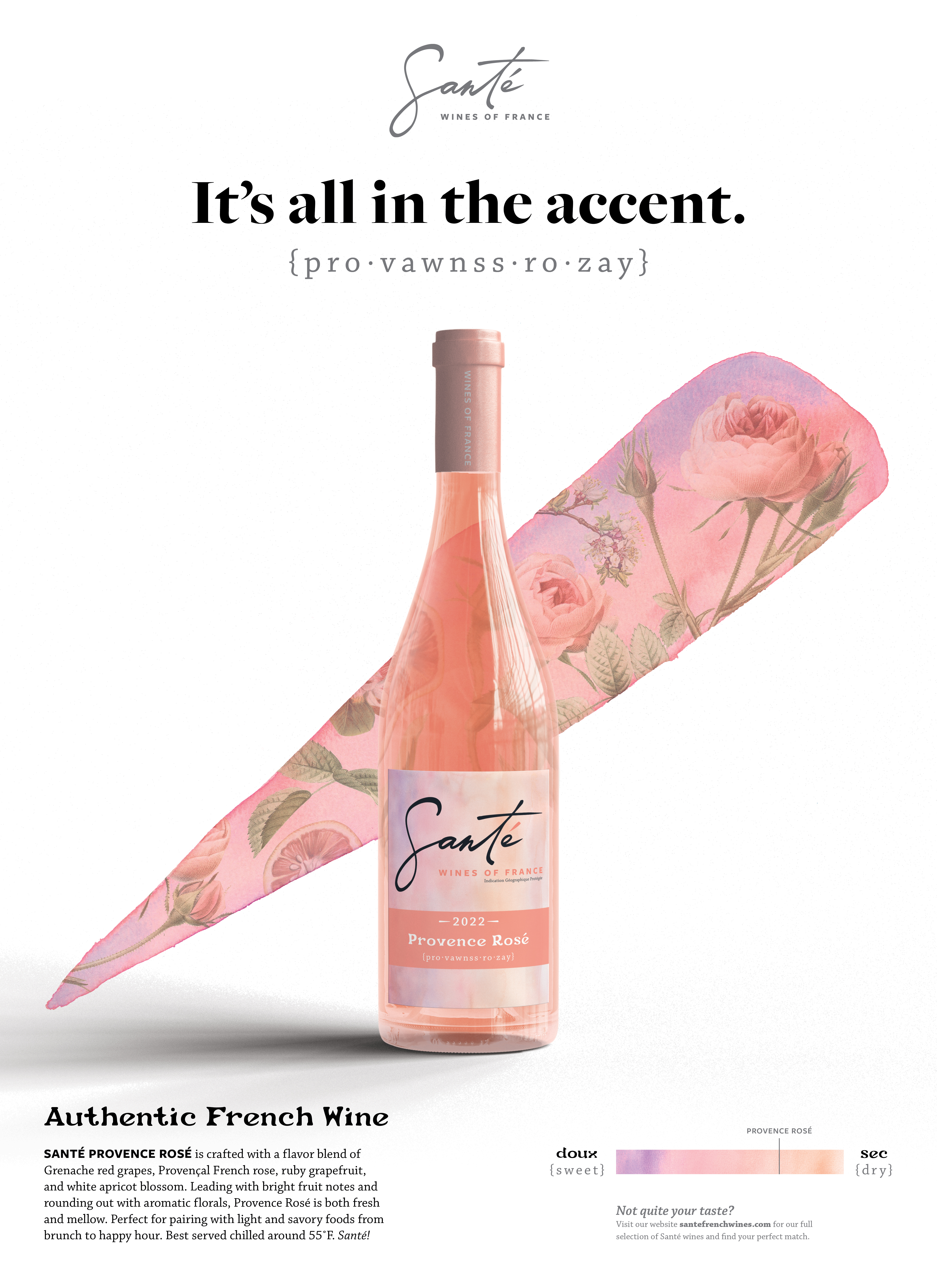
Santé Product Poster:
Rosé Motif
Santé Product Poster:
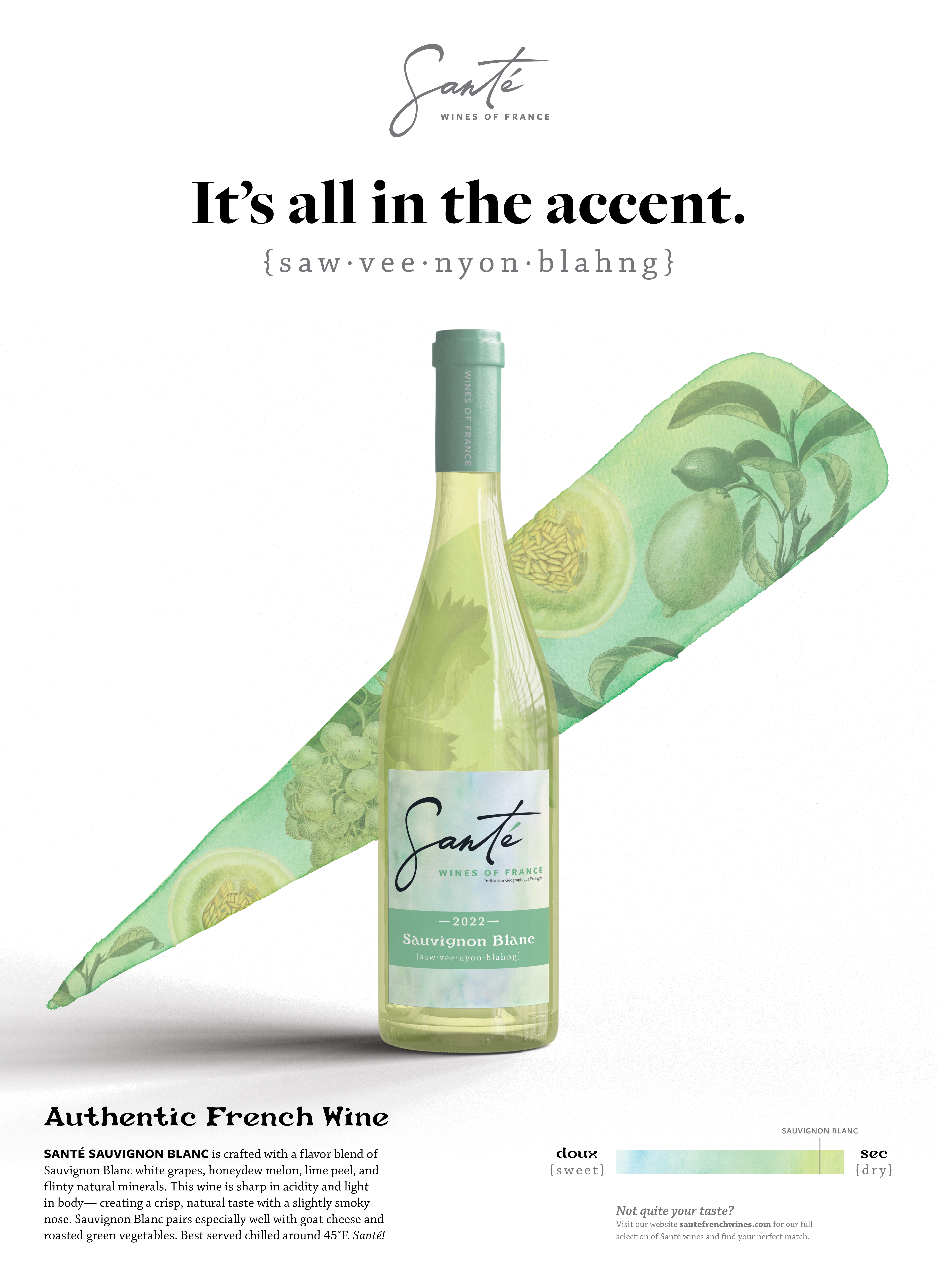
Blanc Motif
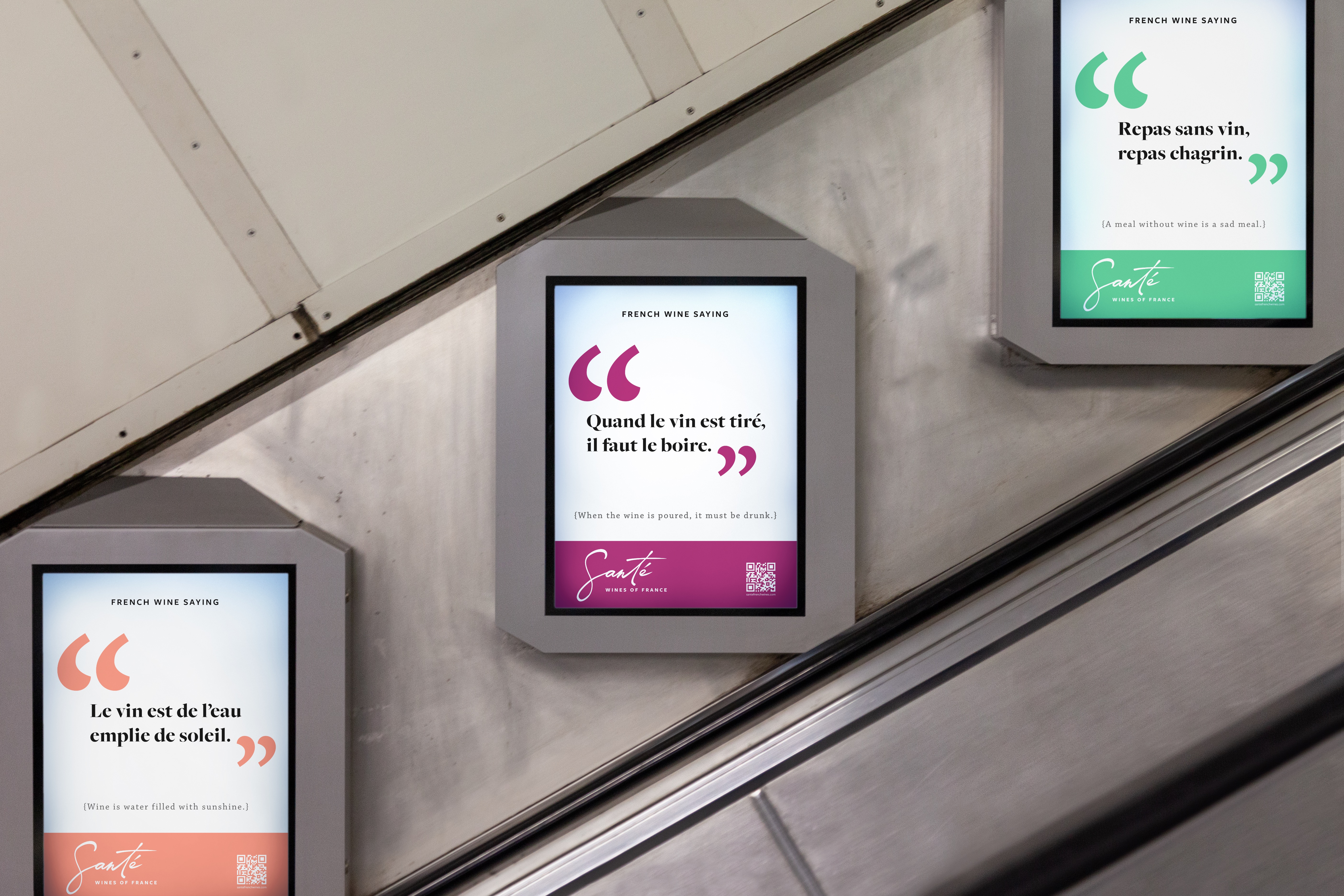
It’s all in the accent.
A very important component that arose when developing the brand identity of Santé was how to keep the brand approachable yet educational for consumers that may be new to the world of wine. The acute accent mark used in the word Santé became a key feature element that acts as a container, an expressive visual symbol, and provides a double meaning in regard to language and semantics.
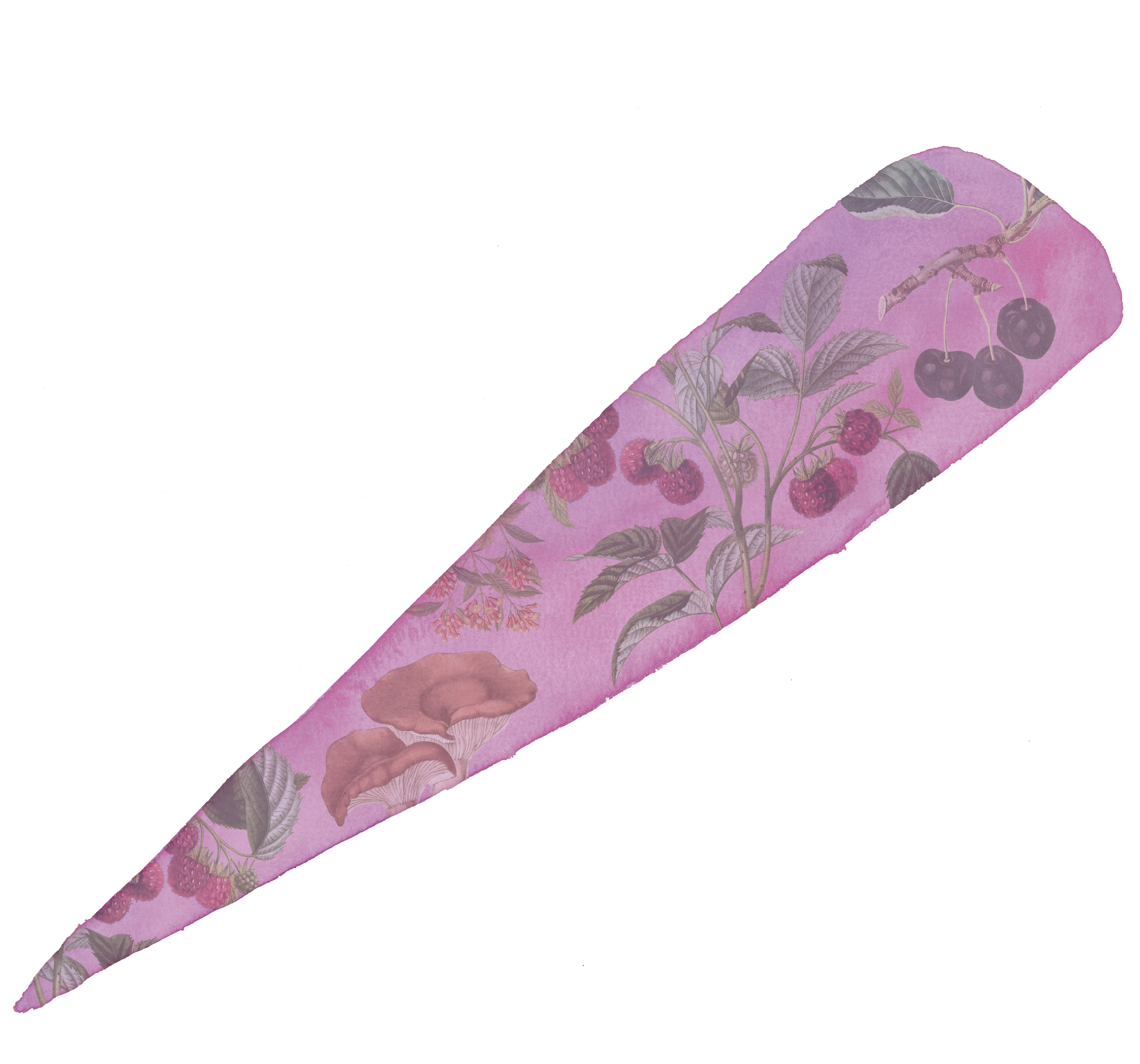
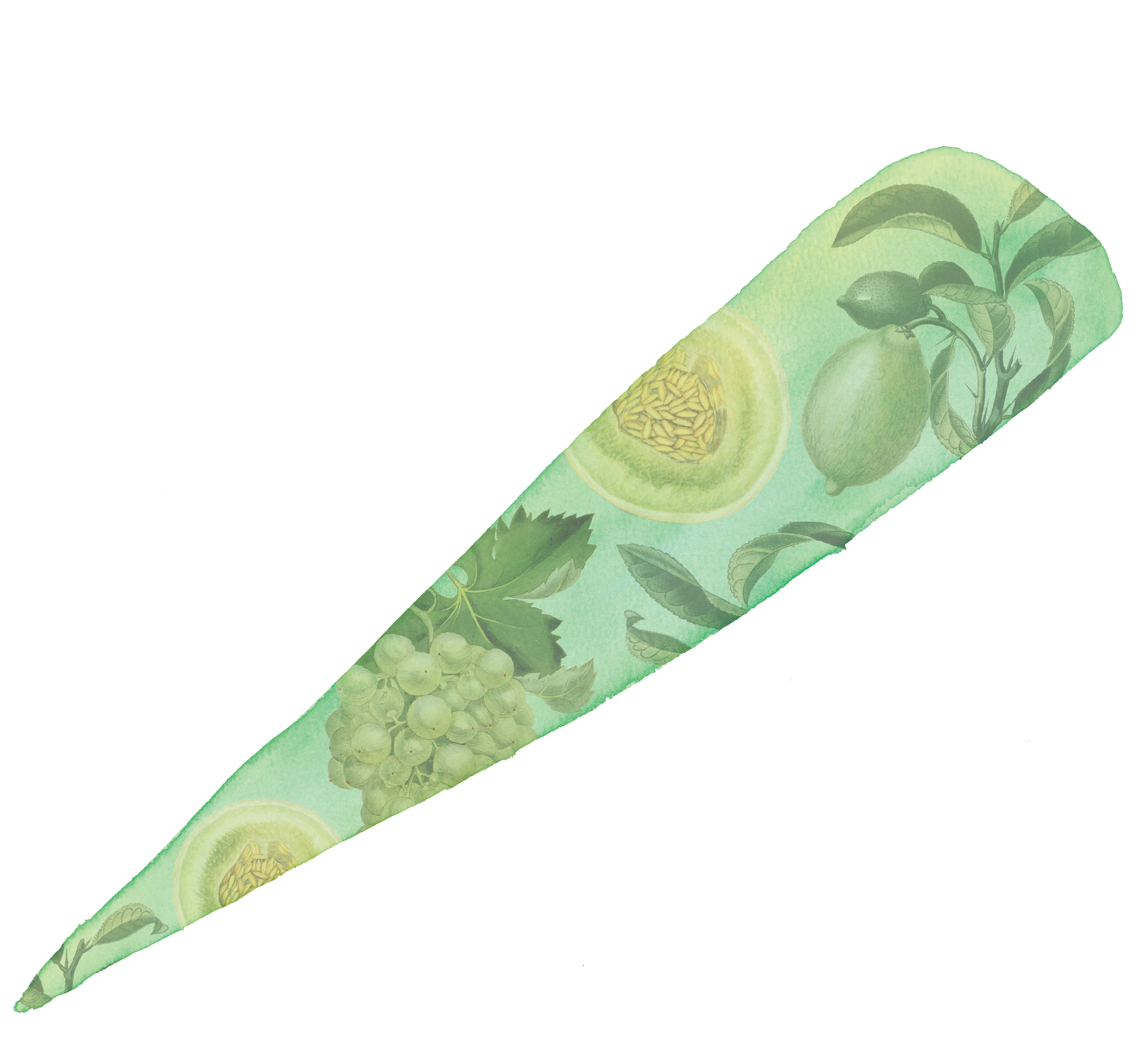
Container
The Santé Accent has a variety of uses as a container for color and information. Shown on the product posters, the accent contains vintage botanical illustrations which allude to the flavor profiles of the product being showcased. The accent can also serve as an informational color key as seen on the French Wine Map poster indicating the various French wine regions.
Expressive Visual Symbol
The dynamic diagonal movement of the accent mark draws the viewers’ eyes quickly and effectively when paired with the product or when used as an informational color key. The symbol works well at a variety of scales— from a large graphic mark to a small website favicon.
Language
One of the most significant differences between English and French many language learners encounter first and foremost is pronunciation. This is especially true if you have ever tried to pronounce a specific type of wine that you are unfamiliar with. Each bottle of Santé wine includes a phonetic spelling in English to aid those unfamiliar with how to correctly pronounce the wine type. The brand tagline “it’s all in the accent” playfully encourages those to say the wine name with confidence. The tagline also simultaneously doubles as a way to promote the unique flavor profiles or accents of flavor within the Santé wine itself.
A very important component that arose when developing the brand identity of Santé was how to keep the brand approachable yet educational for consumers that may be new to the world of wine. The acute accent mark used in the word Santé became a key feature element that acts as a container, an expressive visual symbol, and provides a double meaning in regard to language and semantics.
Container
The Santé Accent has a variety of uses as a container for color and information. Shown on the product posters, the accent contains vintage botanical illustrations which allude to the flavor profiles of the product being showcased. The accent can also serve as an informational color key as seen on the French Wine Map poster indicating the various French wine regions.
Expressive Visual Symbol
The dynamic diagonal movement of the accent mark draws the viewers’ eyes quickly and effectively when paired with the product or when used as an informational color key. The symbol works well at a variety of scales— from a large graphic mark to a small website favicon.
Language
One of the most significant differences between English and French many language learners encounter first and foremost is pronunciation. This is especially true if you have ever tried to pronounce a specific type of wine that you are unfamiliar with. Each bottle of Santé wine includes a phonetic spelling in English to aid those unfamiliar with how to correctly pronounce the wine type. The brand tagline “it’s all in the accent” playfully encourages those to say the wine name with confidence. The tagline also simultaneously doubles as a way to promote the unique flavor profiles or accents of flavor within the Santé wine itself.


Santé Product Poster Mockups


Santé Event Poster
Santé Educational Poster
Website

Santé Website Home Page

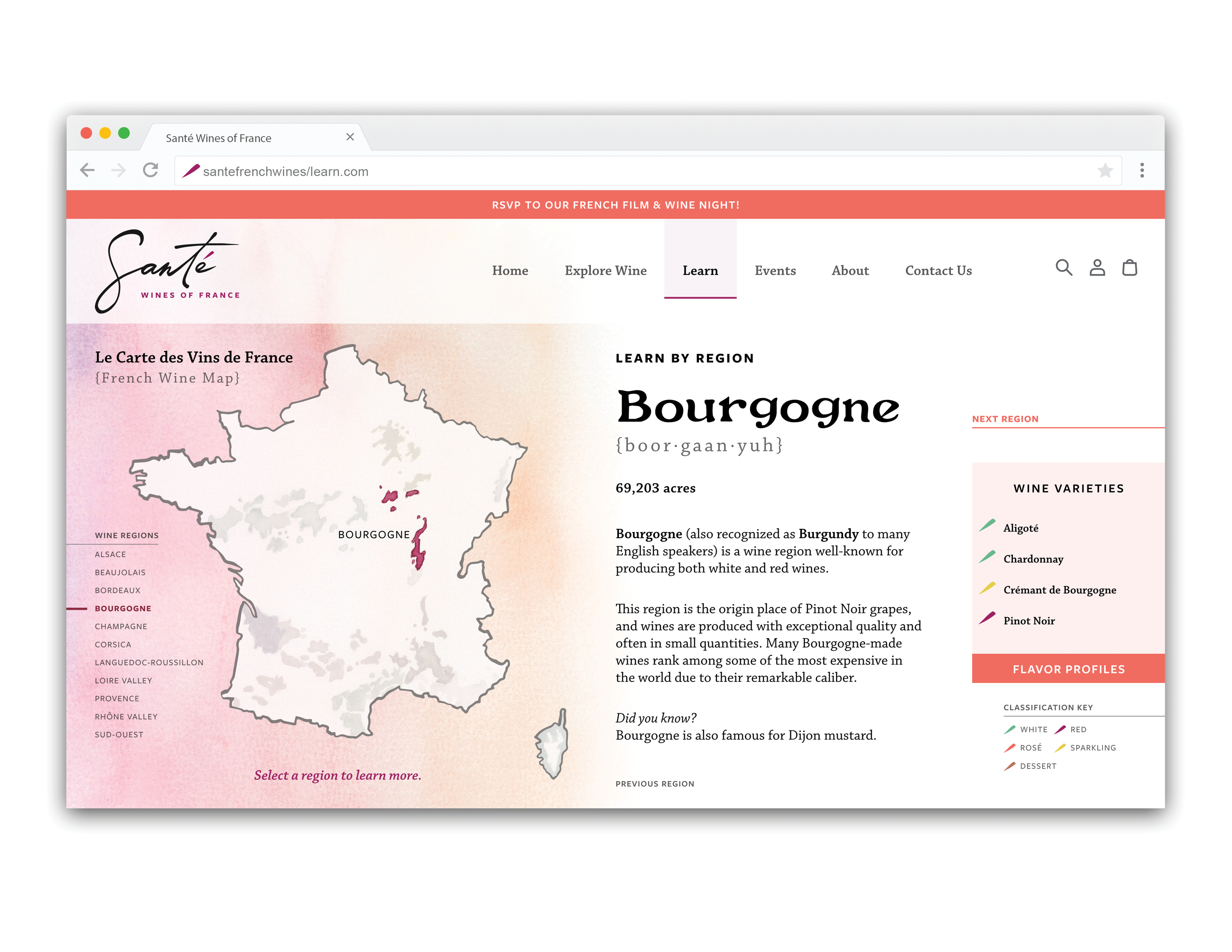
Website Explore Wine and Learn Pages:
The Santé website emphasizes a focus on learning about various wine types, flavor profiles, and wine regions. This is especially helpful for newer wine drinkers or those new to French wine.
The Santé website emphasizes a focus on learning about various wine types, flavor profiles, and wine regions. This is especially helpful for newer wine drinkers or those new to French wine.
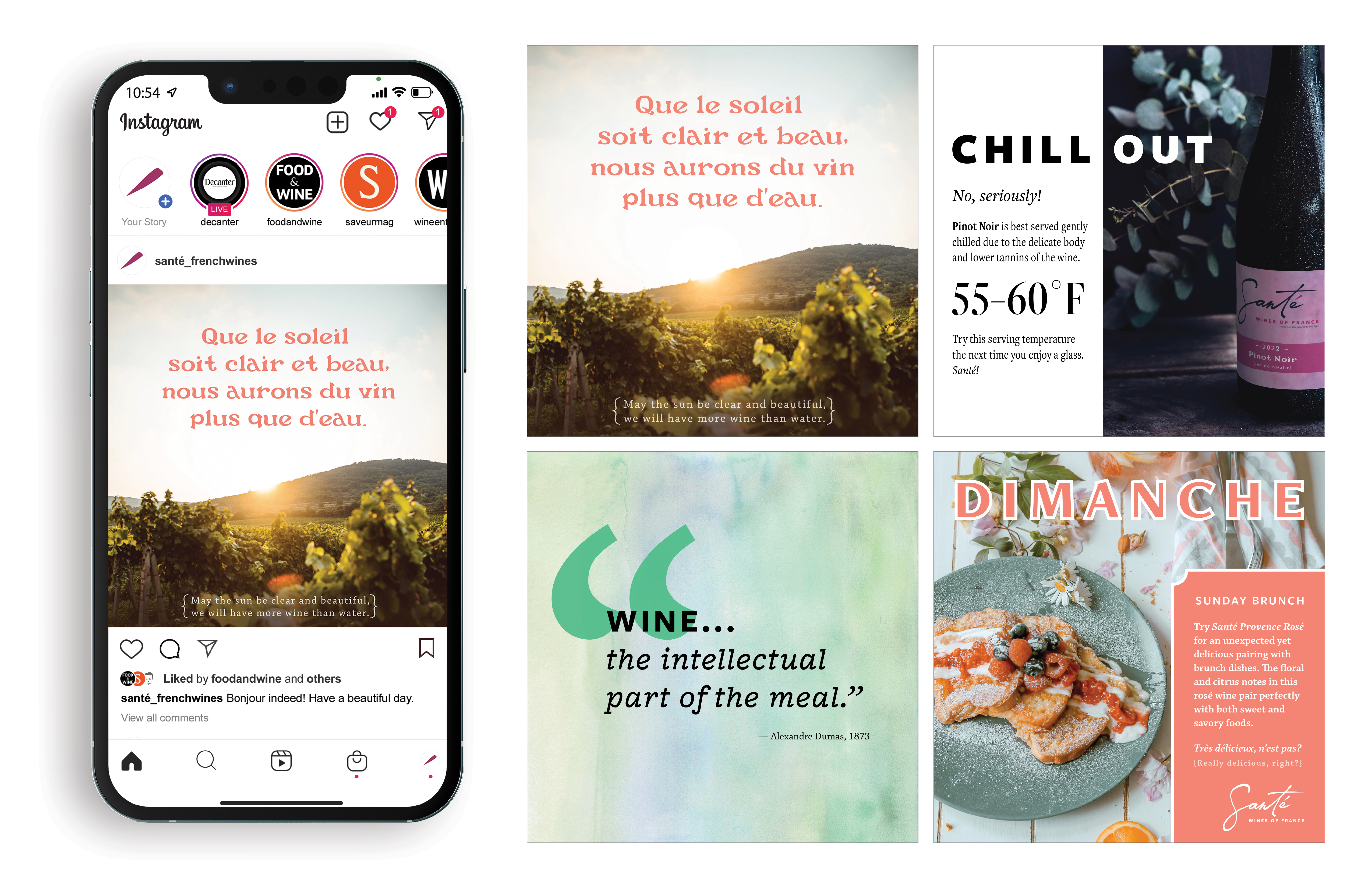
Instagram Posts:
The Santé Instagram posts use a combination of photography, product imagery, and watercolor texture backgrounds to complement and enhance the overall brand image. Each of the posts contain an educational component as well: French to English translations, wine serving tips, a quote, and food pairings.
The Santé Instagram posts use a combination of photography, product imagery, and watercolor texture backgrounds to complement and enhance the overall brand image. Each of the posts contain an educational component as well: French to English translations, wine serving tips, a quote, and food pairings.
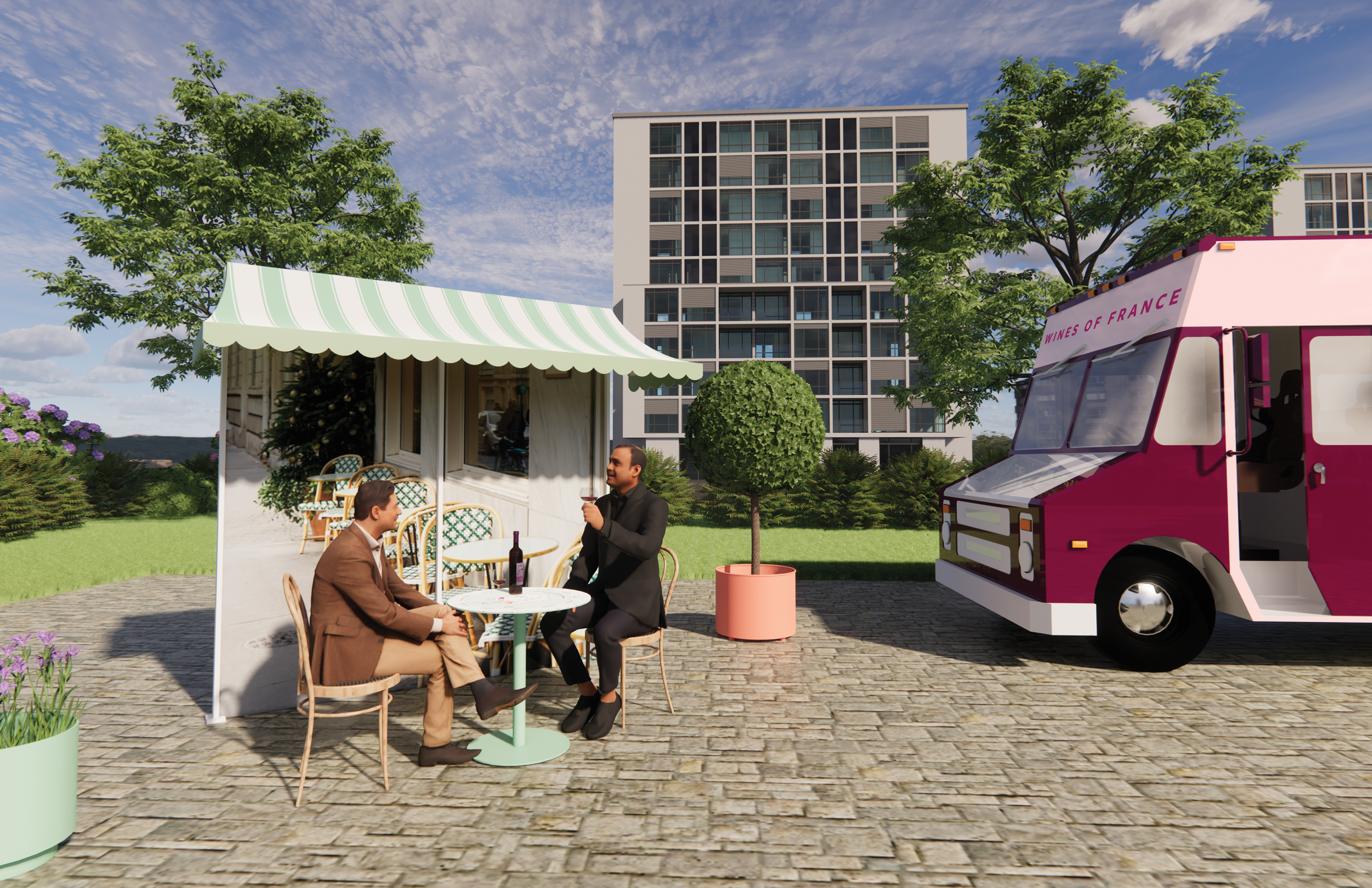
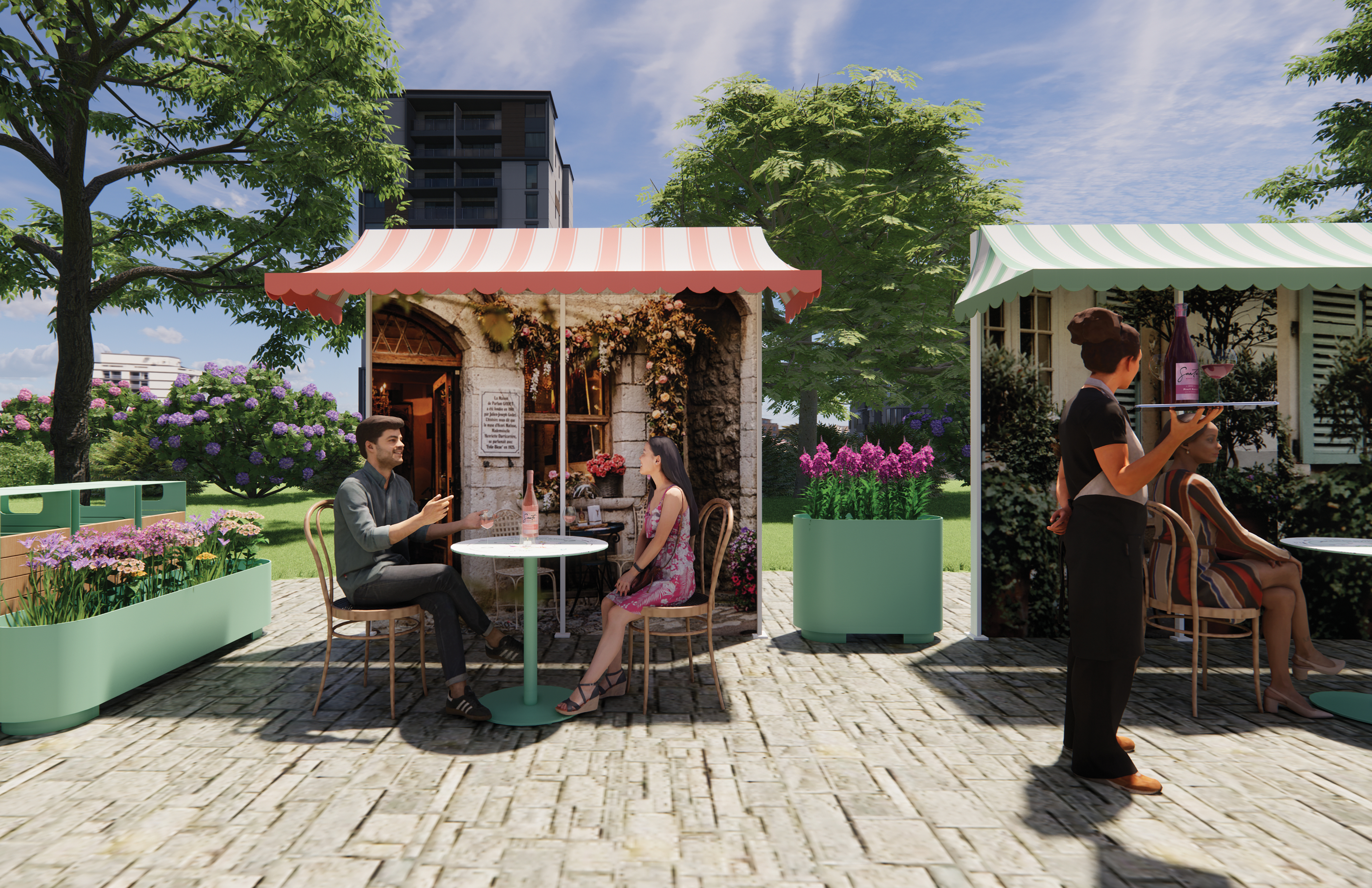
Environmental Applications
The Santé environmental applications showcase a Wine Pop Up Event that can take place in a city center or downtown environment. This allows guests to be transported away from their day-to-day life by enjoying a glass of wine in front of a Parisian café vignette (complete with decorative awnings and photography of French café façades). The environmental application is completely portable and allows Santé to take their product on the road to different US cities.
All environmental scenes are 3D modeled with Revit and rendered with Enscape. After the initial build of the scene and mapping textures, this technique allows for multiple 3D views to be rendered quickly and with detail.
All environmental scenes are 3D modeled with Revit and rendered with Enscape. After the initial build of the scene and mapping textures, this technique allows for multiple 3D views to be rendered quickly and with detail.
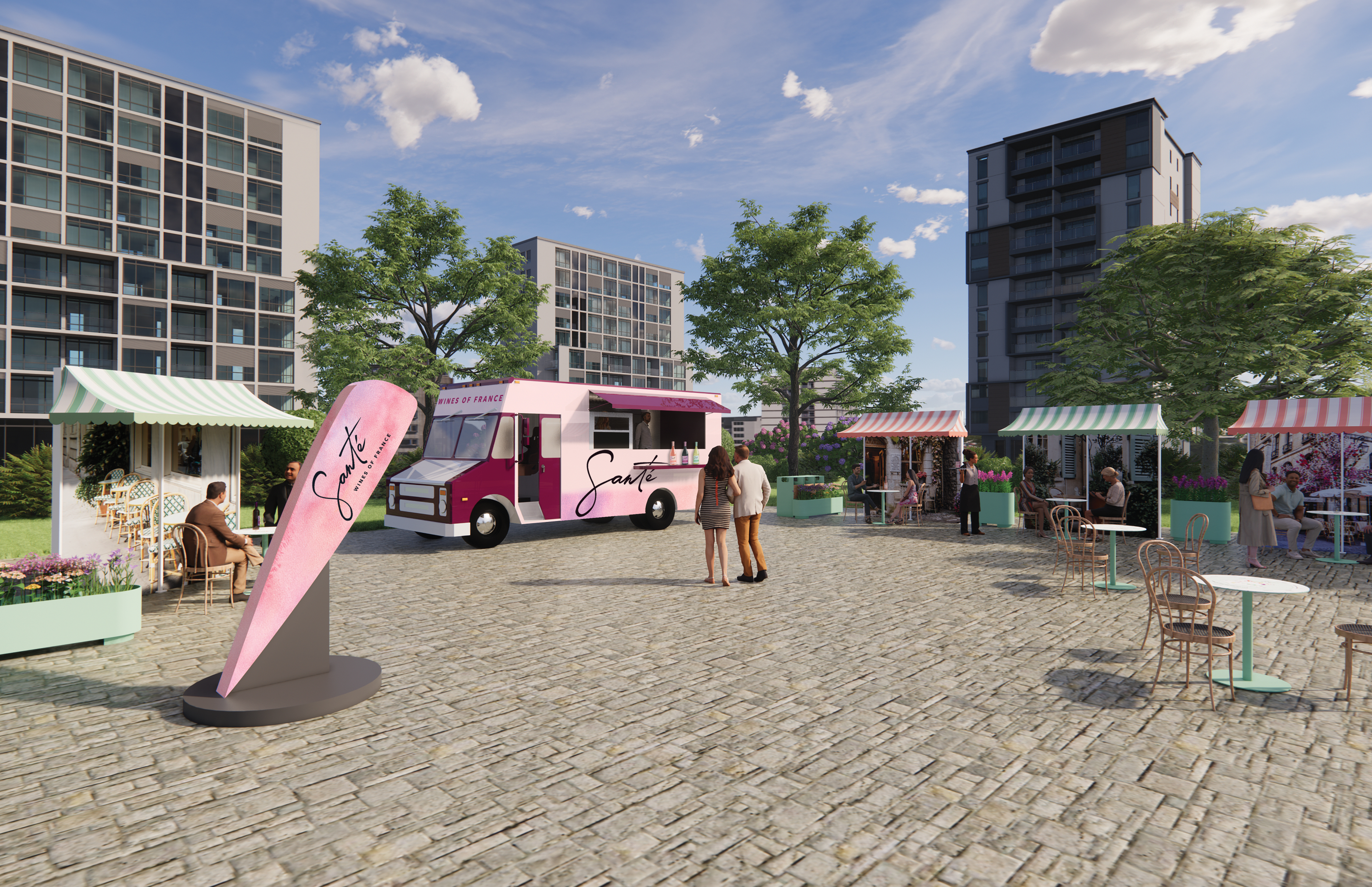
 Environmental Application:
Santé Wine Pop Up Event
Café Vignettes
Down to the design details.
In addition to creating an overall scene with café vignettes, the brand experience continues down to the tabletop design. Guests can enjoy a glass of Santé wine while also learning about the various wine regions / where their wine is from by viewing the decorative and informative design while seated at their table. This design creates an educational and interactive experience, as well as a conversation starter for people learning about wine or getting to know each other at the Wine Pop Up Event.
The entire Santé environmental experience allows guests to live in the present moment and have a sense of discovery and delight through enjoying simple pleasures.


Environmental Application:
Santé Wine Pop Up Event
Café Tabletop Details
Santé Wine Pop Up Event
Café Tabletop Details
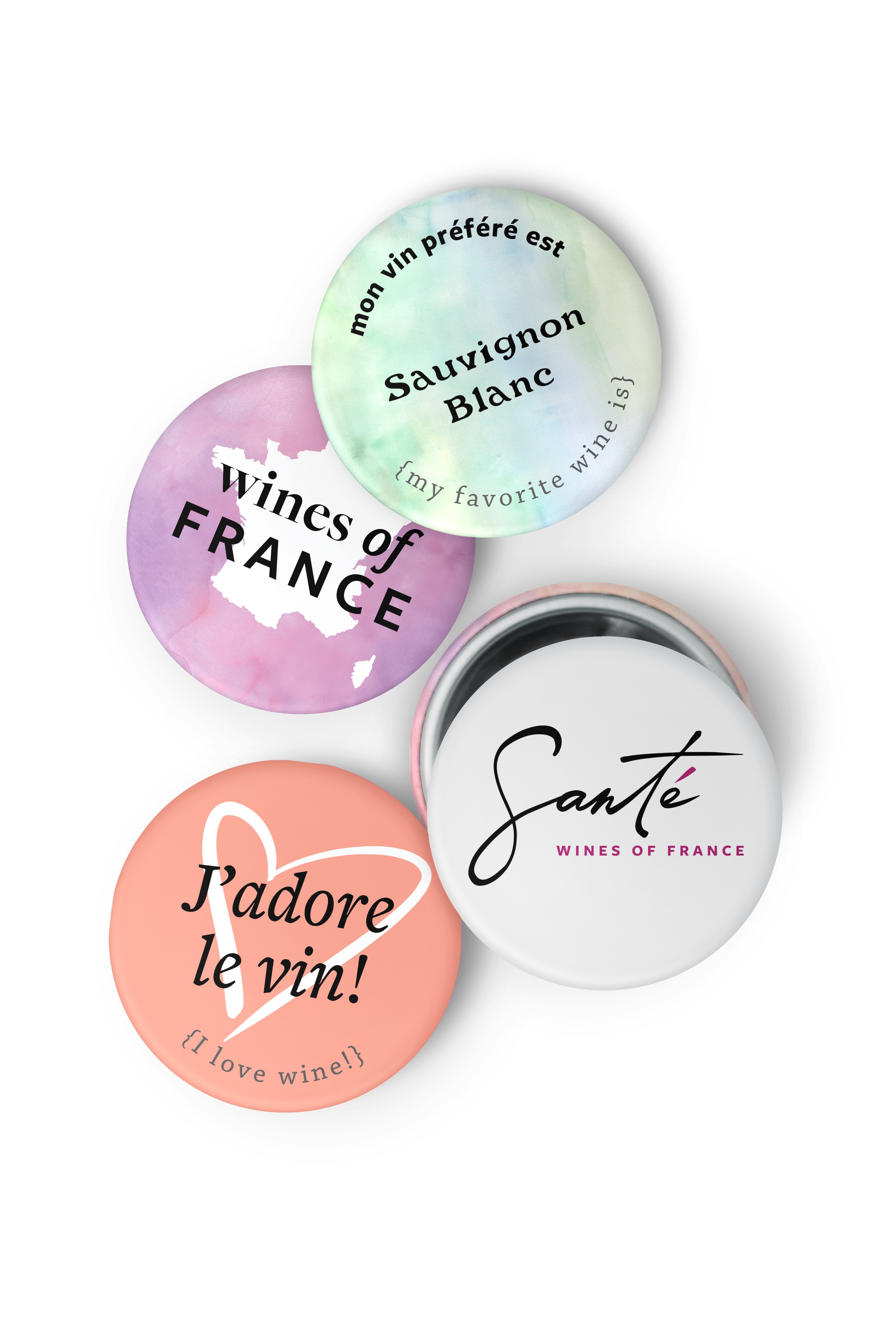
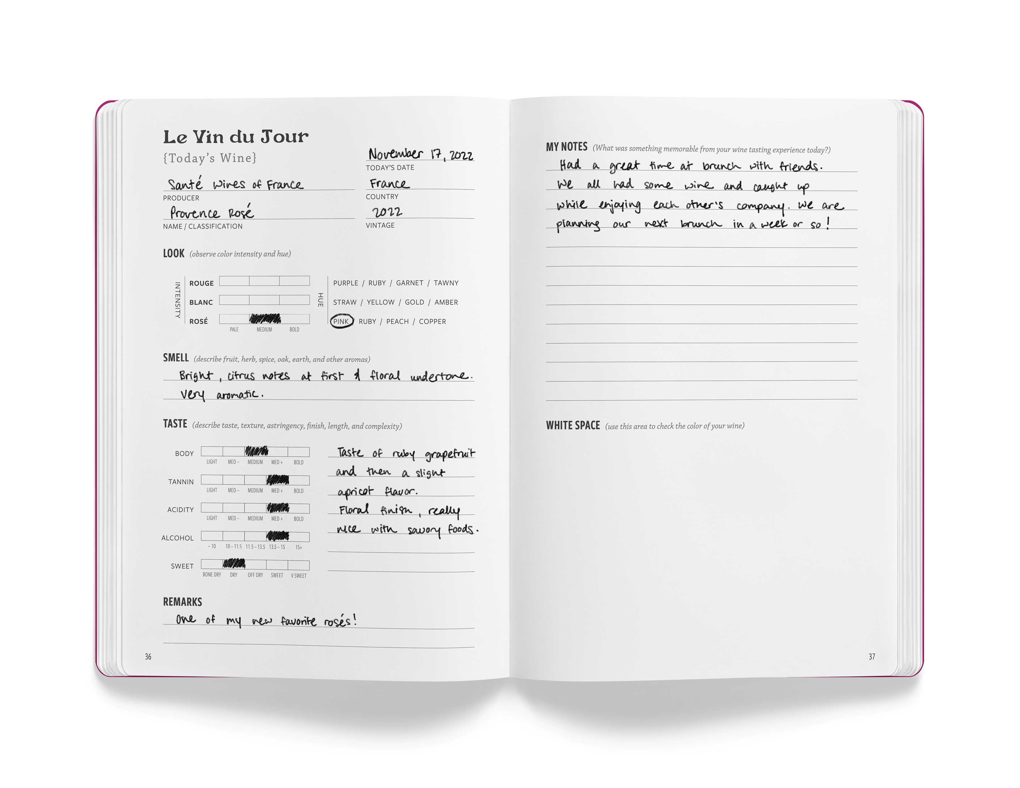
Mockups & Extras
A variety of additional mockups were created to further express the overall brand identity of Santé. From large scale environmental elements to small scale products that can be enjoyed on a daily basis, the brand identity remains authentic, versatile, and approachable yet elevated.


Credits & Tools
Imagery Sources:
Unsplash
Photography used for Website Home Page by Klara Kulikova
Photography used for Website Home Page by Klara Kulikova
Photography used for Instagram Posts by Toa Heftiba and Martin Katler
Photography used for Café Vignettes by Megan Bucknall, Veronika Jorjobert, and V2F
Vintage Botanical Illustrations (Public Domain / Fair Use)
Additional tools beyond the typical use of Adobe Illustrator, InDesign, and Photoshop were used to complete this project.
Unique Tools:
Revit
Enscape
LiveSurface Context
Accolades
5 pieces from this project were accepted to show at the 2023 WORK National Juried Student Exhibition at Jacksonville State University in Alabama.
Show juried by Marisol Ortega (Designer, Illustrator, and Letterer).
Show juried by Marisol Ortega (Designer, Illustrator, and Letterer).
2023 WORK National Juried Student Design Exhibition