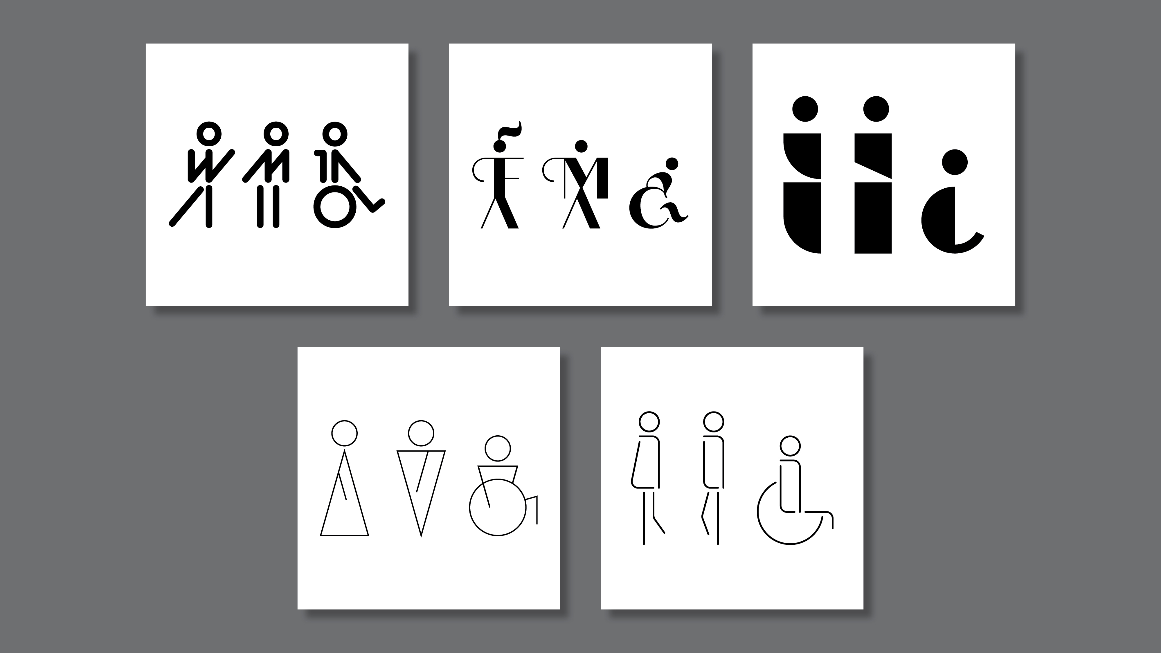
Restroom Pictograms
1. 5 Designs
2. About the Sets
Project goals were to create 5 sets of Restroom Pictograms that must include both female and male pictograms at a minimum. I challenged myself to also include the wheelchair accessible pictogram within each of the sets as well. This was an important design consideration because an accessible icon would be a requirement on a true commercial restroom project.
Project Considerations include:
Context (who is it for)
Styles (visual differences)
Abstraction (levels of detail)
Types (icon, index, symbol)
Project Considerations include:
Context (who is it for)
Styles (visual differences)
Abstraction (levels of detail)
Types (icon, index, symbol)
5 Designs
About the Sets
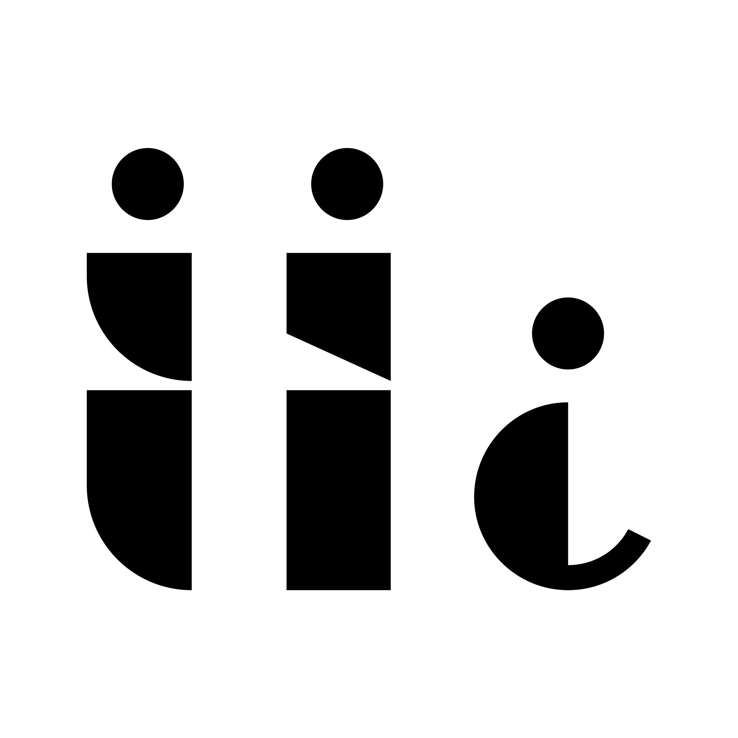
Set 1: At the Train Station
The first set of pictograms I created originate from the typeface BC Alphapipe RB Bold. I utilized different letterforms to create each of the figures and incorporated the use of W and M on the woman and man pictograms respectively.
These figures resemble signage or symbols you may see around public transit areas. They have a minimal and modern feel while still remaining highly recognizable and legible from a distance.


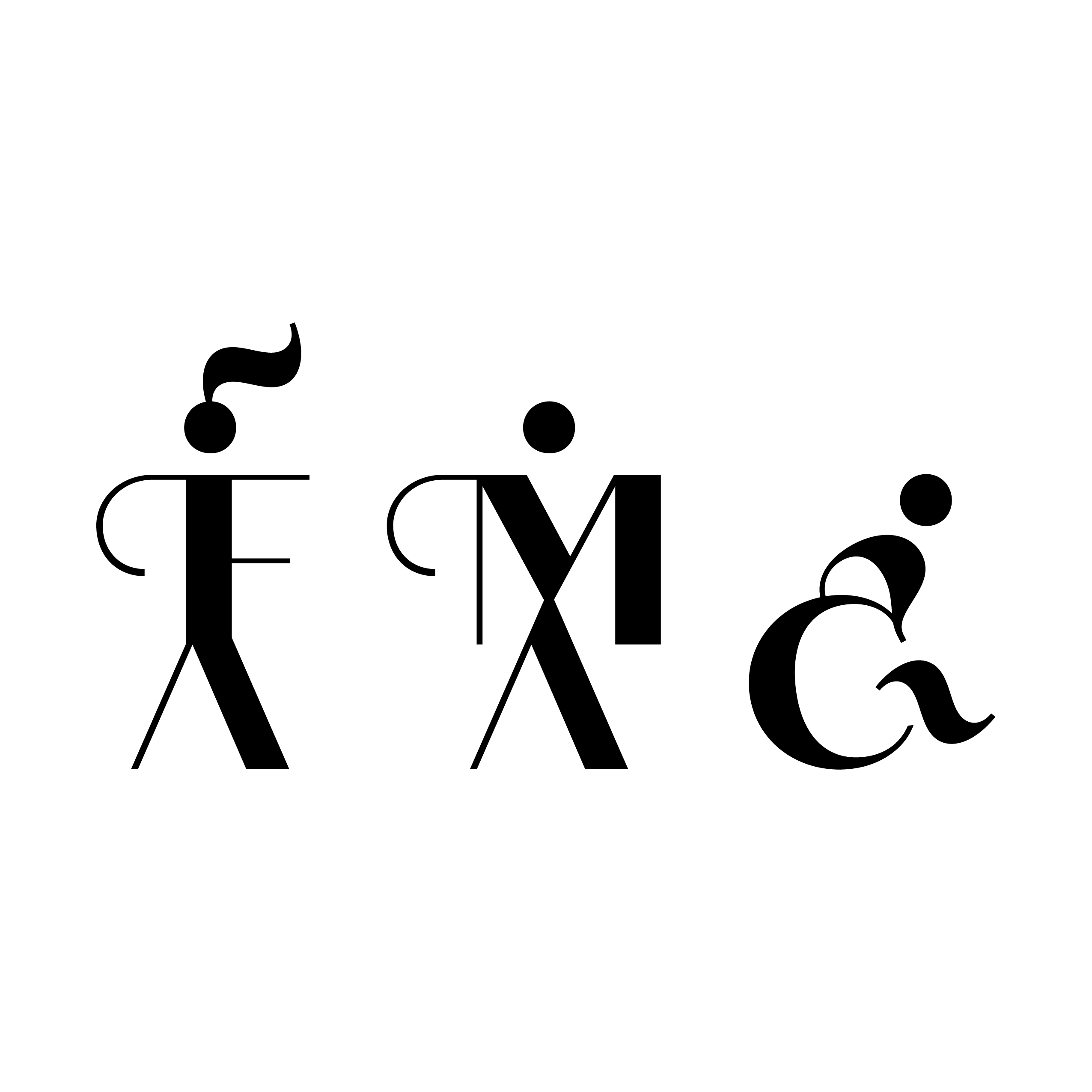
Set 2: At the Café
The second set of pictograms created originate from the typeface Quiche Sans ExtraBold. I utilized various letterforms as a base for the figures and incorporated the use of F and M on the female and male pictograms respectively.
These figures began to resemble coffee cups to me (especially with the thin decorative swashes on the left side of the F and M letterforms— almost like the handle on a mug). The female ponytail also mimicked steam coming from of a cup of coffee. I especially love the accessible pictogram for this set as the figure appears to be in motion.

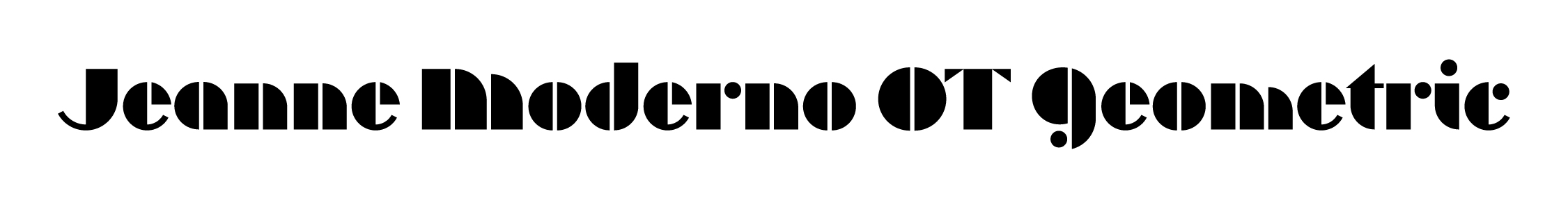
Set 3: At the Sculpture Gallery
The third set of pictograms created originate from the typeface Jeanne Moderno OT Geometric. Letterforms create the base of the figures with very little manipulation.
This set of pictograms is by far the most abstract and subtle in the differentiation between the female and male symbols. The female symbol uses a curved edge while the male symbol remains straight. The accessible symbol is even further simplified and abstracted to the bare essentials. These figures began to remind me of blocks of stone or abstracted sculptural figures one might see in a gallery.
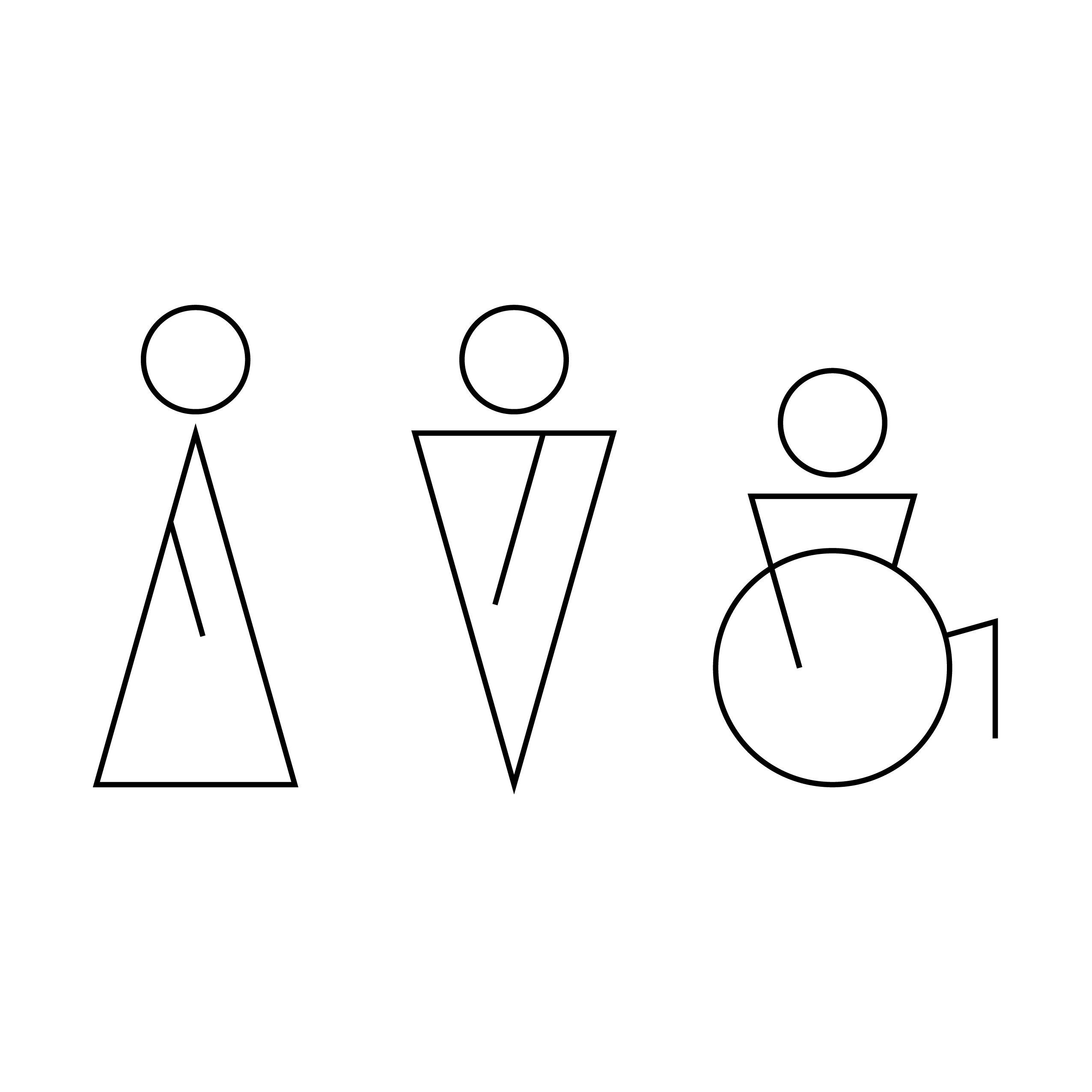
Set 4: At the Office
The fourth set of pictograms is created purely from simple geometric shapes and lines. Repeated elements are rotated and flipped to create recognizable distinctions between the different pictograms.
This set of symbols felt the most corporate, and the triangular bases of the female and male pictograms reminded me of the up and down arrows one might see in a corporate elevator lobby.
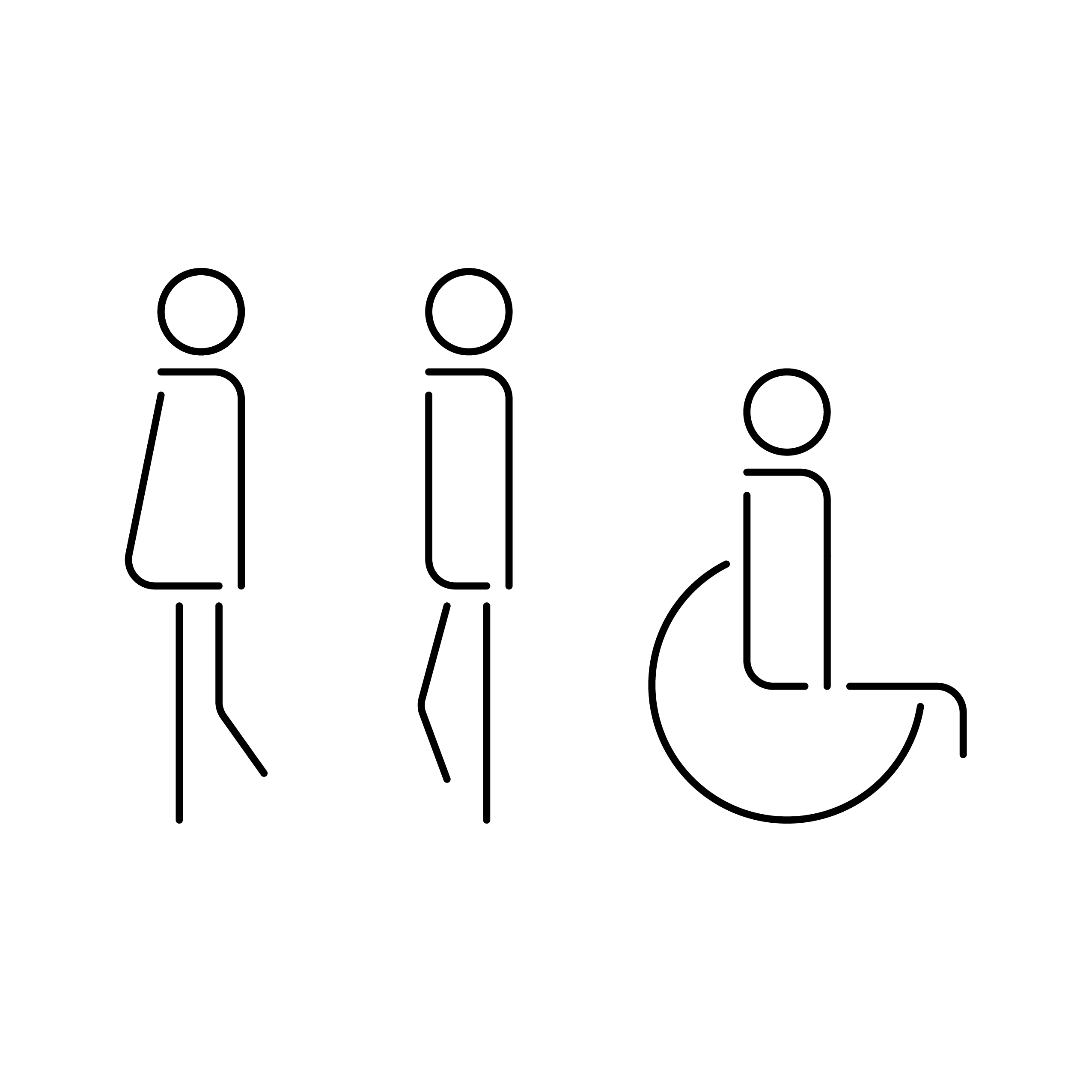
Set 5: At the Hotel Lounge
The final set of pictograms is created with line work only. Very small adjustments were used to create distinctions between the figures. The female and male figures share the same legs, just a small rotation occurs at the bent leg which changes the contextual interpretation.
This set of symbols feels sleek and modern with a slight playful attitude. The forms of the figures began to remind me of cocktail stemware or a toothpick through an olive in a martini glass.