Receipt Design
1. Working Designs
2. Final Design
3. About the Typefaces 4. Project Notes
Project requirements were to design and print a receipt for a real or fictional retail store. The primary goals were to learn about informational hierarchy, organization, scale, tab tools, and working in small scale and low resolution.
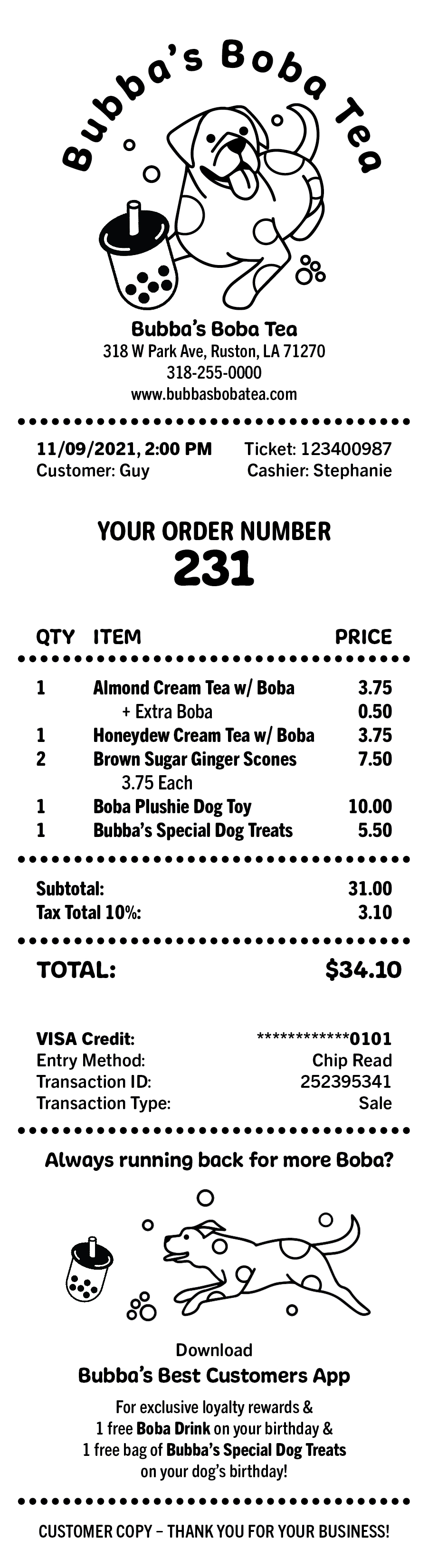
I chose to create a receipt design for a fictional store of my own imagination: Bubba’s Boba Tea. This would be a boba tea shop that sells teas, pastries, and specialty dog toys and treats. The namesake of the shop comes from my parents’ dog Bubba, a large and friendly boxer. I loved the way the names Bubba and boba sounded together, and it really inspired me to create this receipt design for the fictional store.
I chose to create a receipt design for a fictional store of my own imagination: Bubba’s Boba Tea. This would be a boba tea shop that sells teas, pastries, and specialty dog toys and treats. The namesake of the shop comes from my parents’ dog Bubba, a large and friendly boxer. I loved the way the names Bubba and boba sounded together, and it really inspired me to create this receipt design for the fictional store.
Working Designs
 Test prints from an actual receipt machine were used to ensure legibility at a low resolution.
Final Design
The final receipt design had to look and function as though it was an actual receipt. Items like company information, transaction details, customer specific information, and company app promotion add to the realism of the design.
Design details are specific to Bubba’s Boba Tea:
Informational break lines are created with black dots to mimic the boba tea pearls found in drinks.
About the Typefaces
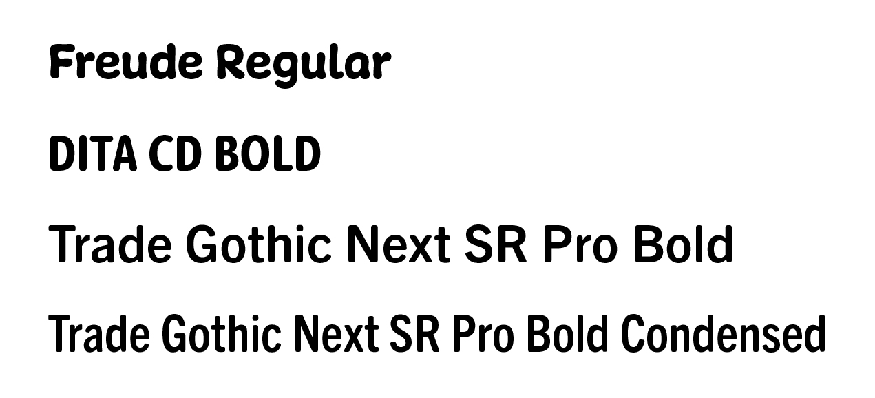
It was very important for me to choose typefaces that have a substantial but soft quality— similar to a boba tea pearl. The main feature typeface Freude Regular has almost a chewiness to the look and really embodied the quality of boba to me. All of the soft letterforms feel approachable and friendly— just like Bubba the dog.
The supporting body copy typefaces tie well with Freude Regular but remain highly legible at a small point size and low resolution seen on receipt print outs.
The supporting body copy typefaces tie well with Freude Regular but remain highly legible at a small point size and low resolution seen on receipt print outs.
Project Notes
This project was created for educational purposes only and uses modified / manipulated graphics from outside sources.
Original Graphic Source Credits:
Dog: Davies Peace Design, Vector Contributor
Boba Tea: Iconfinder