Expressive Typography
1. Quote & Concept
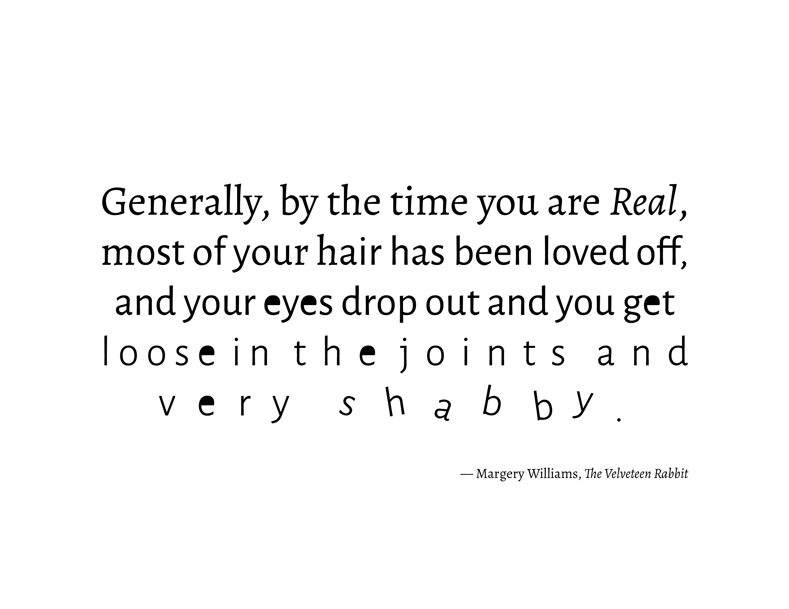
Project goals were to select a short quote and then express the quote’s meaning through typographic manipulation. I selected one of my favorite lines from the book The Velveteen Rabbit by Margery Williams.
Quote
Concept
One of the biggest challenges on this project was keeping the overall composition quite simple to evoke the meaning behind the quote. I focused on small changes at the letterforms and words— some very subtle and others more noticeable.
“hair has been loved off” A gradual change occurs in the second line of text from serif to sans serif. The text then remains in sans serif for the duration of the quote.
“eyes drop out” The counter space of the “e” (also called the eye) is removed. This remains removed at every letter “e” that occurs thereafter.
“loose in the joints” The tracking begins to increasingly become looser, and the letterforms themselves are thinner as if eroded over time.
“shabby” The final step shows the letterforms breaking free from the baseline— portraying a dilapidated feel.
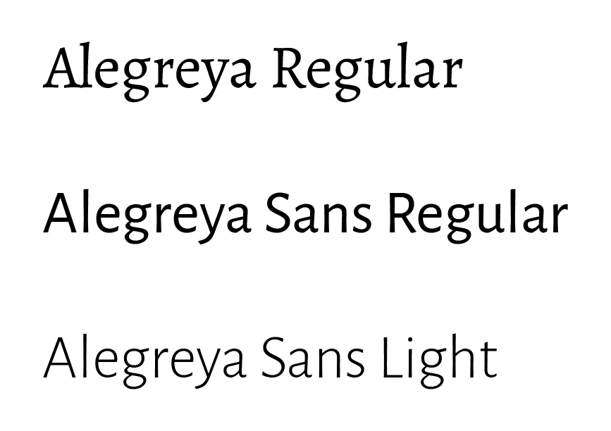
Typeface Selection
I chose to use the typeface family Alegreya as it has a traditional children’s book feel with the serif version and maintains very similar letterforms in the sans serif version. This allows the transition between the two to be very subtle.