Books, Zines, and Things
1. How to Cat Lady
2. i miss you
Project requirements were to create at least two zines in an edition of 5+. This project allowed students to experiment with new processes, tools, and binding methods. The subject matter of the zines, number of pages, size/format, and paper choice was open to personal choice and exploration.
I chose to create two zines inspired by and for my family:
How to Cat Lady inspired by day-to-day life with my cat Sophie
i miss you dedicated to my sister Parker living abroad in South Korea.
I chose to create two zines inspired by and for my family:
How to Cat Lady inspired by day-to-day life with my cat Sophie
i miss you dedicated to my sister Parker living abroad in South Korea.
How to Cat Lady
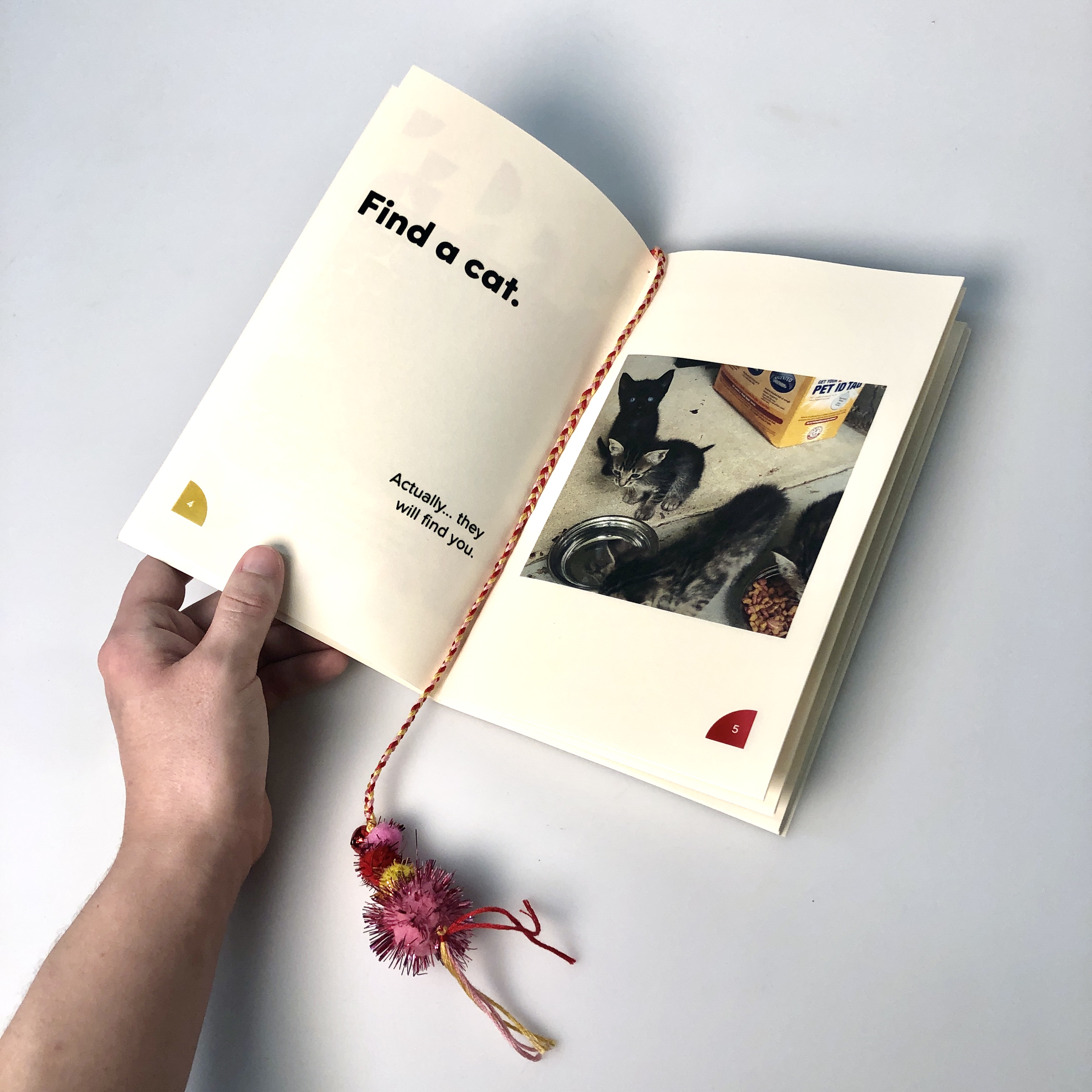
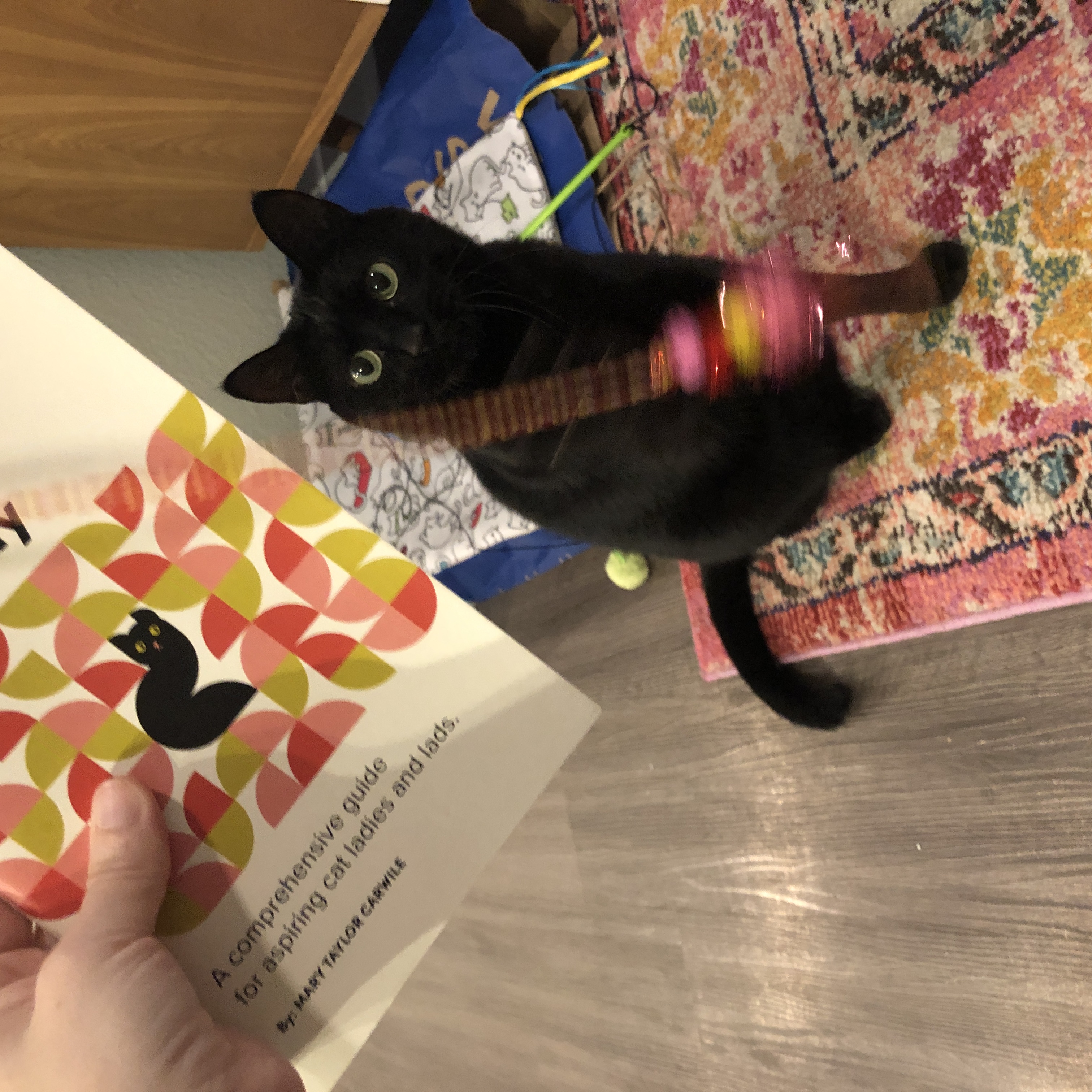
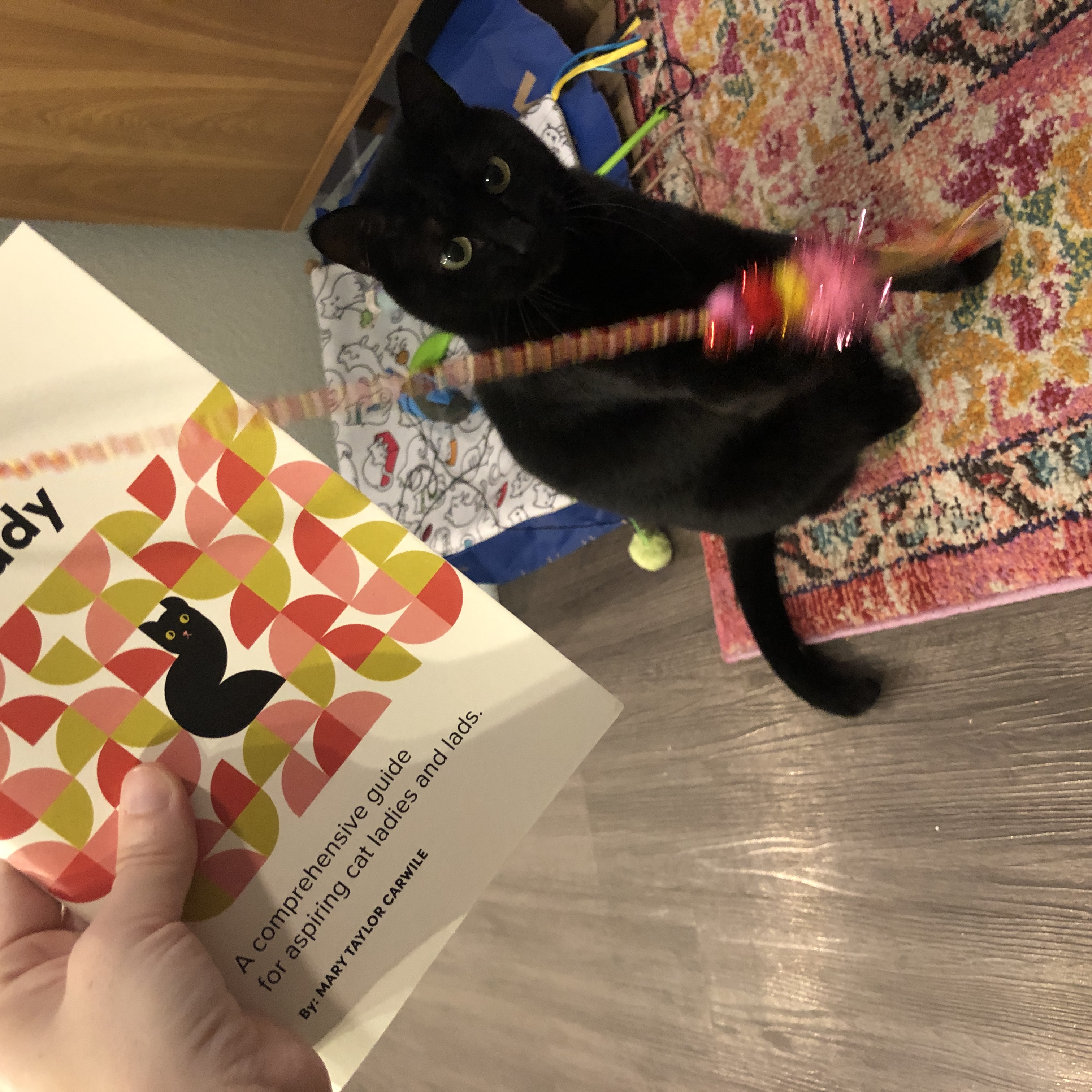
When creating the first zine for this project I chose to design something I had a lot of experience in as well as existing content to pull from. I have literally thousands of pictures of my cat Sophie from the time she was a kitten to today, so I knew that creating a zine from my photography of her would give me so many options. After looking through all of my photos, I curated a collection of images of her that reflect her personality and paired the photos with simple phrases or tips for aspiring cat ladies and lads. The zine is 48 pages long (including the decorative first and last pages) and offers 22 unique cat lady tips. The zine also serves as a personal keepsake memento for me as well.


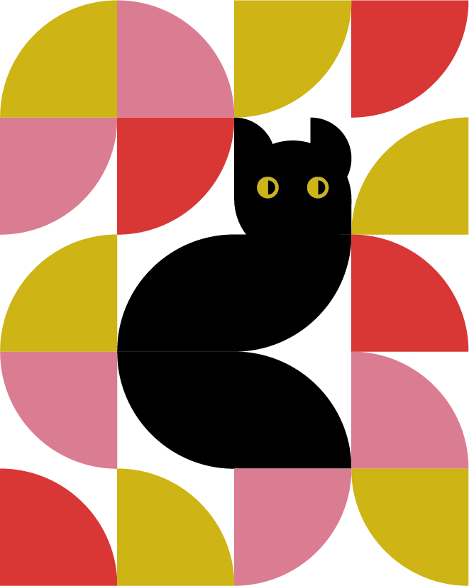
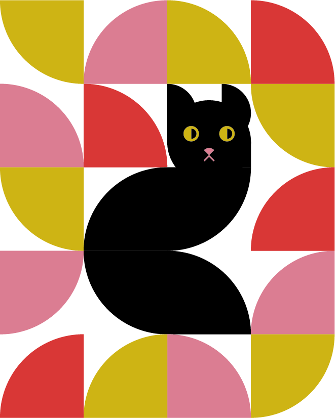
Geometric shapes create the cat figure and provide a container for page numbers within the zine.
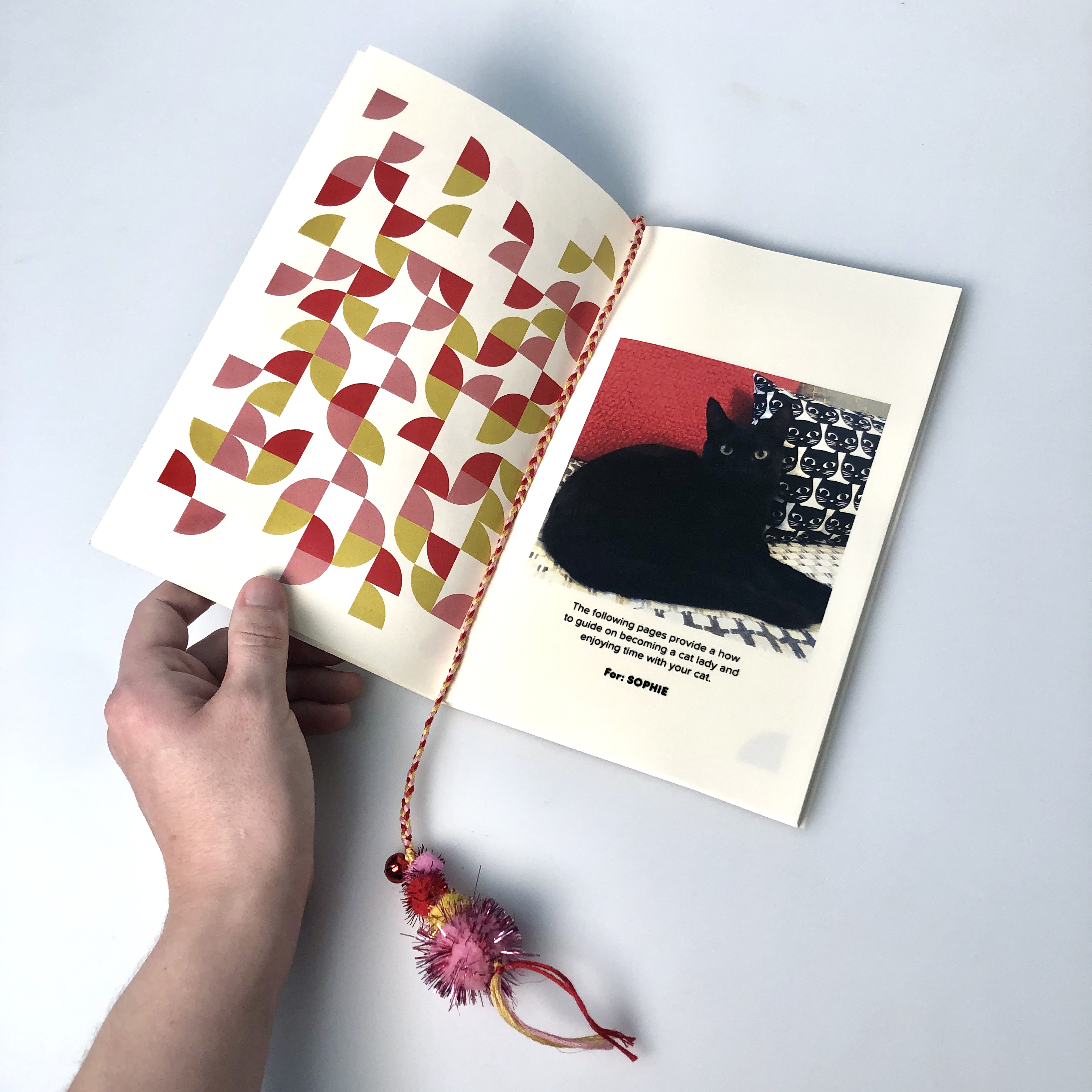

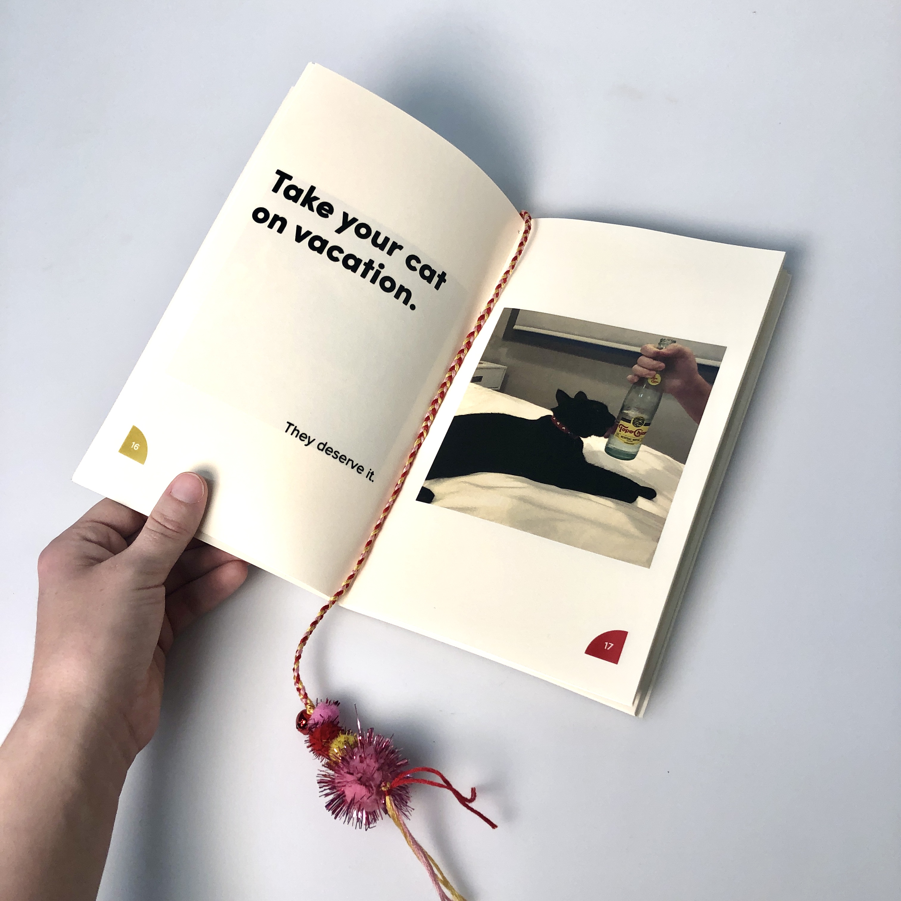

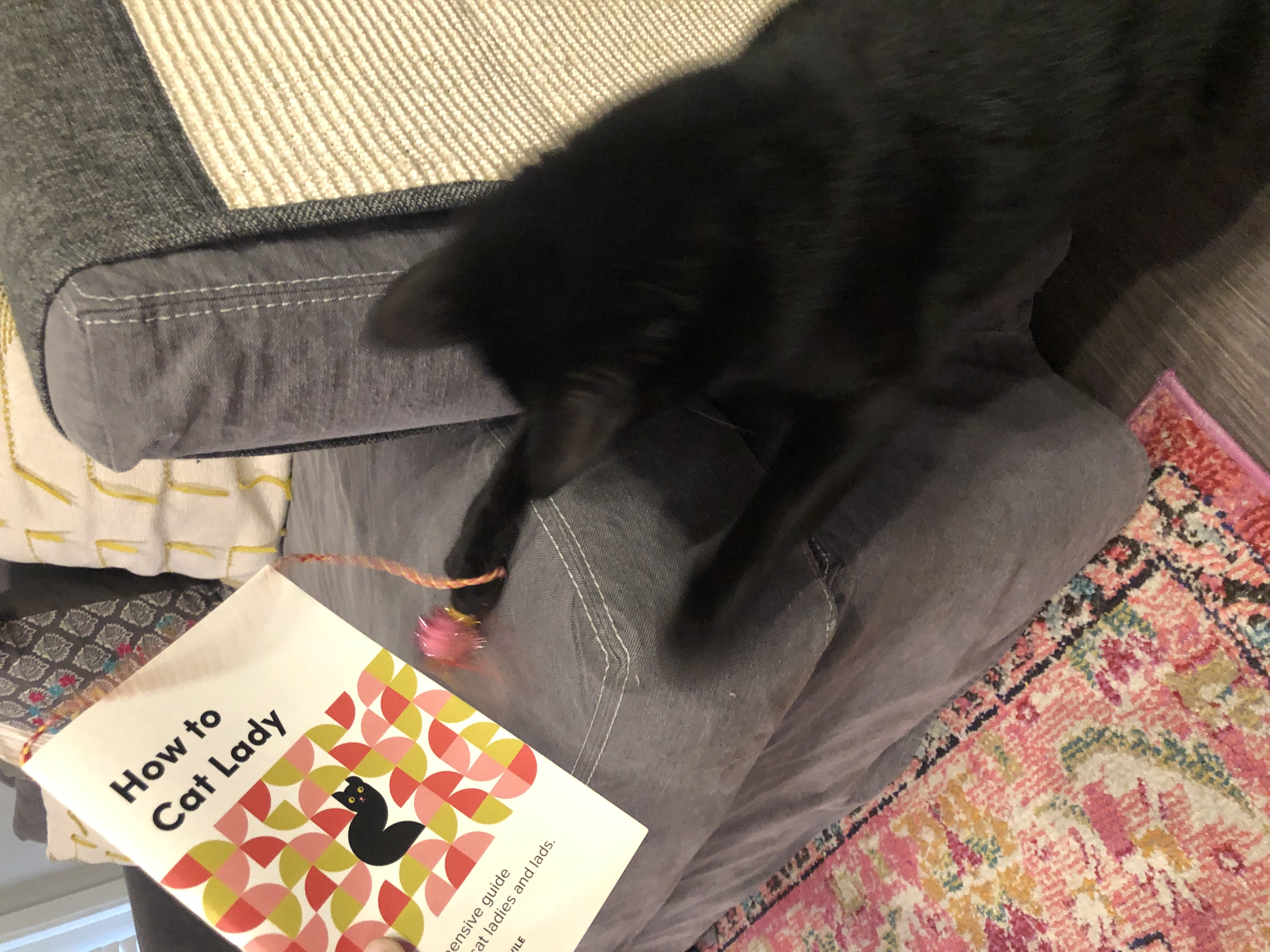
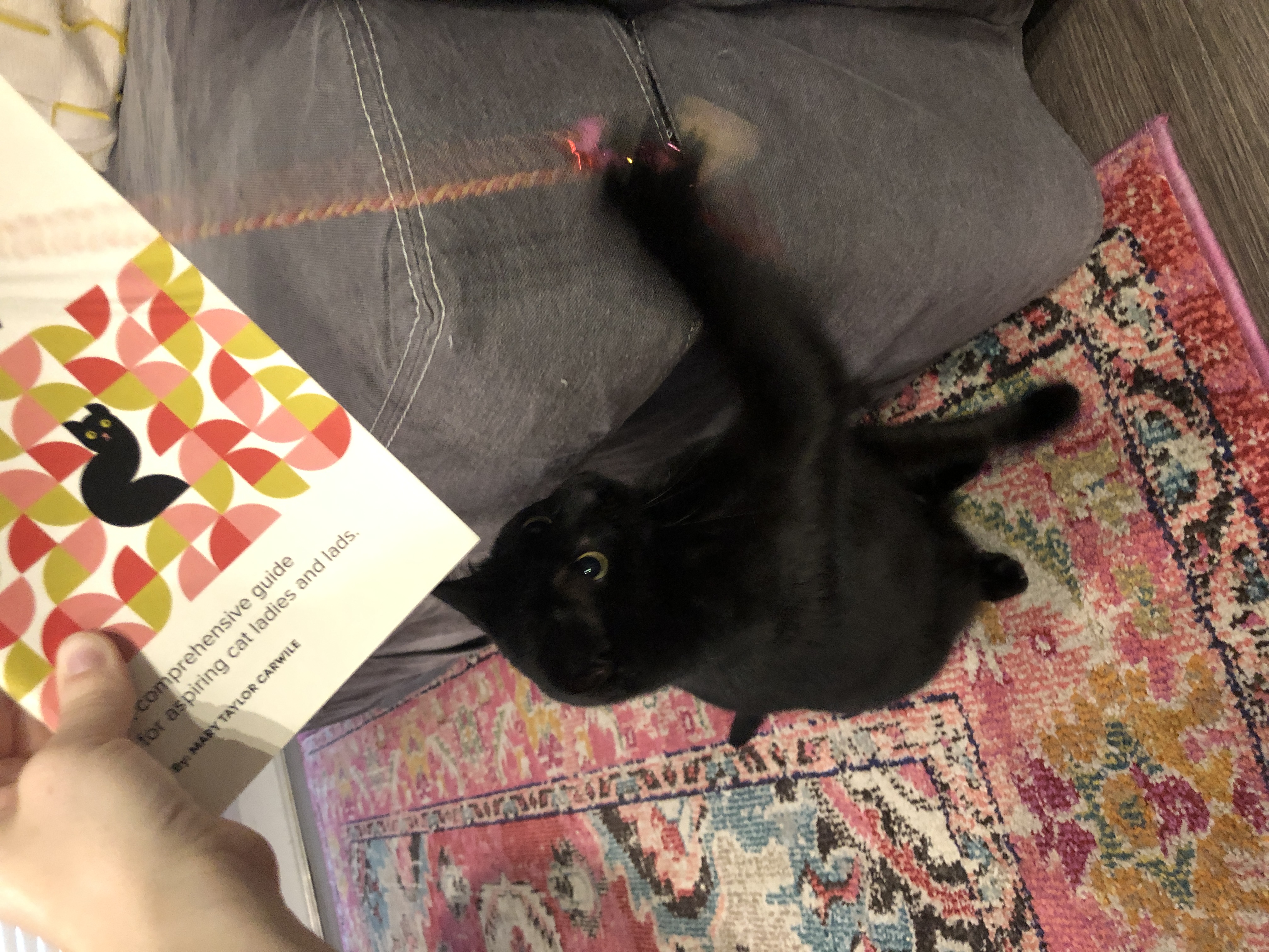
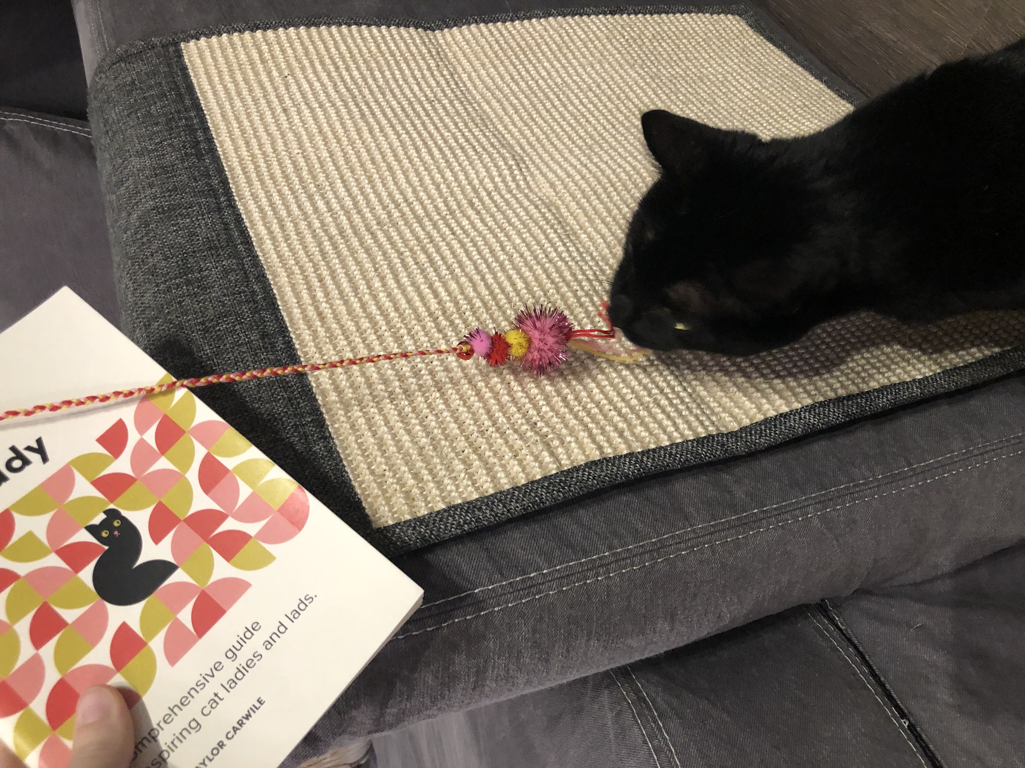
A custom page marker doubles as an interactive cat toy
Center of Attention
As I was working on the zine, I continually noticed that my cat (the focal point of every photo) stood out very strongly when surrounded by color as she is an all-black cat. This directly inspired the cover composition as well as the typeface selection. The color selection of the shapes ties in closely to the majority of the accent colors seen in the photographs and complements Sophie’s yellow-green eyes.
As I was working on the zine, I continually noticed that my cat (the focal point of every photo) stood out very strongly when surrounded by color as she is an all-black cat. This directly inspired the cover composition as well as the typeface selection. The color selection of the shapes ties in closely to the majority of the accent colors seen in the photographs and complements Sophie’s yellow-green eyes.
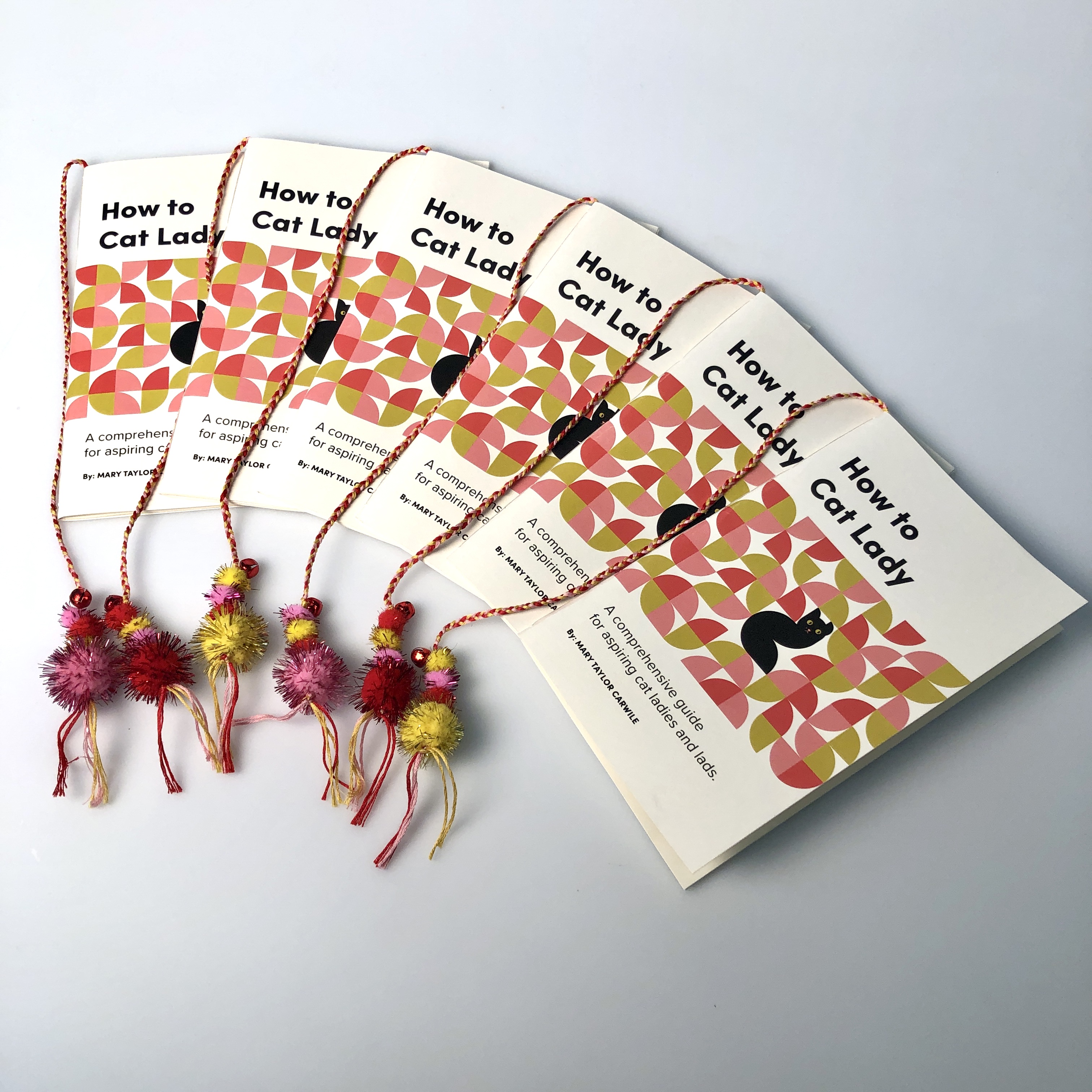

A total of 6 editions were created (5 for class and 1 for Sophie).
Sofia Pro Black
A bold geometric typeface plays off of the clean geometry of the cover shapes and accents the black cat color. (It also didn’t hurt that the typeface name is very close to my cat’s name: Sophie).
Proxima Nova Regular
A companion typeface pairing that utilizes geometric foundations while providing slight variations in stroke width for a more humanistic quality (the lady to the cat if you will).


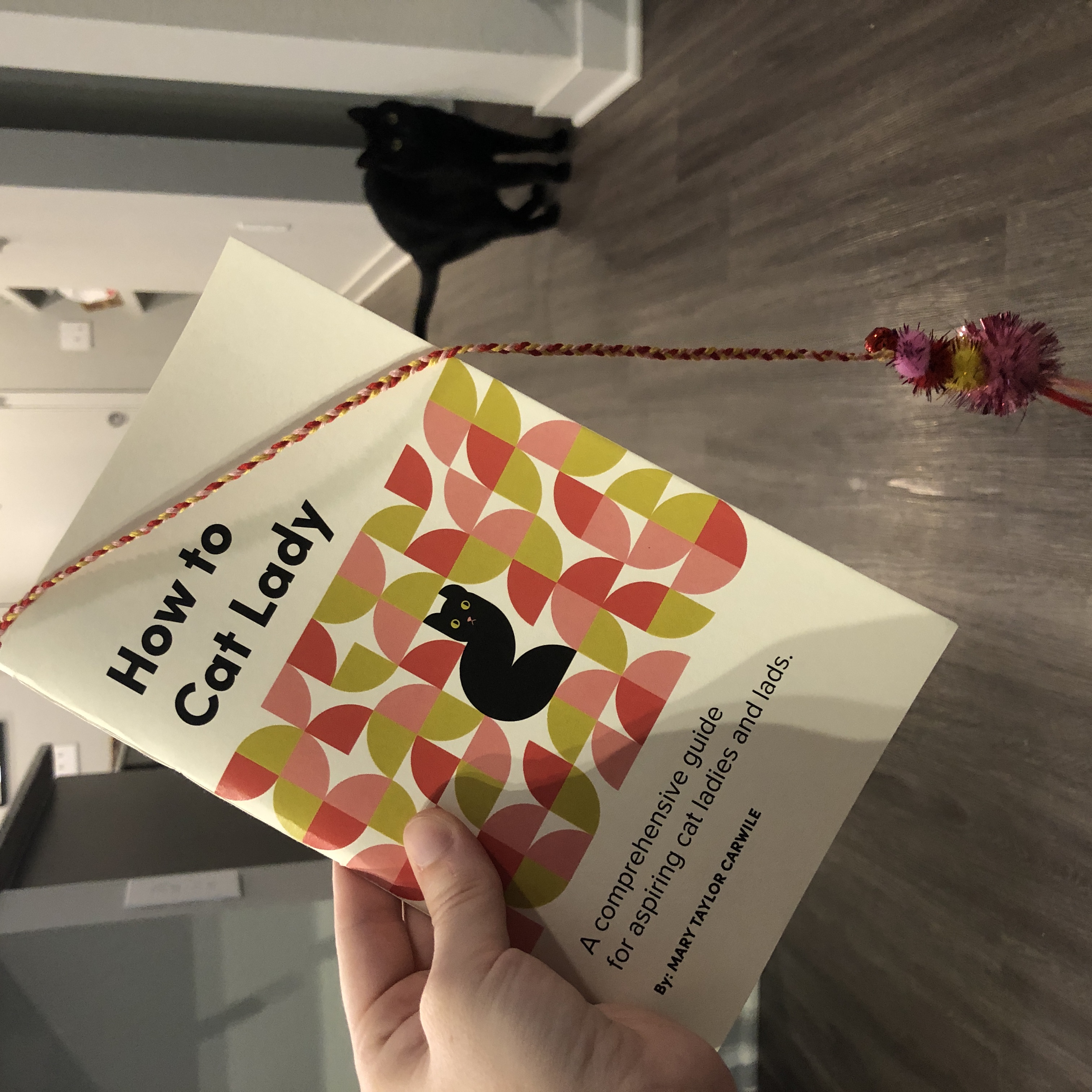
The zines are cat tested and approved.
Cat Lady to the Core
A very important part of my process was ensuring this zine could be used as functional cat toy. I selected the craft balls, embroidery thread, and the jingle bells with the zine color scheme in mind, but also with my cat’s toy preferences in mind. One of her favorite toy types is craft balls, so I knew that she would immediately be drawn to the page marker if I incorporated this element. She loved the page markers so much that I had to construct all of them in a separate location as she was “helping” a bit too much. Now Sophie has her very own zine to enjoy in her own way.
A very important part of my process was ensuring this zine could be used as functional cat toy. I selected the craft balls, embroidery thread, and the jingle bells with the zine color scheme in mind, but also with my cat’s toy preferences in mind. One of her favorite toy types is craft balls, so I knew that she would immediately be drawn to the page marker if I incorporated this element. She loved the page markers so much that I had to construct all of them in a separate location as she was “helping” a bit too much. Now Sophie has her very own zine to enjoy in her own way.
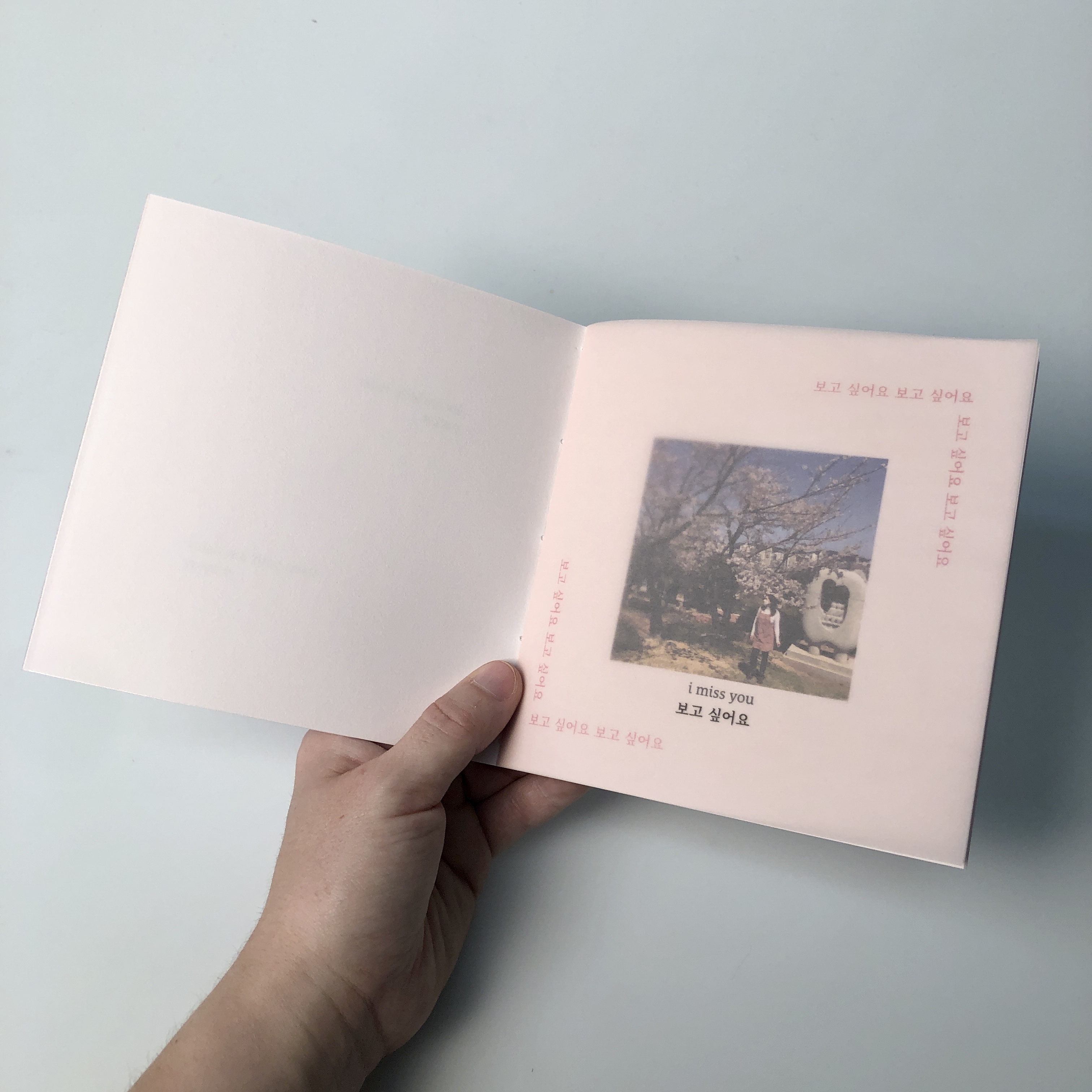
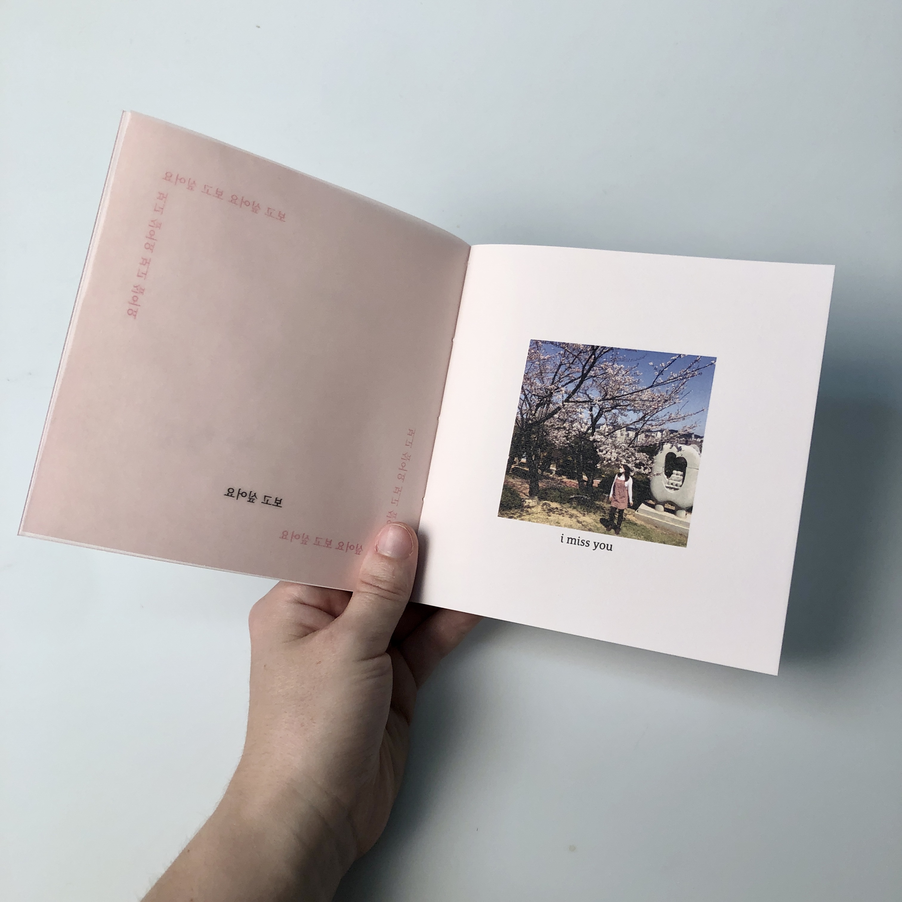
i miss you
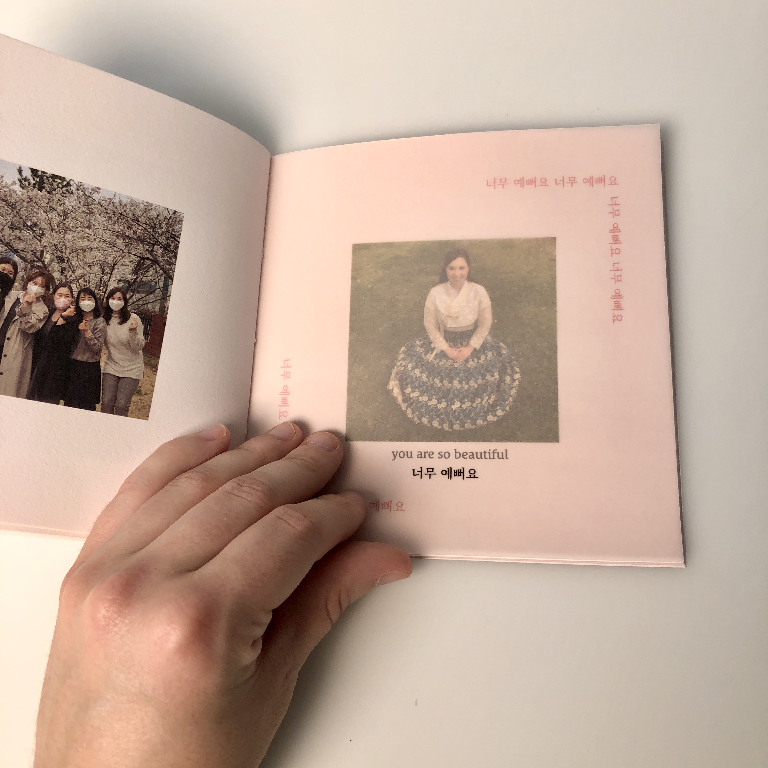
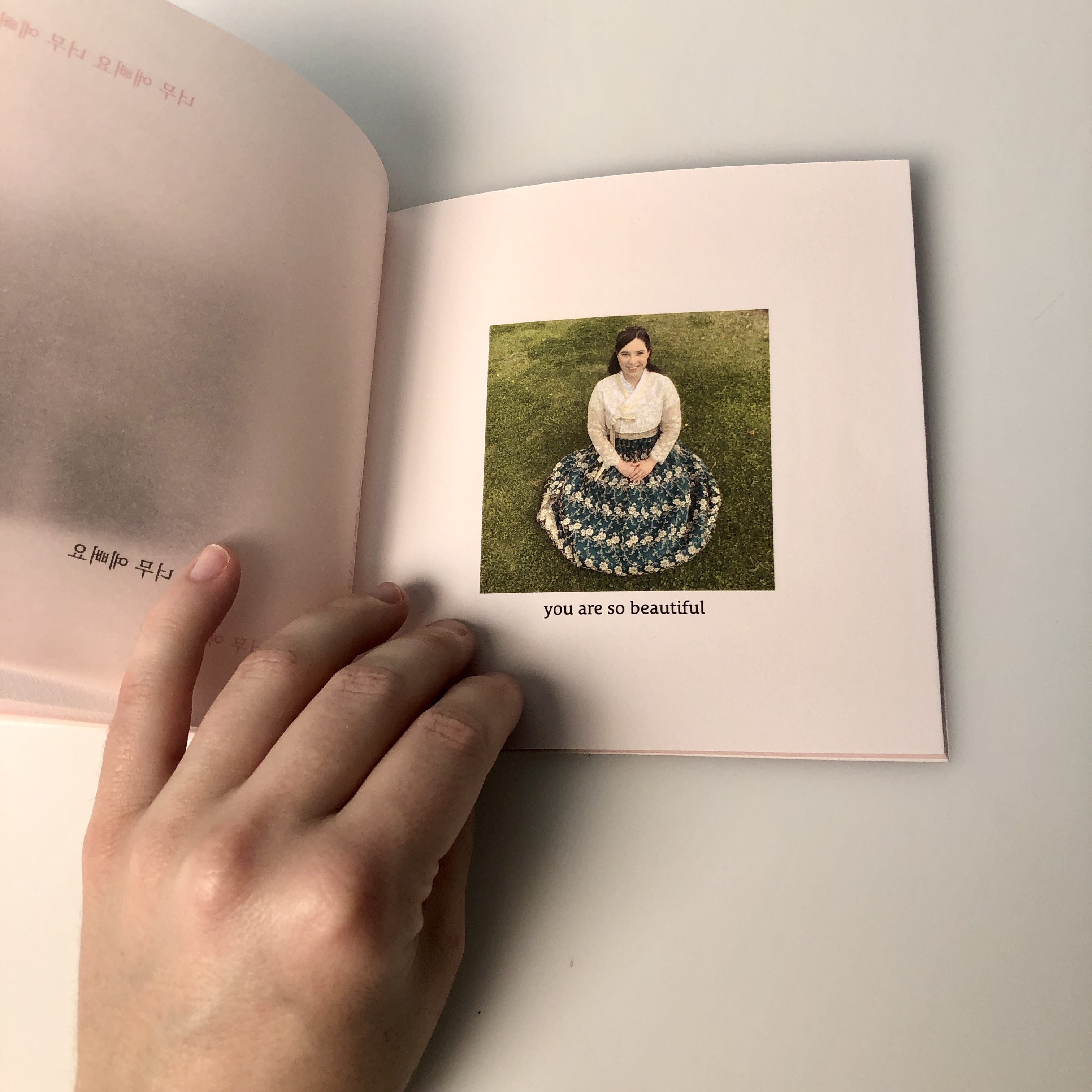
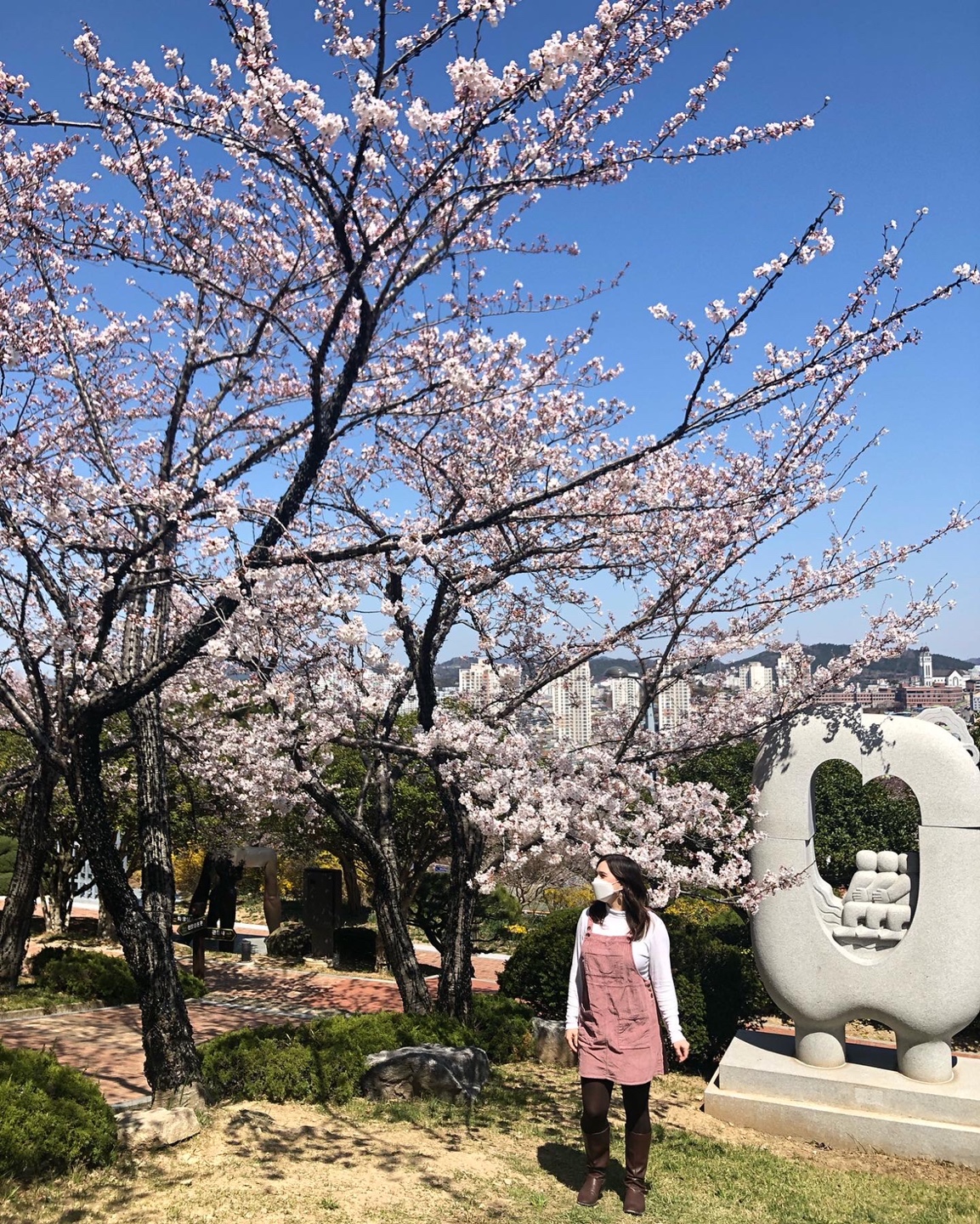
When creating the second zine for this project I chose to design something that I could send to my sister Parker who is currently living abroad in South Korea. This is the first time in several years that we have lived apart from each other, so I knew I wanted to create a special keepsake for her that she could view and display on one of her shelves. I pulled together some of her favorite photos that she has taken of herself and her friends in South Korea and paired the imagery with simple and meaningful phrases written in both English and Korean. My sister is currently learning the Korean language, so all of these phrases are something that she can read, understand, and enjoy. I have a feeling that she will be quite amused at some of the phrases that I selected, as I have very limited knowledge of the language.


Photography: Parker Carwile
벚꽃Cherry Blossom


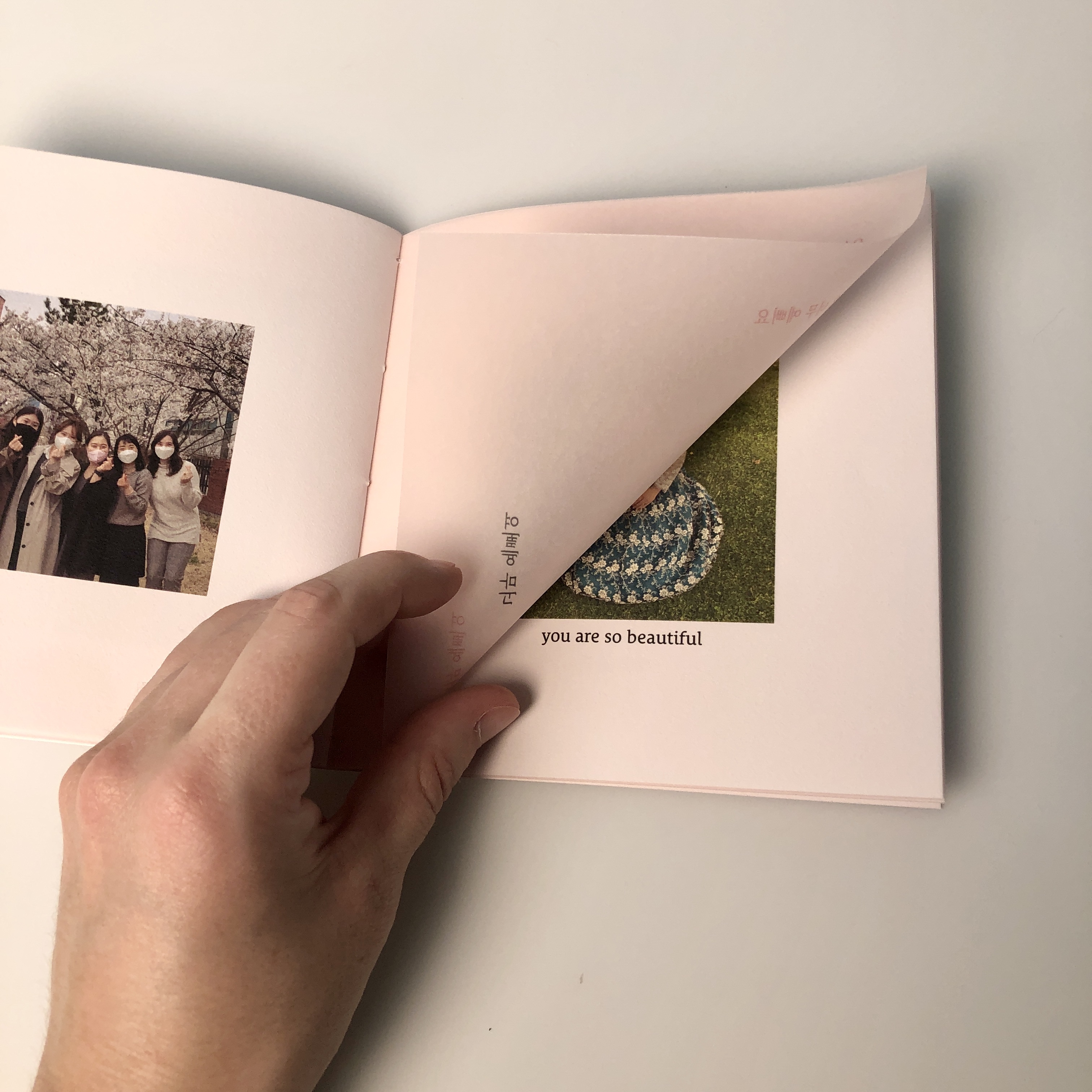

Pink velum sheets overlay the rose-tinted paper to create a unique and ephemeral experience.
Experience in Materiality
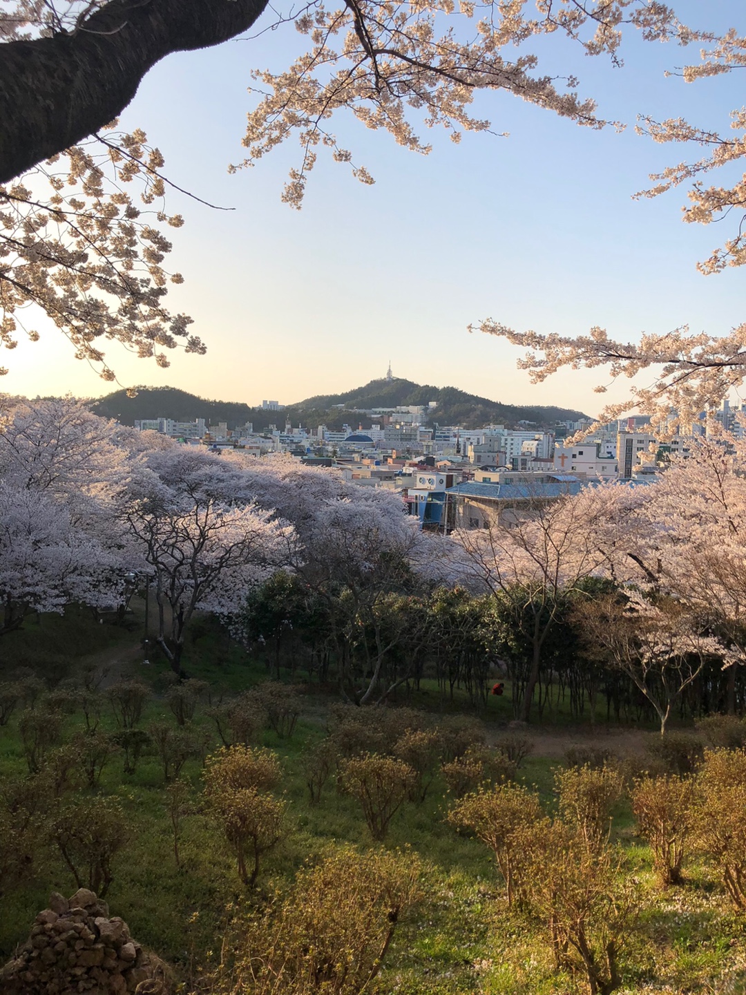
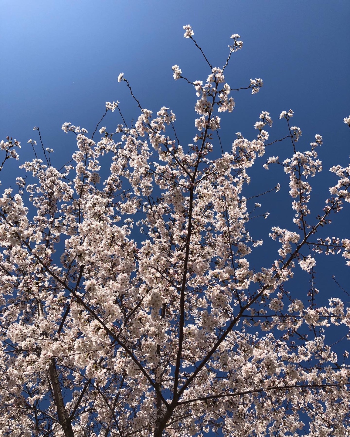
One of my sister’s favorite experiences so far in South Korea was enjoying cherry blossom season. She recently took several beautiful photos during this season that I knew I wanted to showcase within the zine and pull inspiration from.
The materiality of the pages directly relates to the beauty and fleeting quality of cherry blossoms. Velum sheets fade gently away as the pages are turned and represent the delicate nature of falling cherry blossom petals. The rose-tinted paper represents the idealized experience of the season (almost as if seeing the entire world in rose-colored glasses). The two sheet types work together to create a layered tone-on-tone experience: quite similar to individual petals culminating together into a single blossom.
 Photography: Parker Carwile
봄Spring
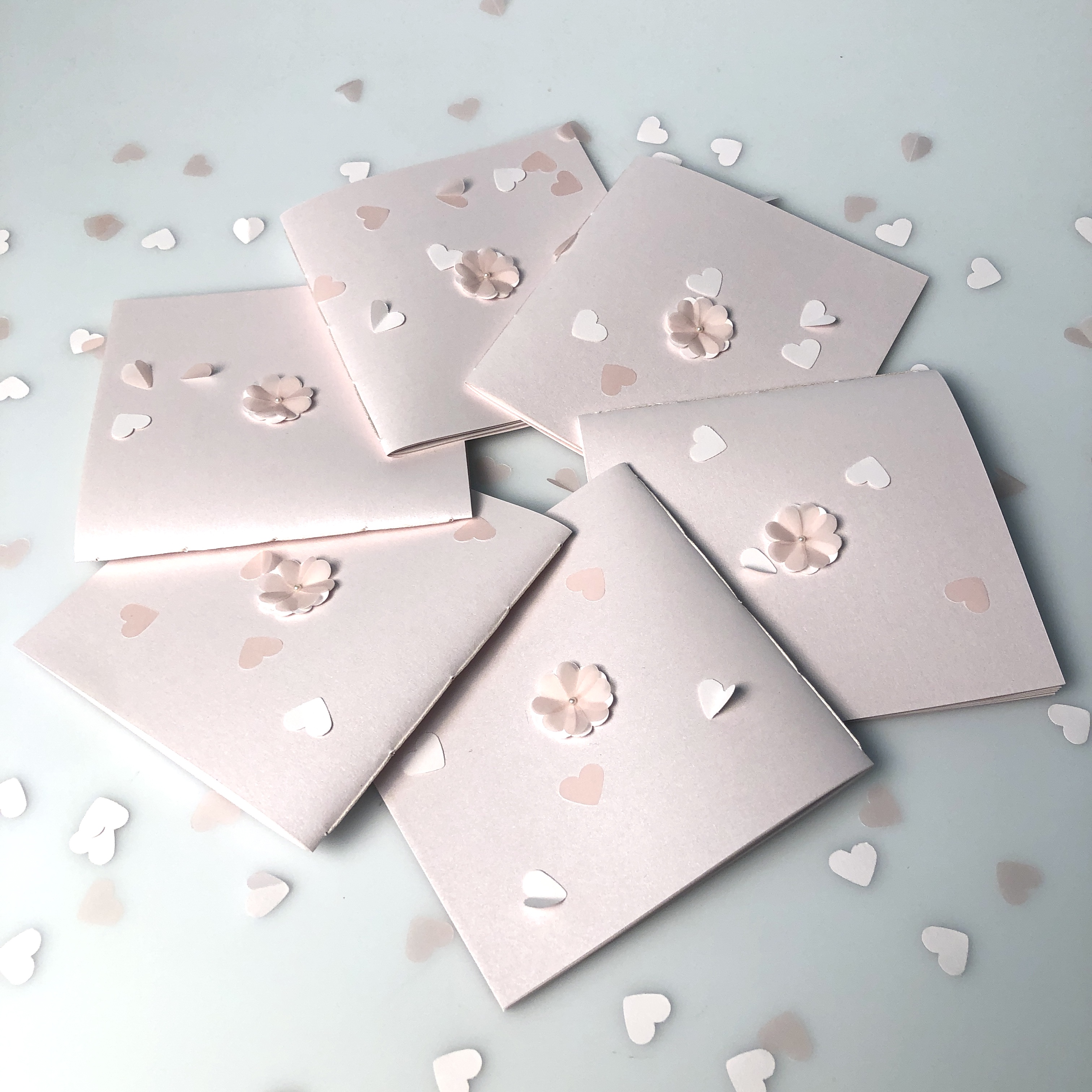
A total of 6 editions were created (5 for class and 1 for Parker).
Each cover features a single cherry blossom flower created with the paper types used at the inside pages of the zine. The cover paper is soft pink with a shimmering quality like a frosty spring morning.
Framed to Last
The zine page format, photography cropping, and corner typography placement all emphasize square geometry and framing. I thought of this in terms of evoking the feeling of taking a photograph or clicking a camera. These singular and special memories are captured in time and then preserved for a lifetime.
The zine page format, photography cropping, and corner typography placement all emphasize square geometry and framing. I thought of this in terms of evoking the feeling of taking a photograph or clicking a camera. These singular and special memories are captured in time and then preserved for a lifetime.
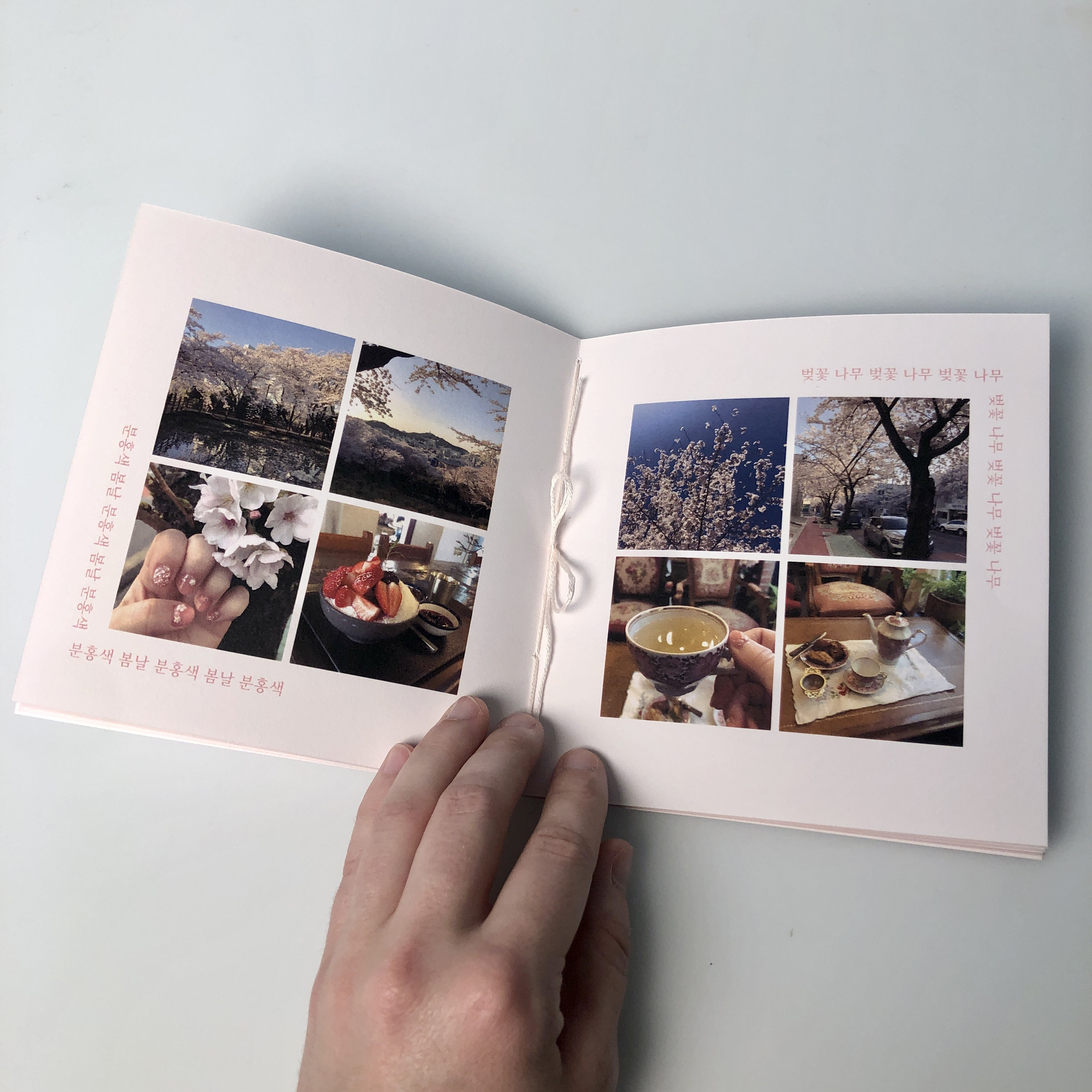 The central feature spread of the zine showcases my sister’s photographs of the cherry blossom trees as well as some seasonal activities she enjoyed relating to the cherry blossoms.
Noto Serif KR SemiBold
Although the typeface selection for the Korean Language on Adobe Fonts was a bit limited, there were a few options to choose from that included both serif and sans serif. I utilized the serif version as it had a more traditional quality that paired nicely with the long-celebrated tradition of enjoying cherry blossom season.
Le Monde Courrier Std Book
A companion typeface pairing that utilizes a soft serif similar to the serif seen in Noto Serif KR. All of the words and phrases in English within the zine are kept in lowercase lettering: this adds to the overall delicate and gentle nature of the zine.

 Photography: Parker Carwile
내 여동생My Little Sister
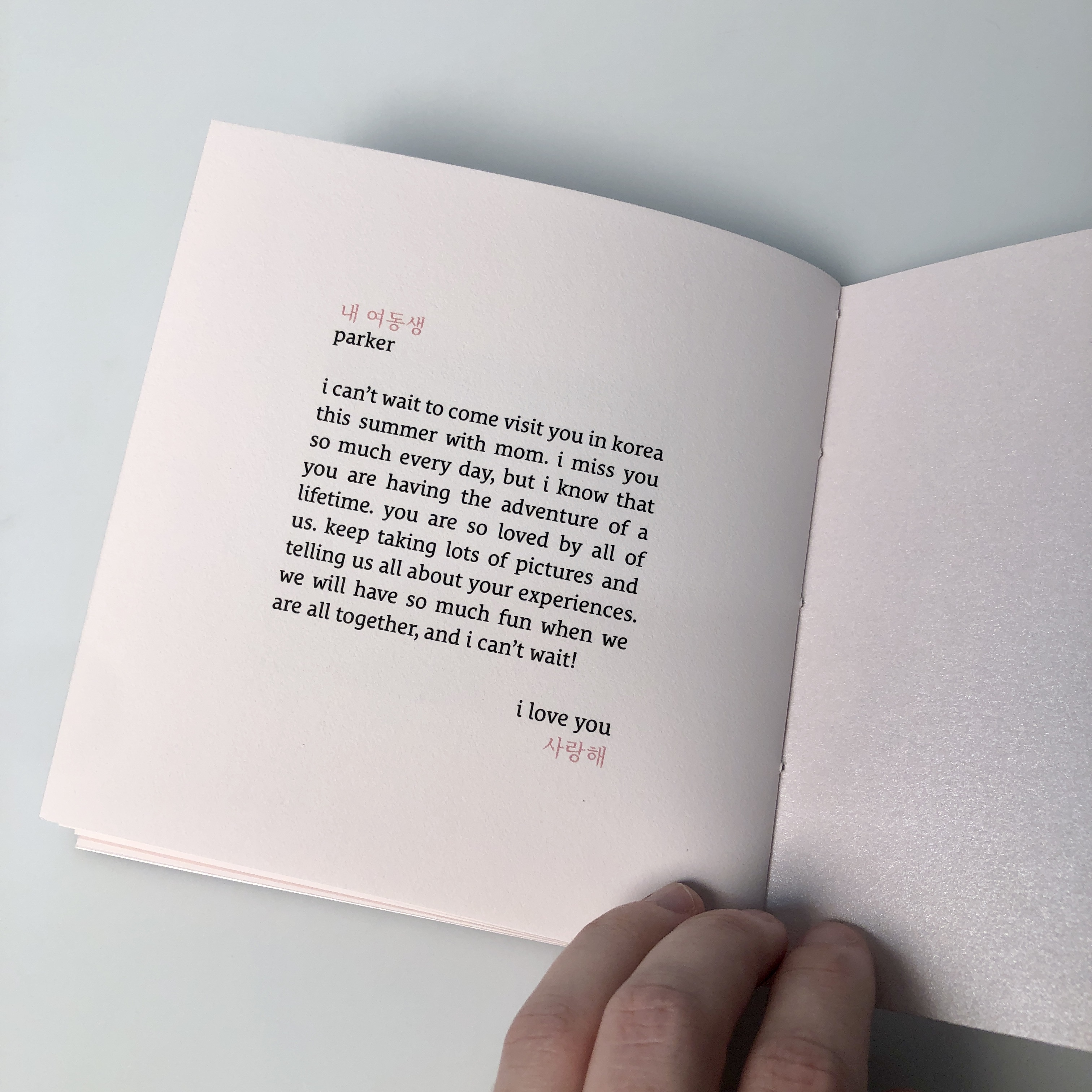 A small personal message completes the zine on the last page.