American Airlines Rebrand
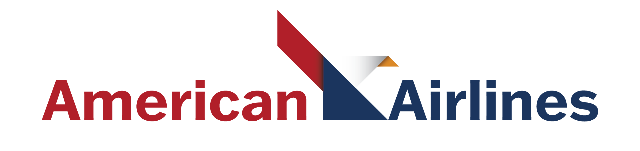
1. Final Mark
2. Mockups & Applications
Project goals were to redesign a recognizable brand with a firmly established identity system. I chose American Airlines as my brand of interest.
I focused on taking graphic cues from the current brand system as well as referencing the iconic Massimo Vignelli American Airlines logo from the 1960s. My goals were to create a new mark that could feel both modern and have a heritage type quality. The identity system is formed through geometric shapes that offer opportunities for adaptable pattern configurations and color play.
I focused on taking graphic cues from the current brand system as well as referencing the iconic Massimo Vignelli American Airlines logo from the 1960s. My goals were to create a new mark that could feel both modern and have a heritage type quality. The identity system is formed through geometric shapes that offer opportunities for adaptable pattern configurations and color play.
Final Mark
Mockups & Applications

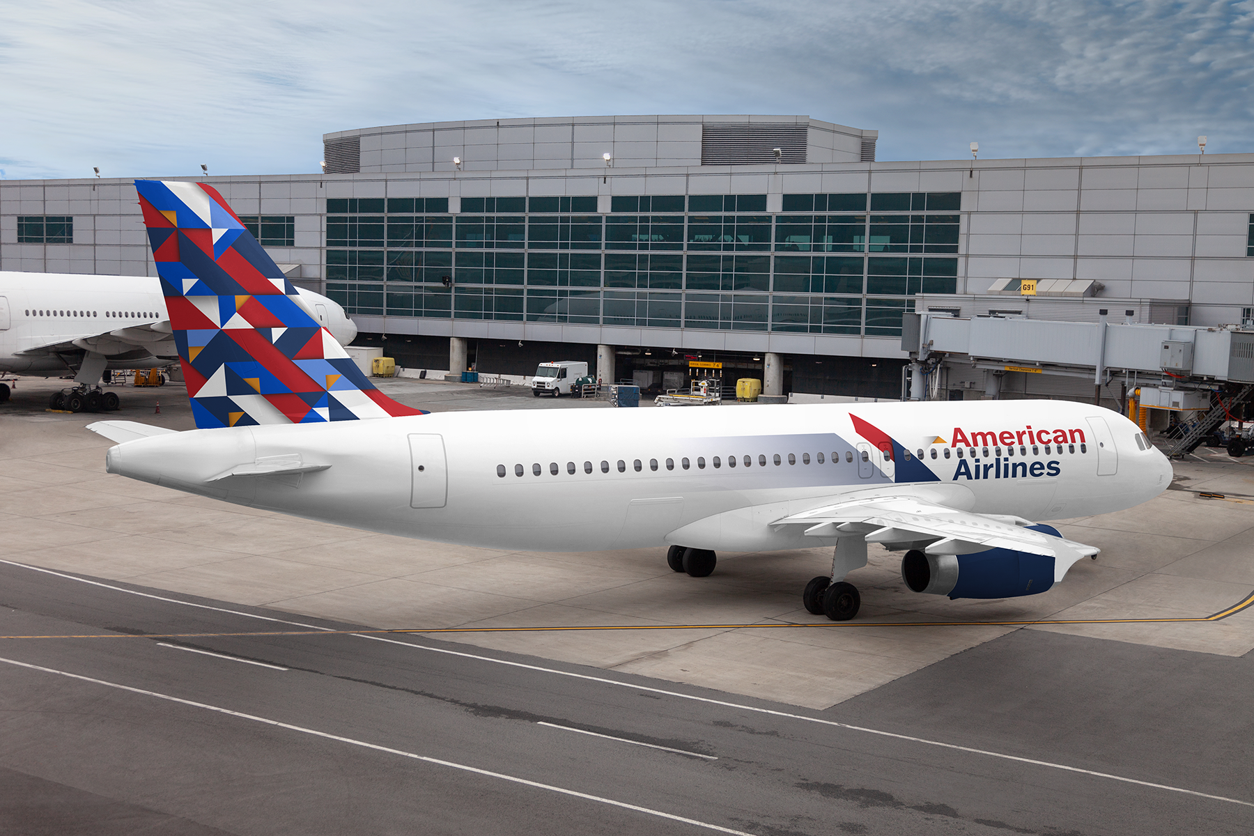 Airplane Design
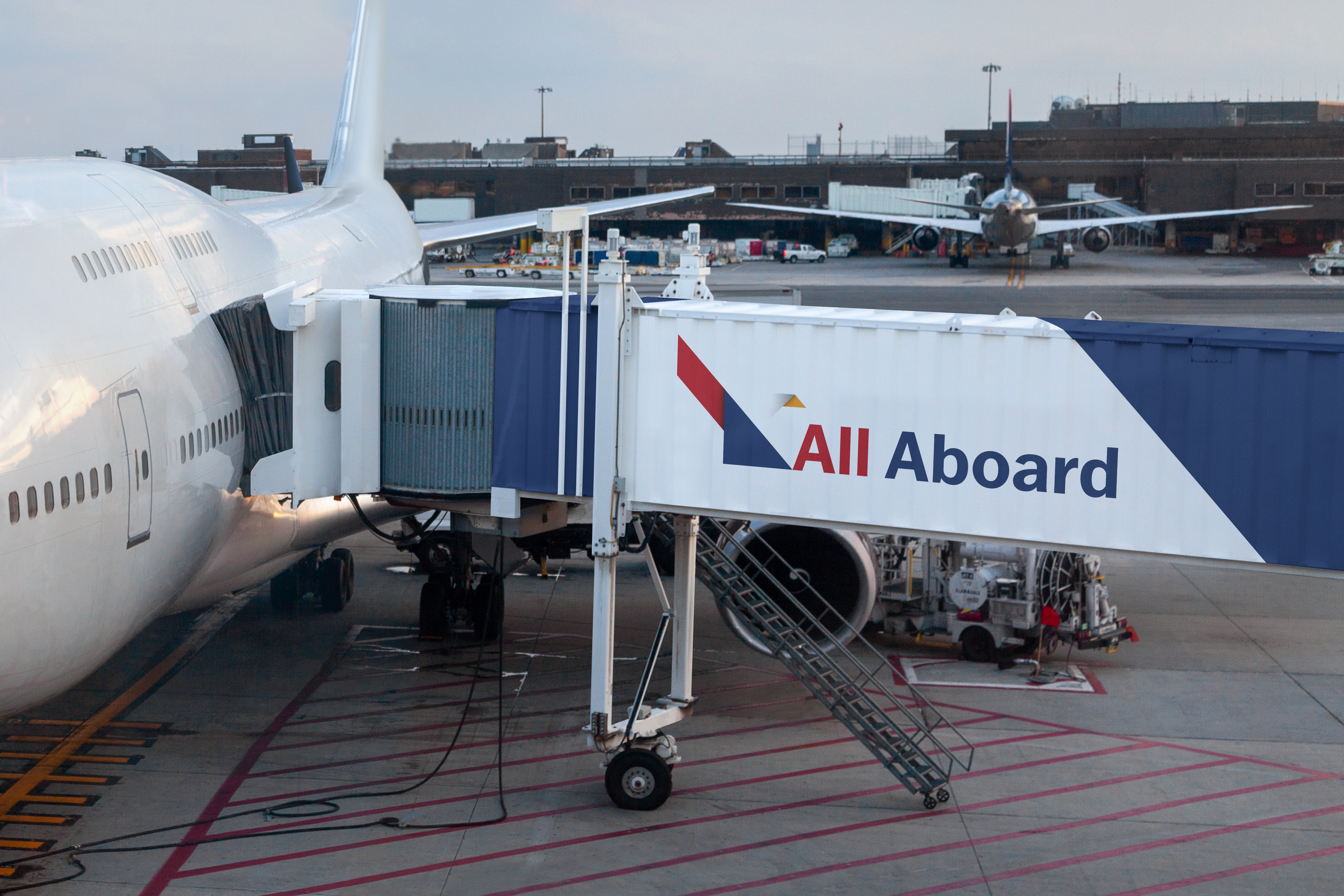 Jet Brigde Design
Crew Apparel Patterns

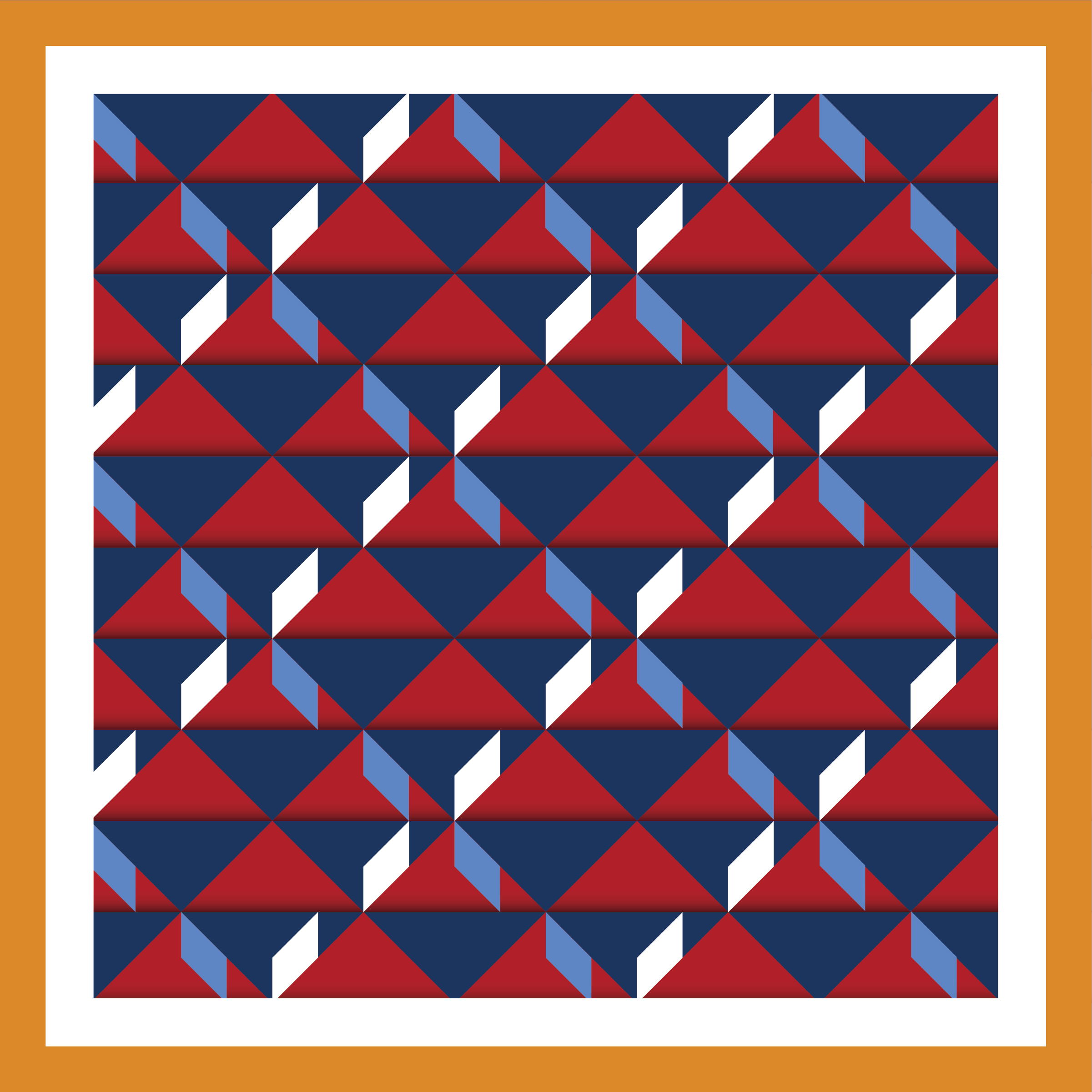 Pattern 01
 Pattern 02
 Pattern 03
Environmental Graphics
 Welcome Home
Large-Scale Graphic for Airport Terminals
The phrase All American takes on multiple meanings:
Promotes brand identity and brand name recall (AA).
Traditional meaning of the phrase describes positive and ideal qualities of the United States of America.
Inviting to all people through the use of language paired with illustrative style. Multiple languages are used as a typographic textural element. State borders begin to fold and overlap with others and the use of color breaks up political divides.
The environmental graphic is both patriotic and inviting to all people within the showcased context.
 Admirals Club Entry Wall
The Admirals Club utilizes increased amounts of yellow-gold to create a distinct sub-brand within the overall American Airlines identity system.