3 Alphabets
1. Found Object
2. System
3. New Helvetica Neue
Project goals were to make a set of three unique alphabets following three different sets of parameters outlined in the descriptions below.
01. Found Object
Create an alphabet (A–Z or a–z) from found objects, shapes or forms.
02. System
Create an alphabet (A–Z or a–z) using a system, via a limited set of parameters, shapes, and forms that are repeated to complete the alphabet.
03. New Helvetica Neue
Starting with Helvetica or Helvetica Neue, create a new “weight” of the typeface that is not simply a bold or italic, extended or condensed. Create at least one version of each letter in the alphabet, but it doesn’t have to necessarily be all caps or all lowercase. You must use both analog (x-acto, pen, tape, etc.) and digital (laptop, camera, phone, software, etc.) tools in some way.
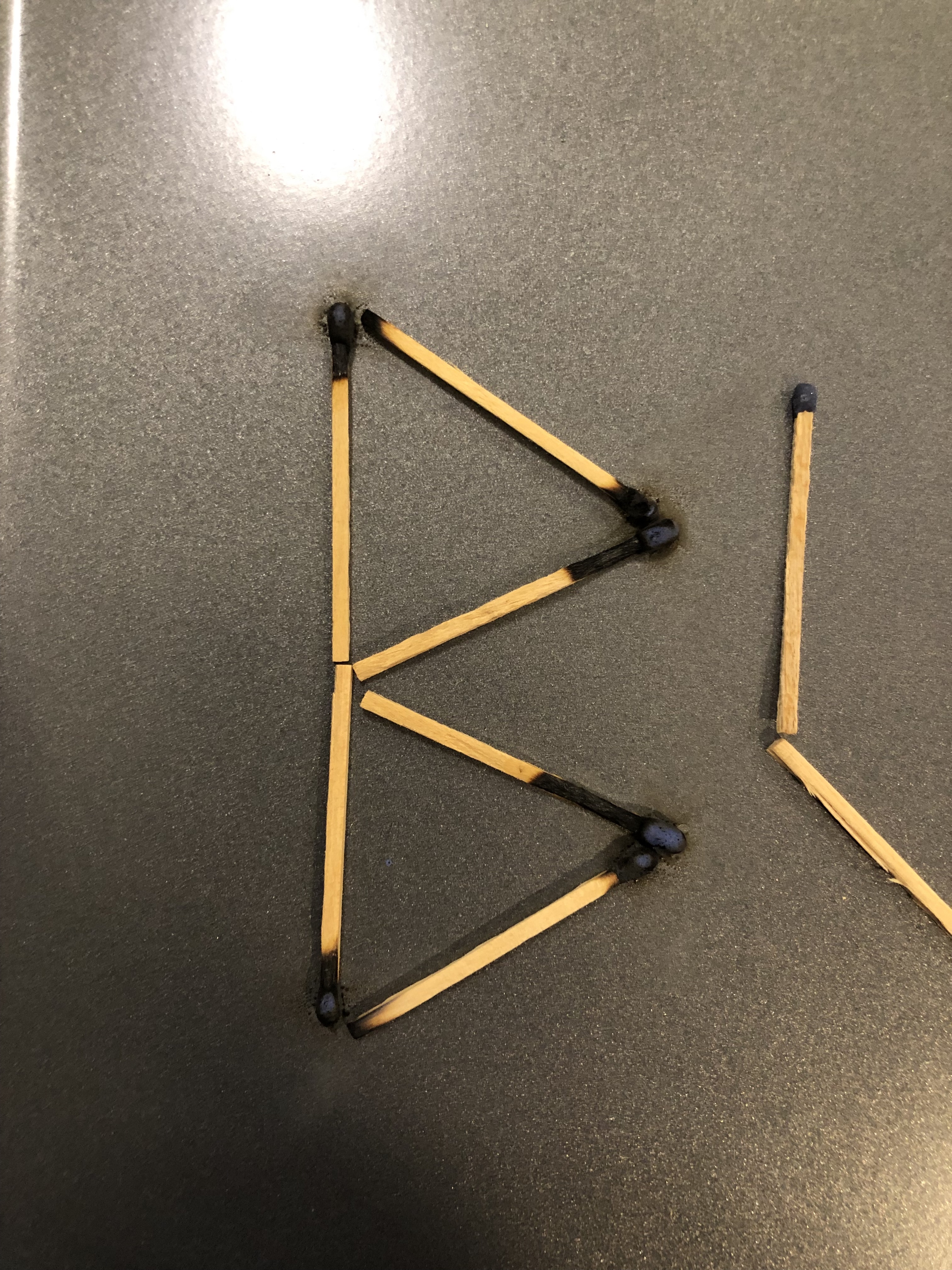
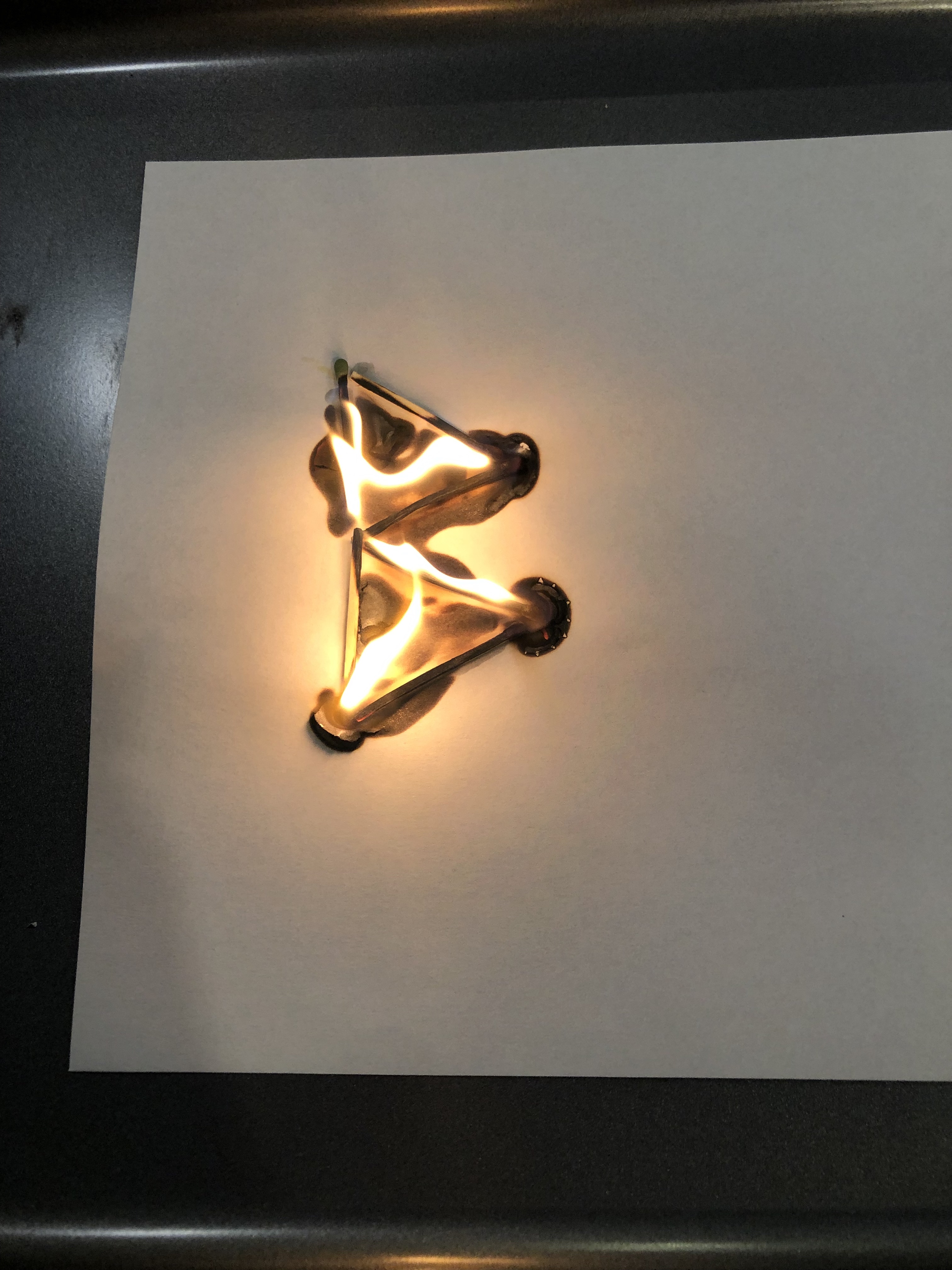
Found Object
Papa’s Alphabet
An alphabet set created with found objects from my grandfather’s shop.
![]()
![]()
![]()
![]()
An alphabet set created with found objects from my grandfather’s shop.

Papa’s Shop: Spring 2022
When I began working on the Found Object alphabet, I initially started by looking for letterforms in everyday objects around my apartment and my belongings. I have been in a major organization / purging phase with my space, so I was having a bit of trouble coming together with the full alphabet. The objects also felt incredibly random, and I didn’t have any fondness for some of the objects. After feeling a bit disappointed with my prospects, I thought about what objects could be incredibly interesting to me and could come together to create a cohesive set— and I envisioned by grandfather’s shop. I spent an entire afternoon in Papa’s Shop looking for letterforms and created a personal and unique typeface: Papa’s Alphabet.
 Each of the letterforms utilizes small scale halftones to provide object detail, contrast, and texture.

The poster design is inspired from how my grandfather stores and displays many of his tools by using a large pegboard wall. Although not every letterform shape is derived from a tool, this makes the typeface all the more authentic to the overall atmosphere of his shop. Papa’s Shop has everything— tools, toys, knives, a rocking chair, a large shop sink, a motorcycle in need of repair, and thousands of popsicle sticks.
24" x 36" Poster
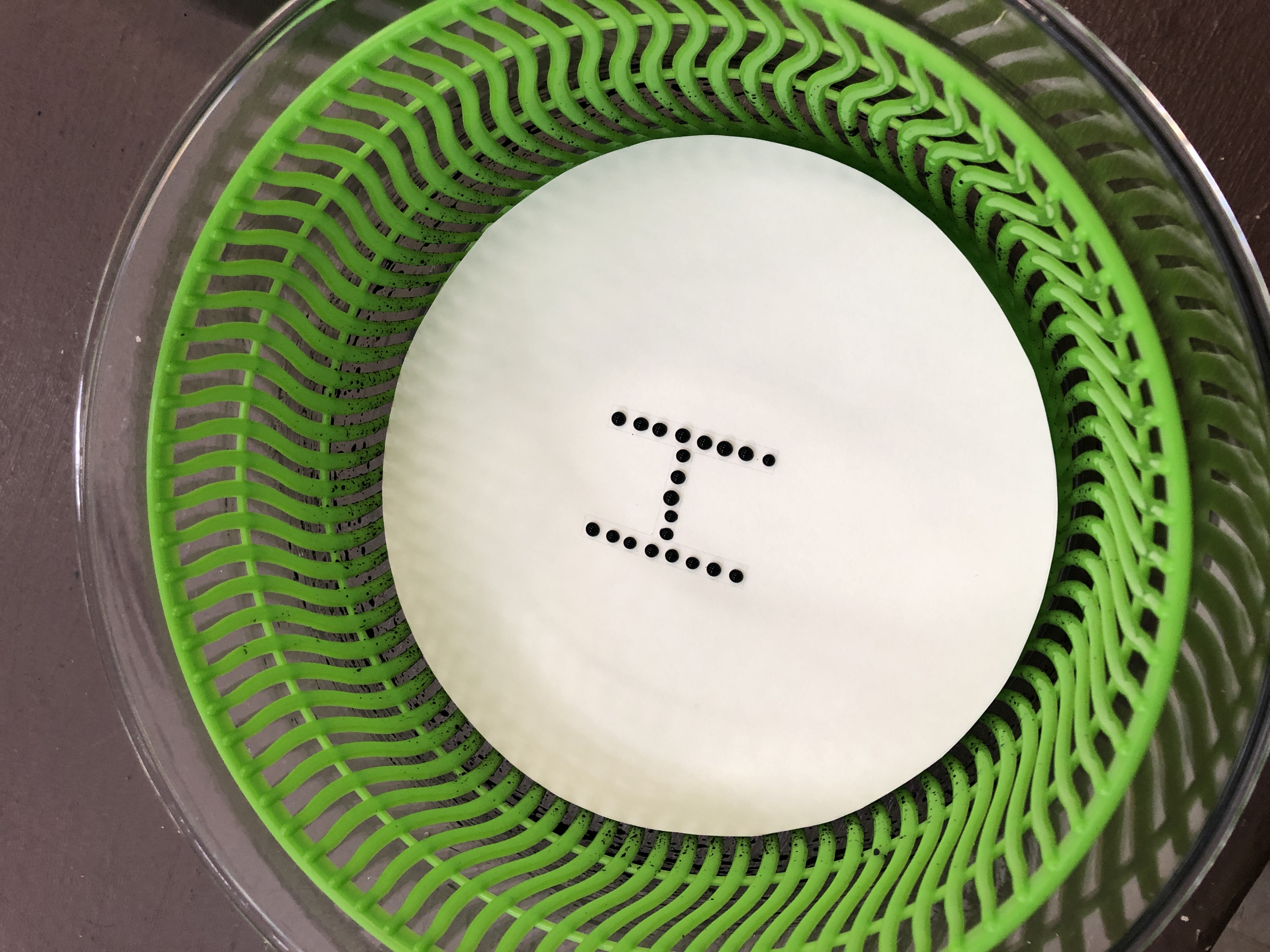
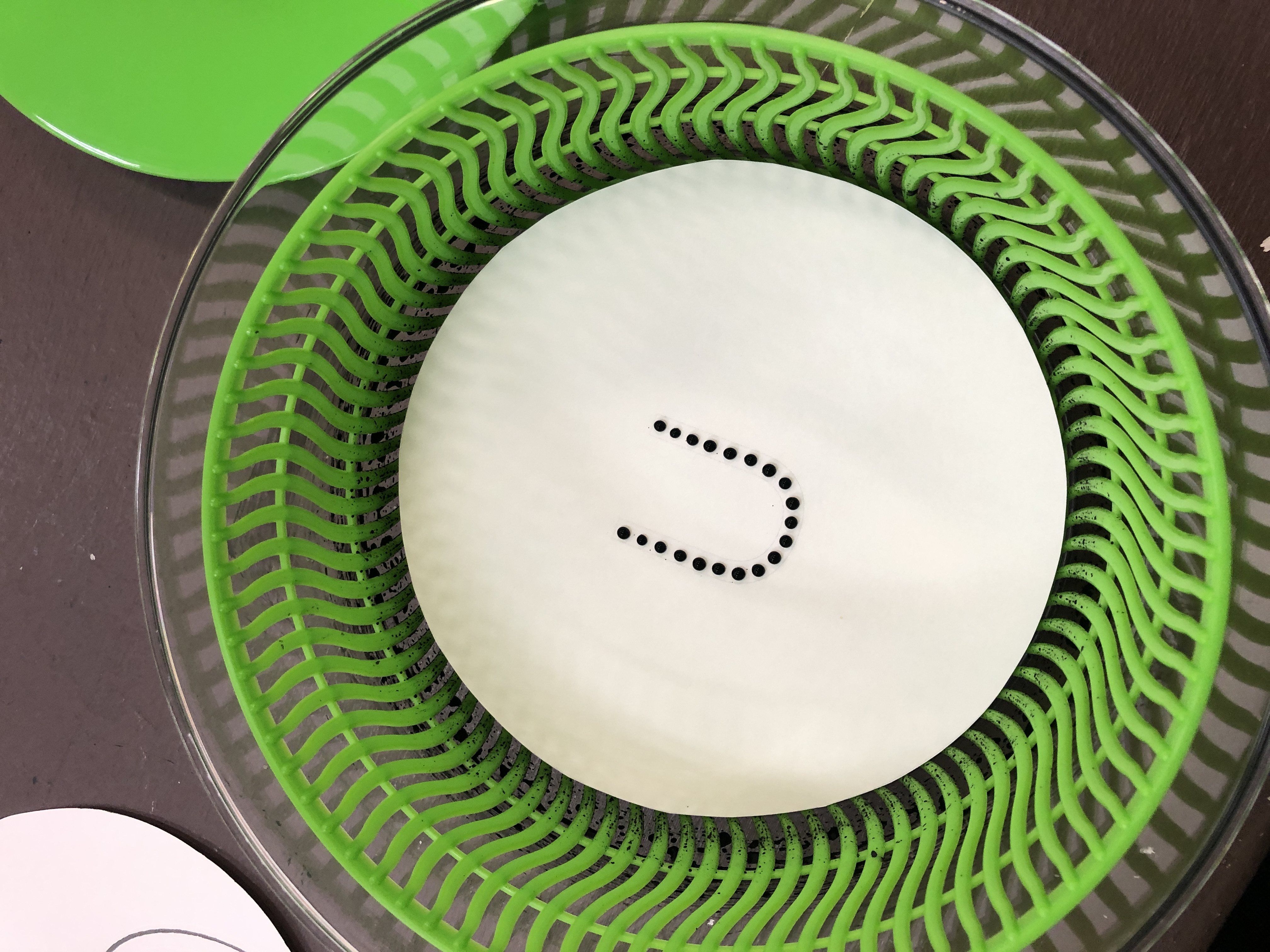
System
Forgot the Coaster
An alphabet set created with watercolor paint and a shot glass to replicate water rings left on surfaces when coasters are not used.


In Class Photography: Jake Dugard
@explorationsindesign
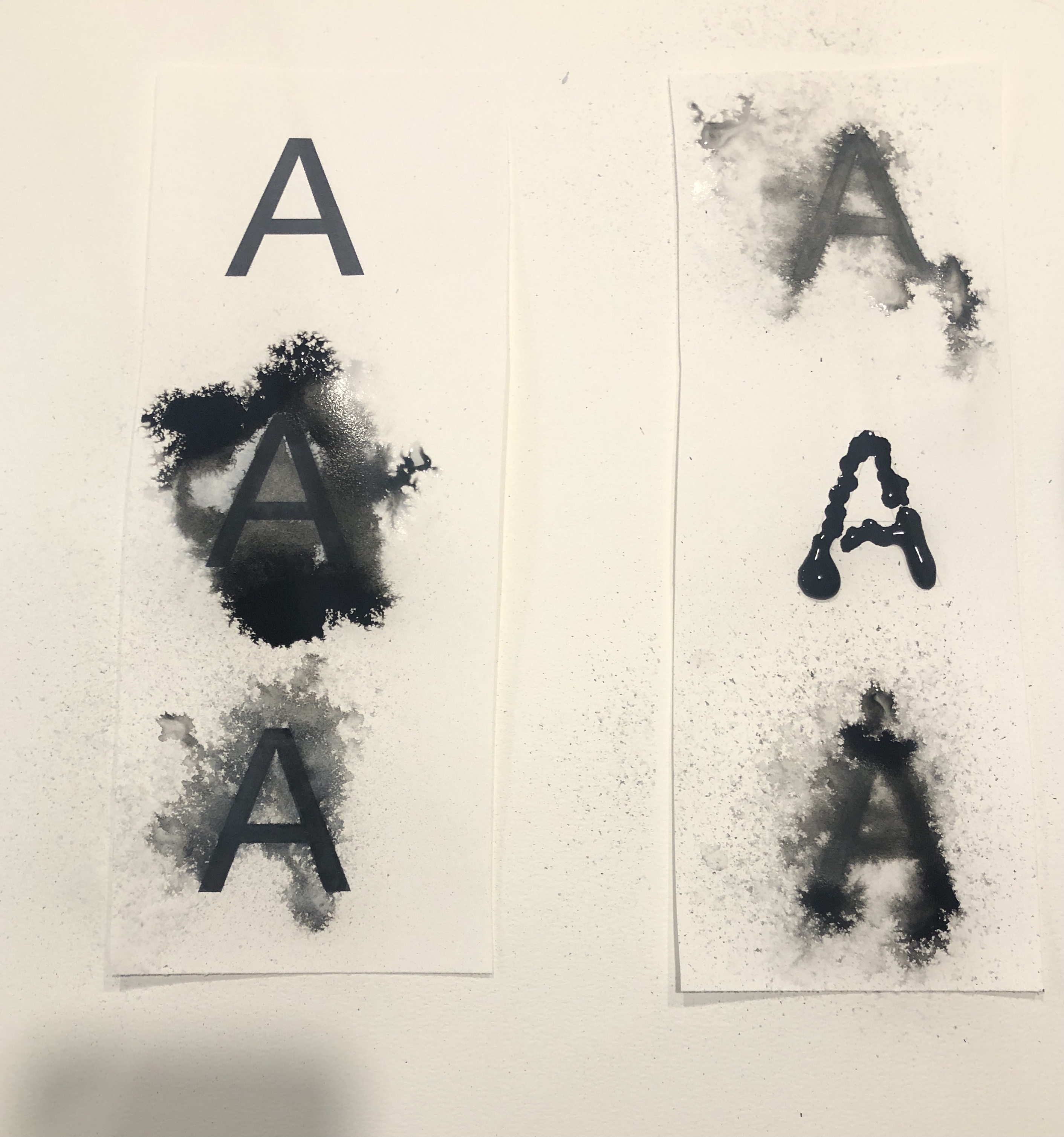
The System Typeface was the first set that I began working on for this project. I knew that I wanted to try something analogue-based for this typeface and using a medium that I don’t normally get to work in really appealed to me. When I began working, I did a lot of experimentation with the process of applying paint to paper. I tried paint to dry paper, and paint to wet paper to evaluate the different forms that would be created. Ultimately the wet to wet application was quite tricky to control and challenging to produce a legible letterform, so I moved forward with wet to dry application. I intentionally tried to make the letterforms a bit on the messier side to encourage extra splatters and droplets to occur. This created a more natural feel— as if someone is picking up a glass with condensation quickly and a unique water mark is left behind. The letterforms are created from placing the rim of the glass fully down or rolling the rim from side to side.
The diameter of the shot glass rim provides the foundation of the letterform geometry and scale.
New Helvetica Neue
Hurricane Helvetica
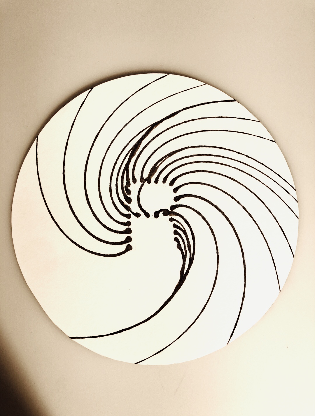
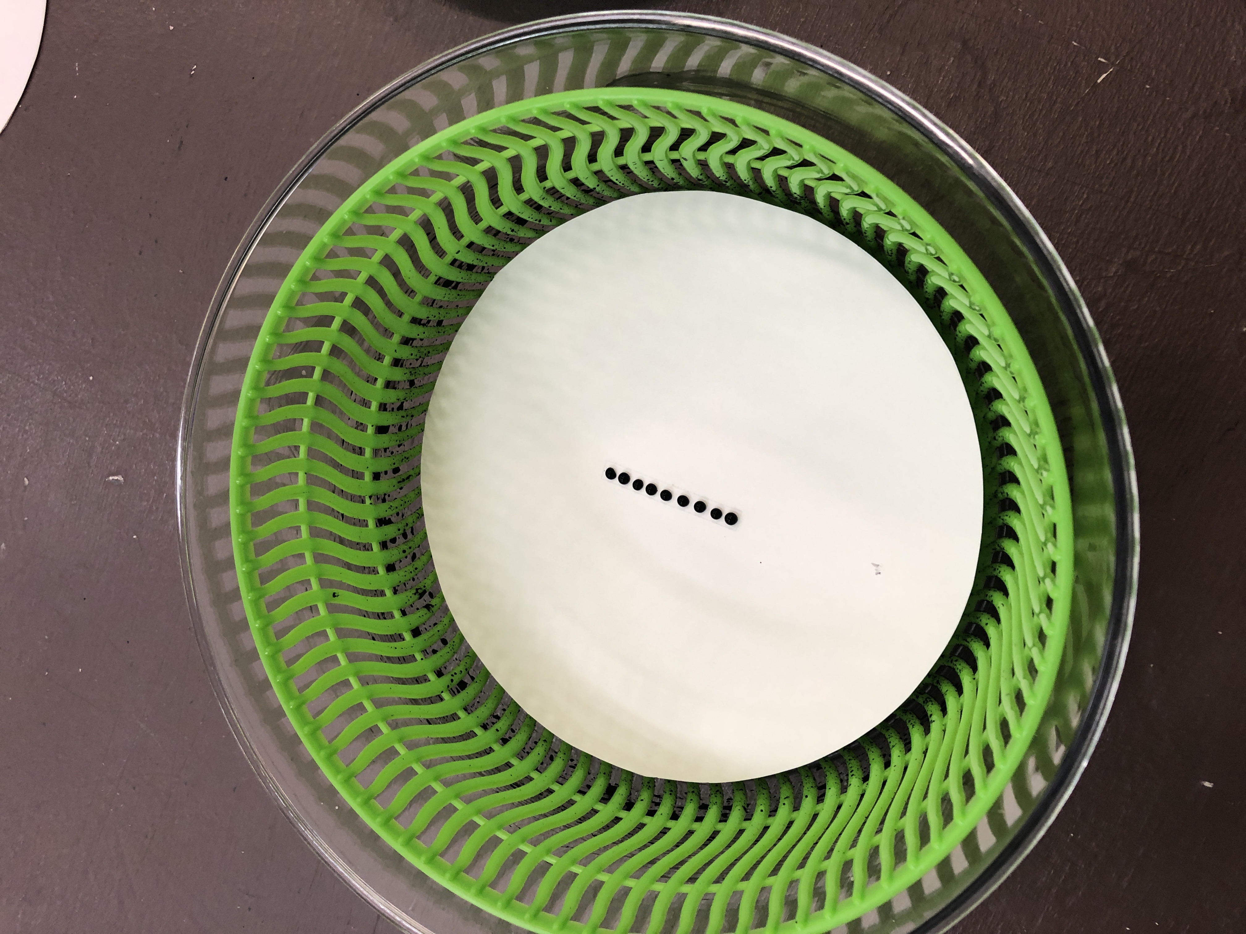
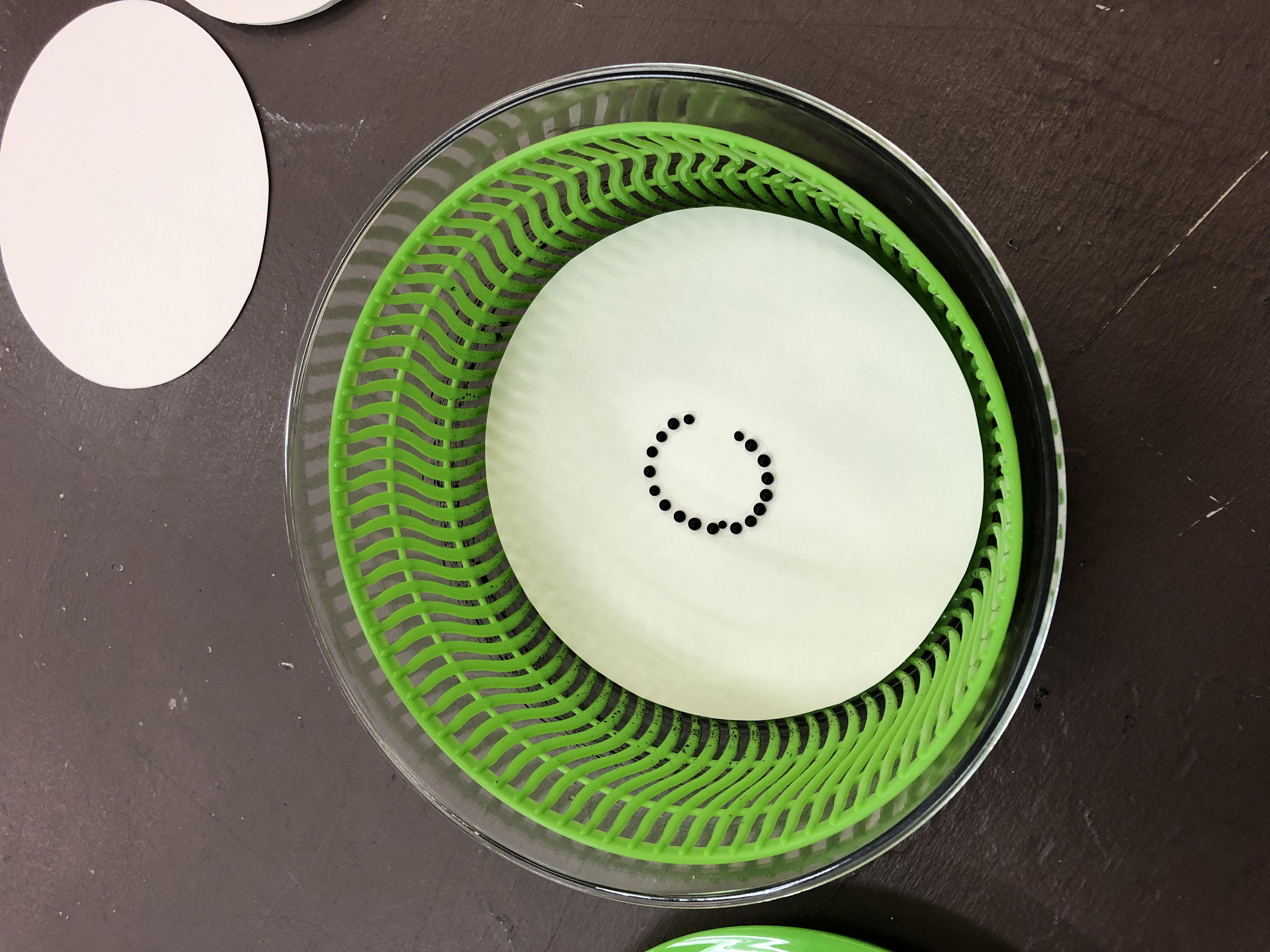
An alphabet set created by salad spun watercolor droplets using Helvetica Neue as a template.
![]()
![]()
![]()
![]()
![]()
![]()
![]()
![]()
![]()
![]()
![]()
![]()
An alphabet set created by salad spun watercolor droplets using Helvetica Neue as a template.
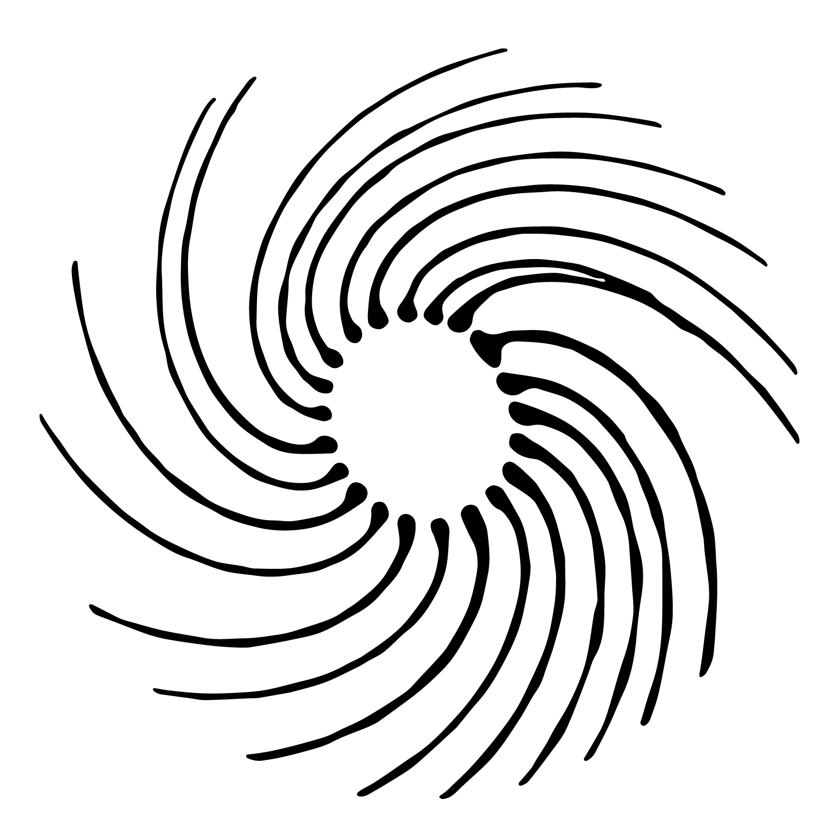
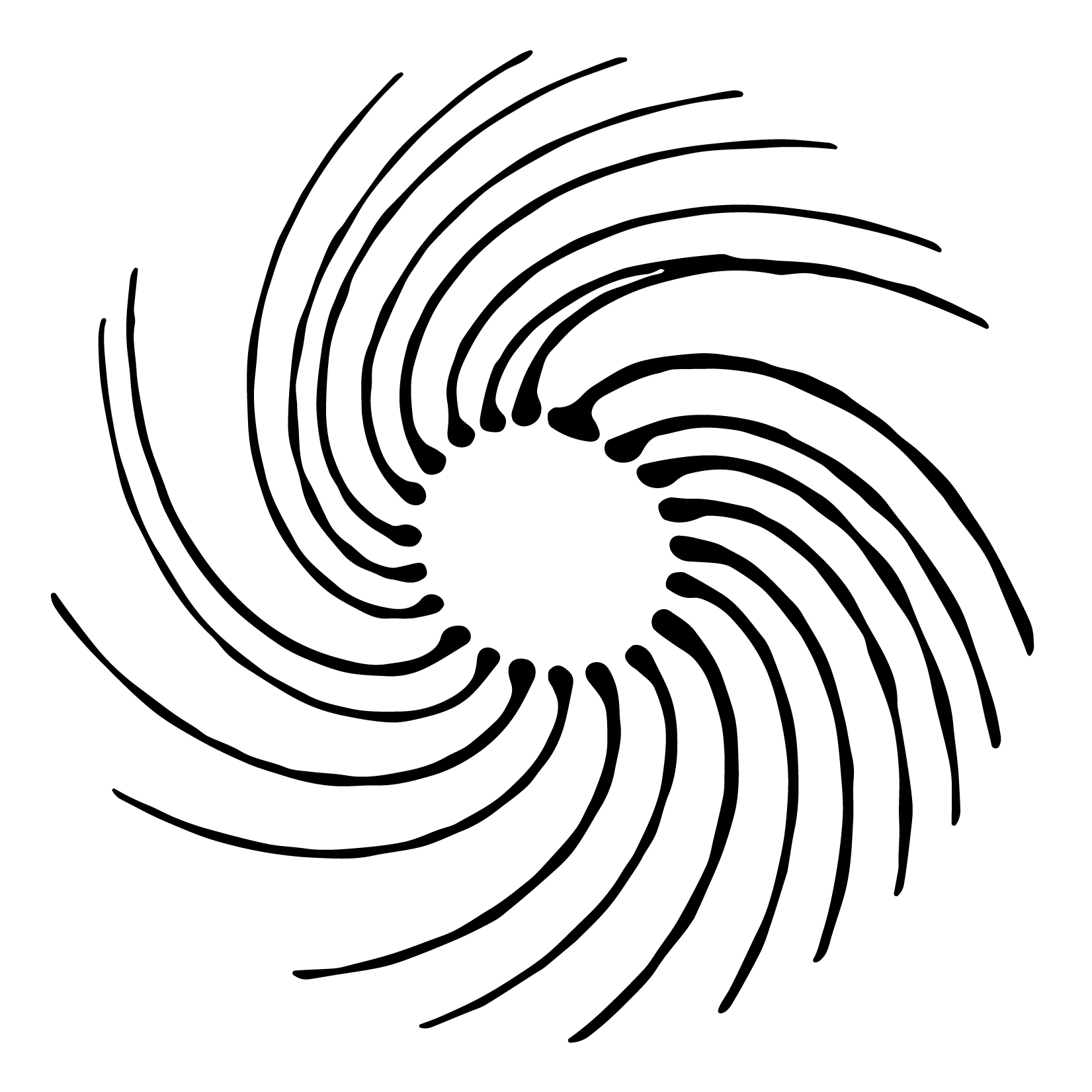

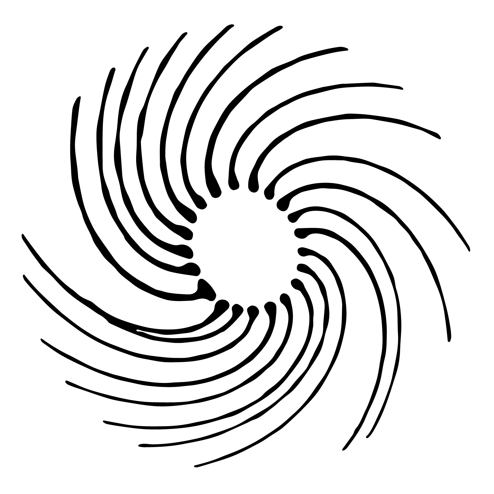


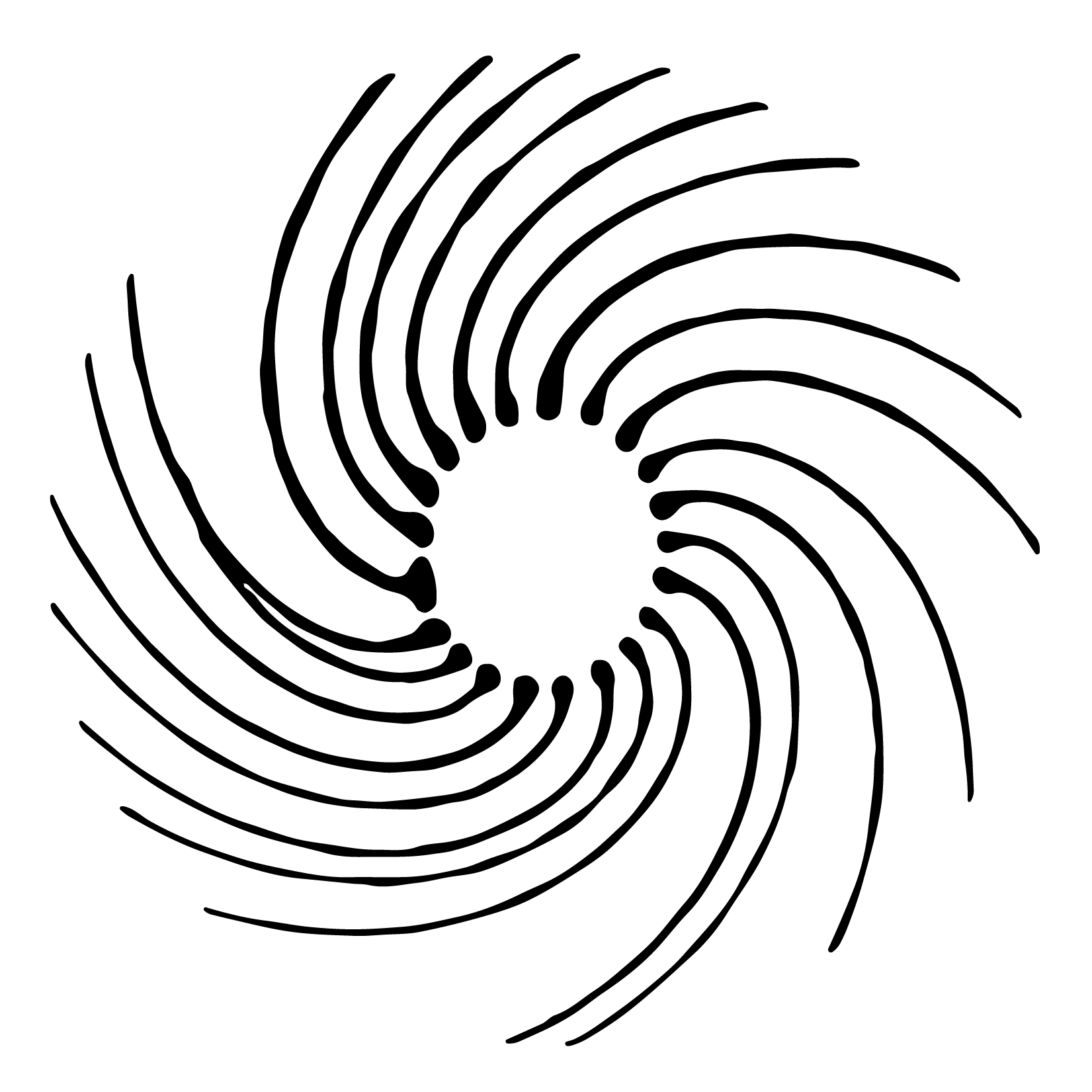
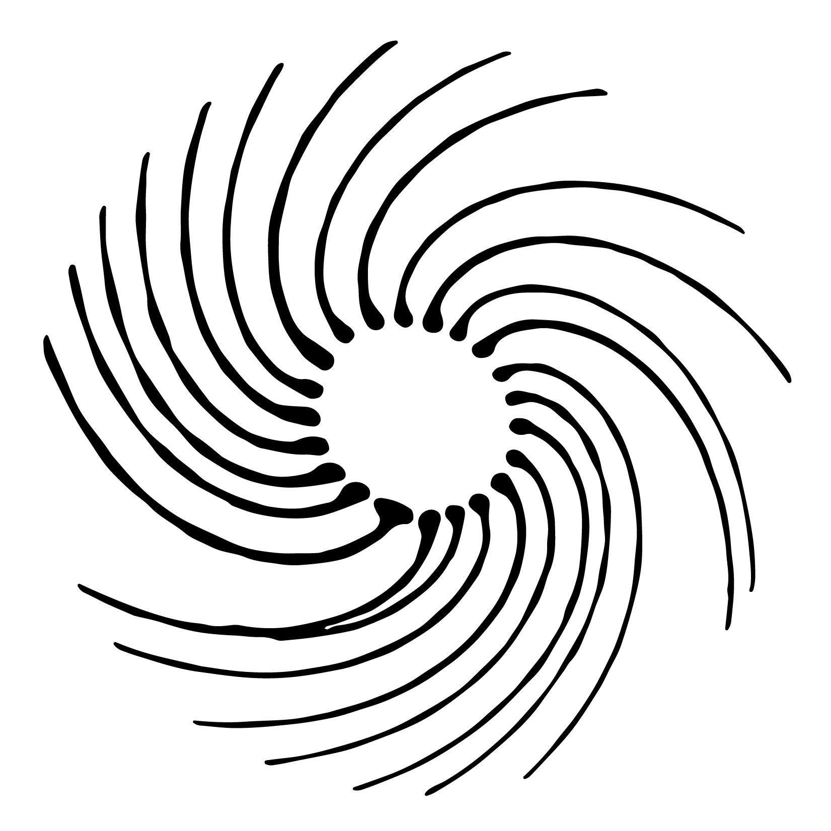
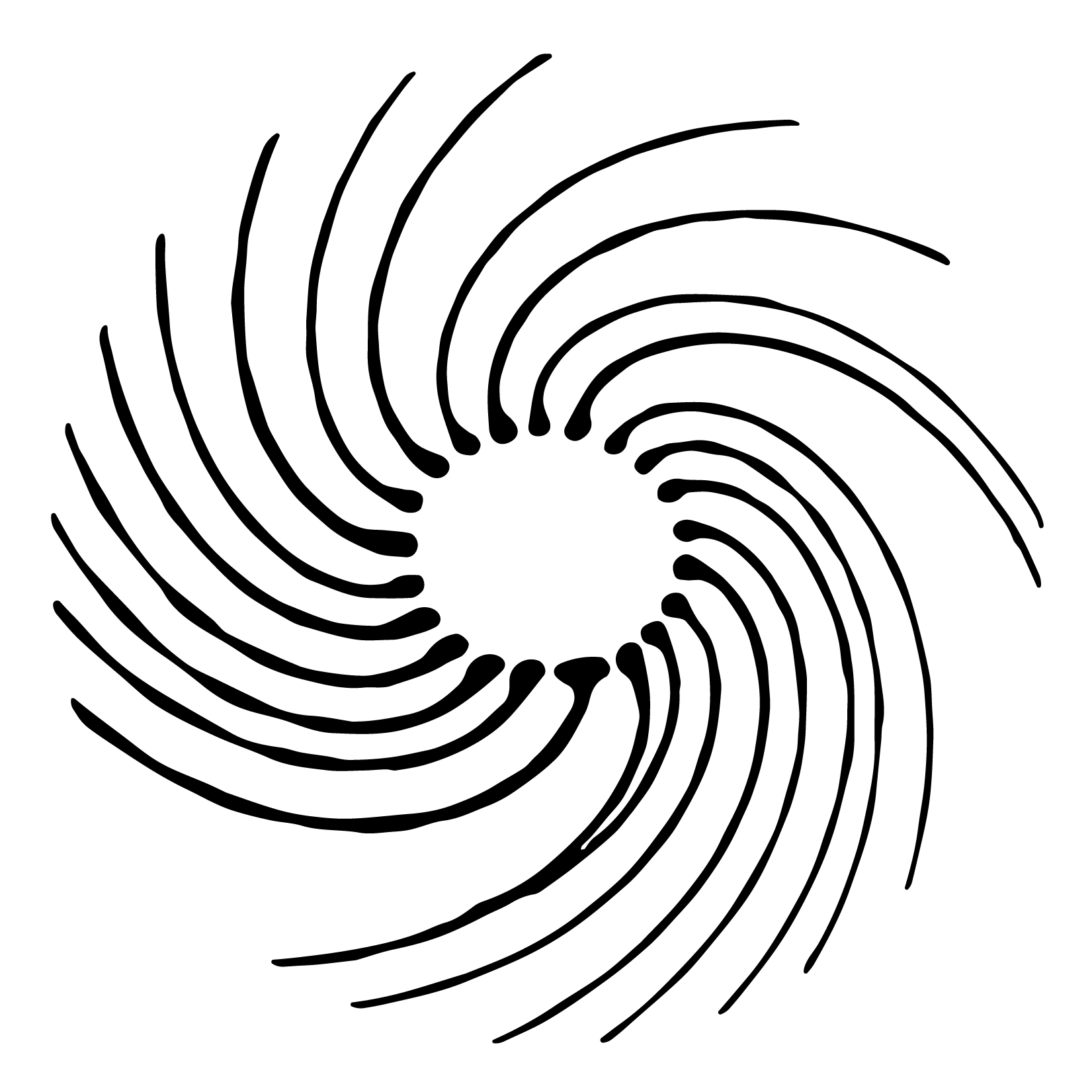
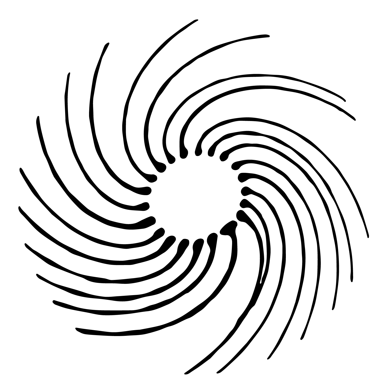
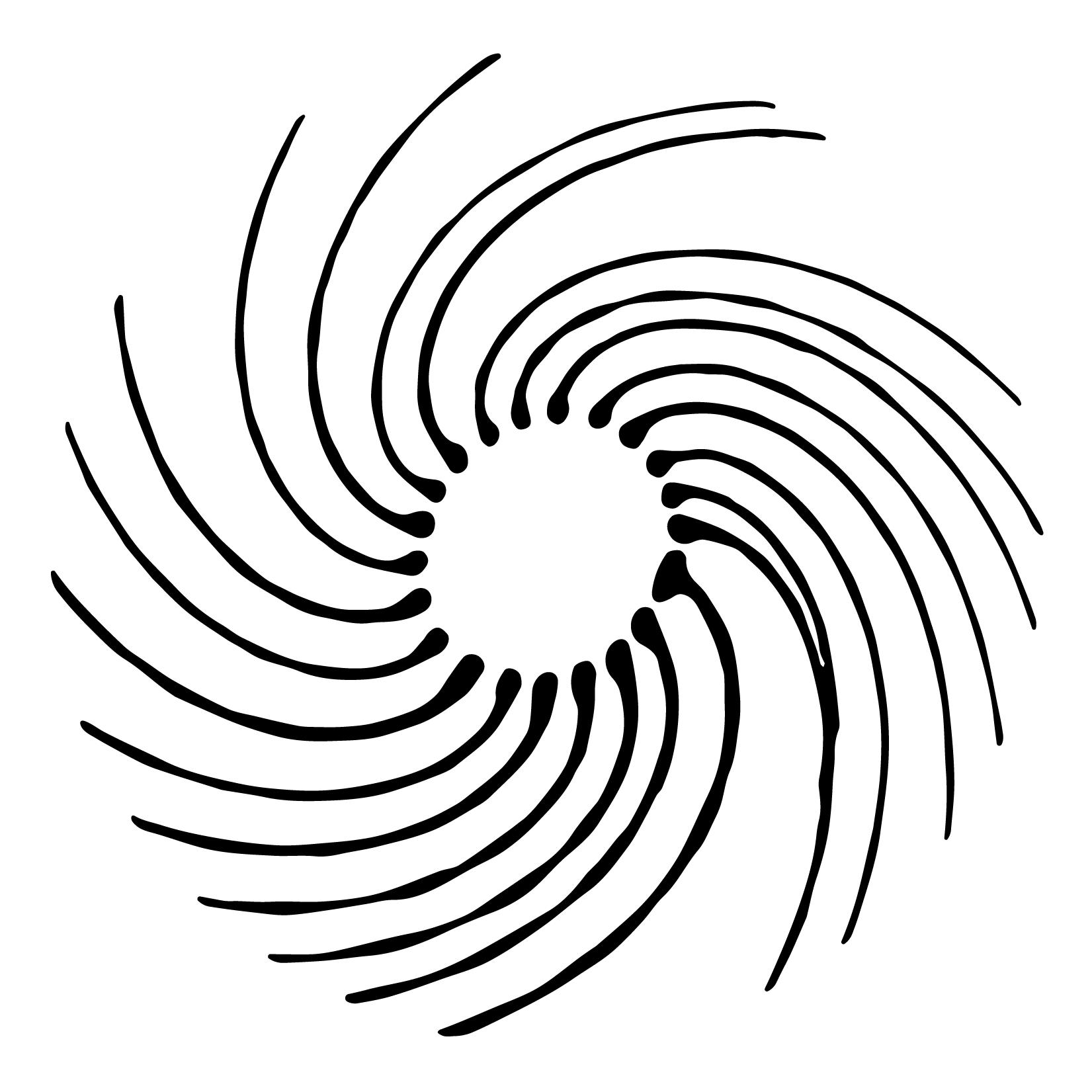
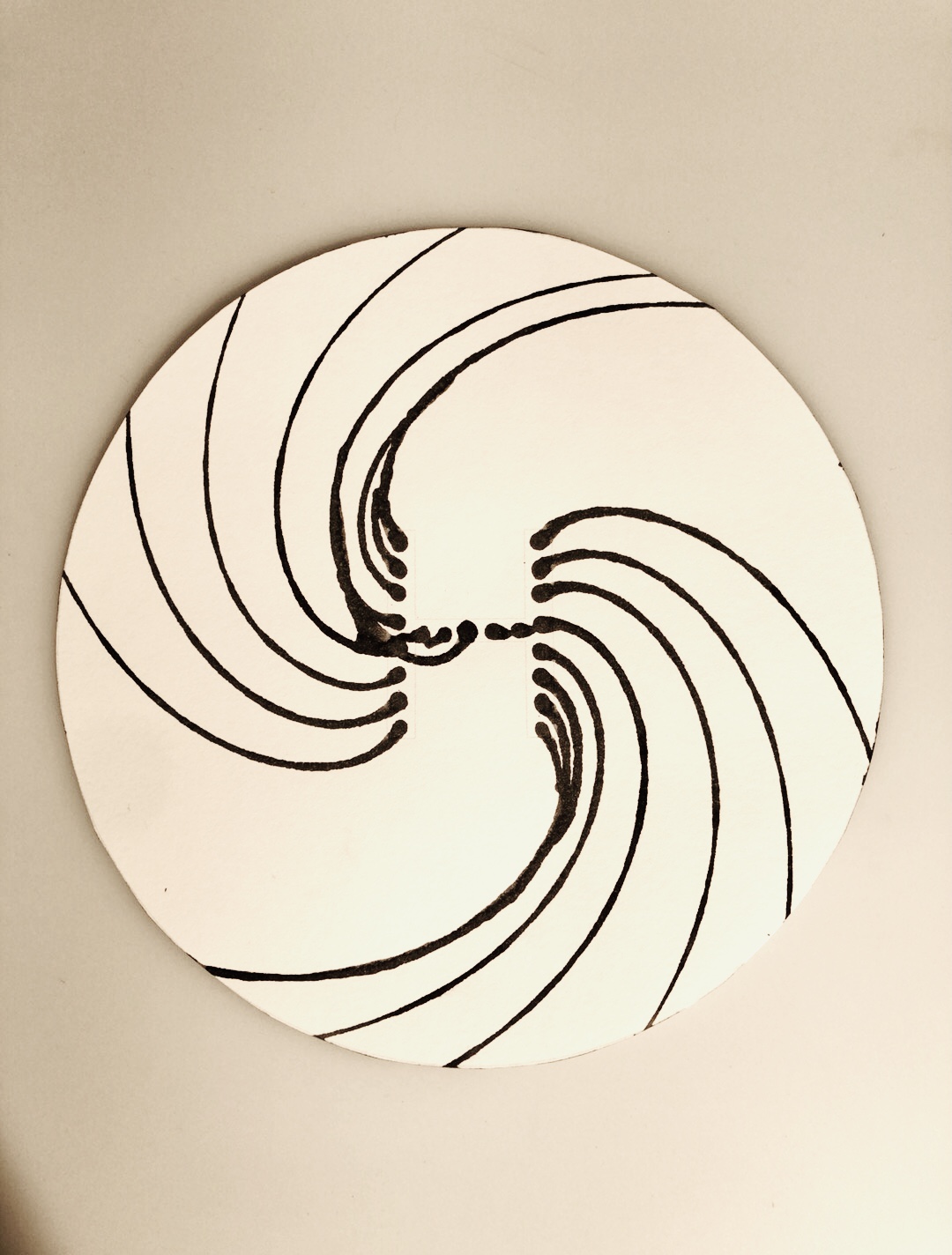
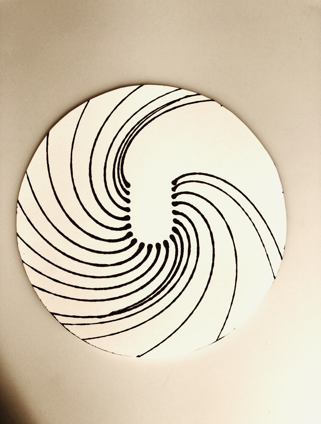
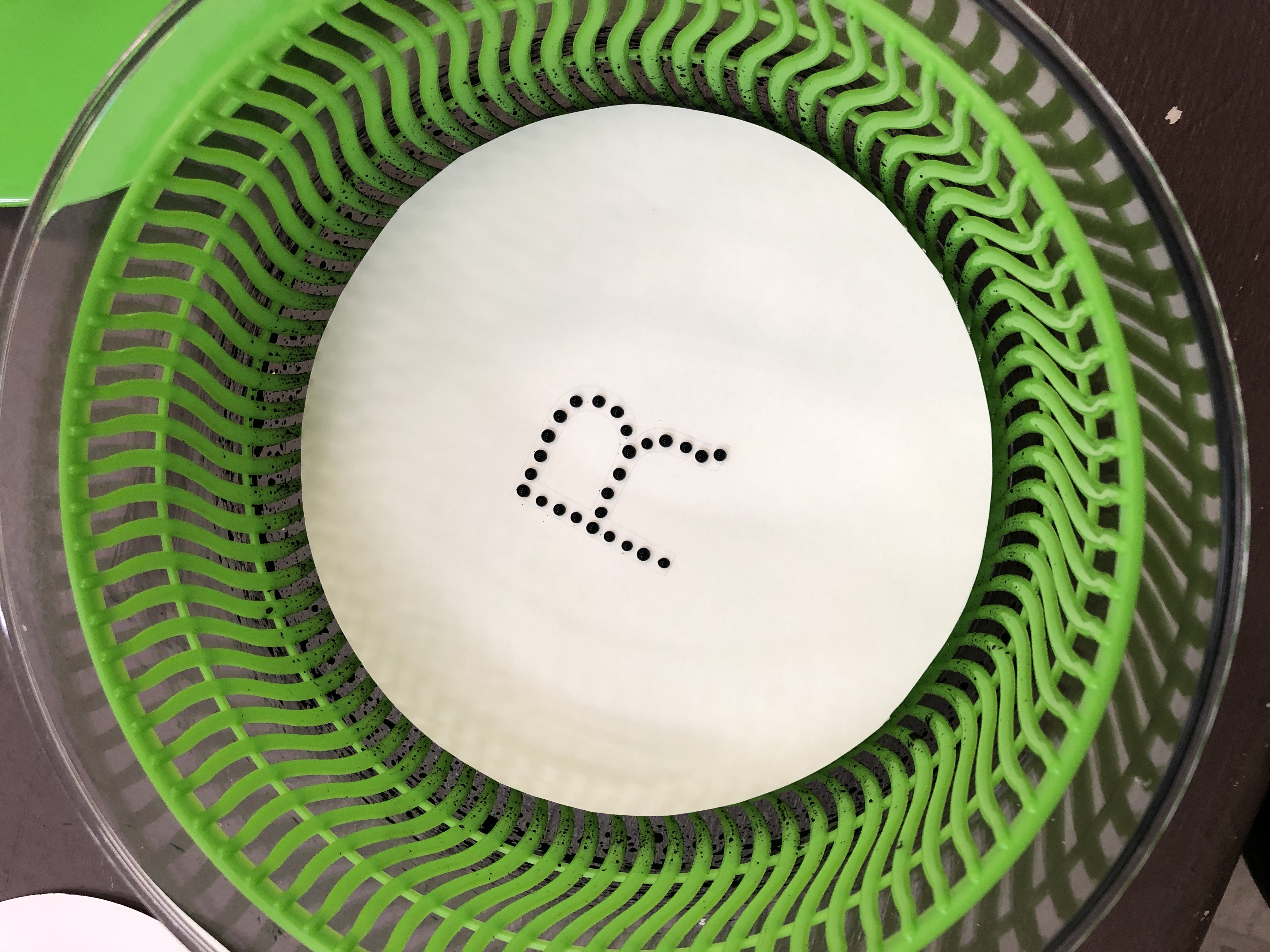

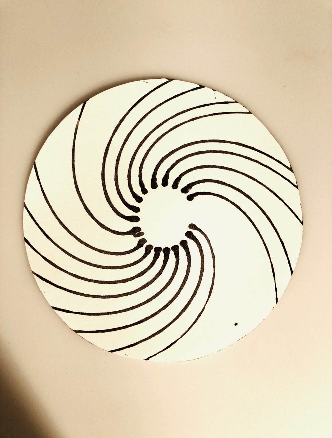
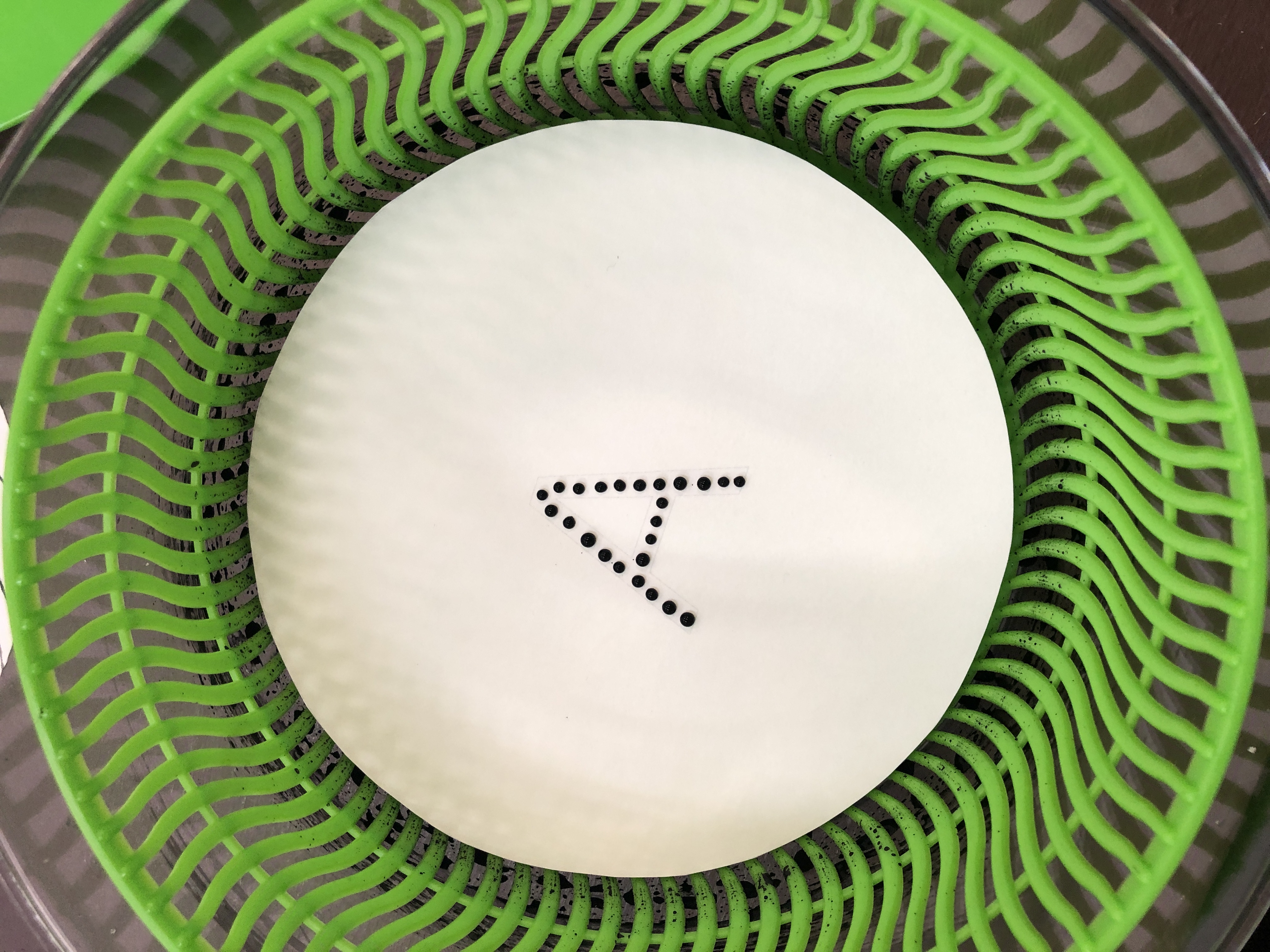

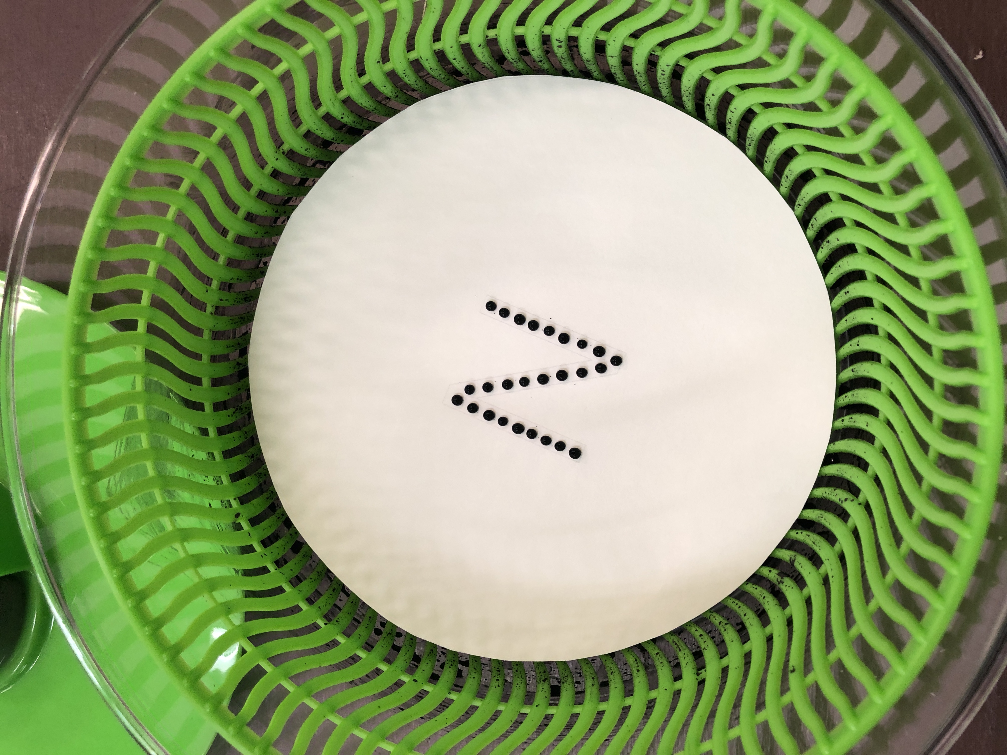

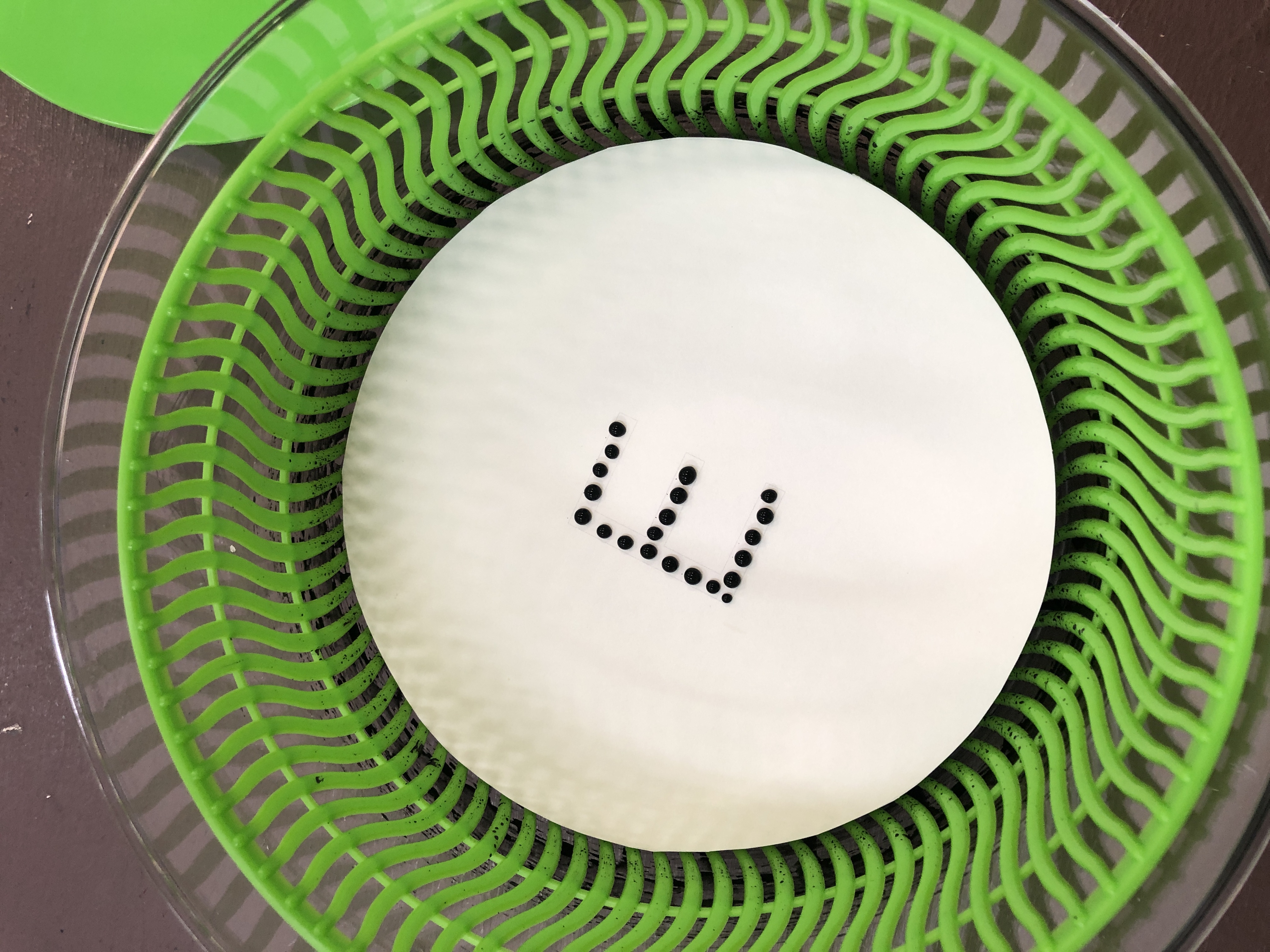
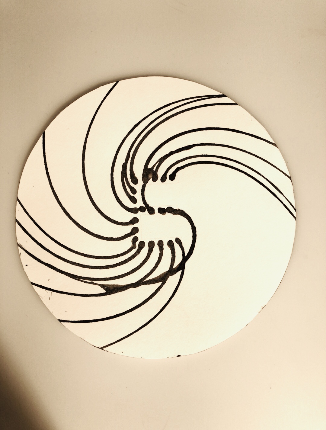
Methodically placed droplets spin out across the sheet.
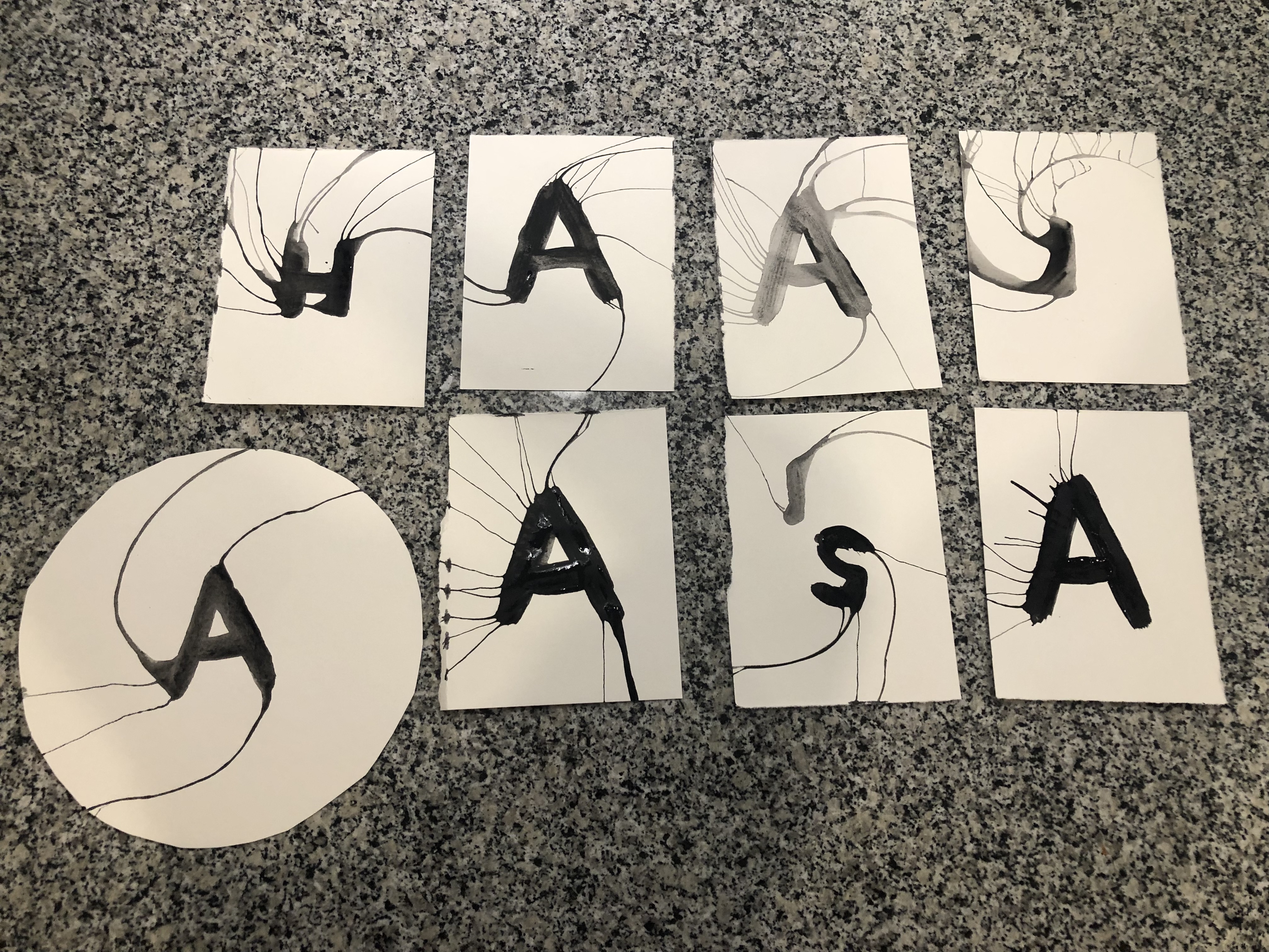
I had so much fun working with watercolor paint for the System Typeface that I wanted to keep experimenting with paint application for the New Helvetica Neue Typeface. I had come across this salad spinner at Walmart while looking for matches (an experiment for the System Typeface I attempted but later abandoned), and I knew that I had to try incorporating the spinner in some way. I definitely had the most trial and error with the spinner and was very close to giving up trying to use it. Initially, I painted the letterforms fully with a thick coating of watercolor paint and spun, but the forms were unsatisfactory and there wasn’t much of evidence of rotation. On a whim, I tried applying the paint as droplets instead and suddenly the process finally worked the way I had hoped it would. Each letterform offered up new surprises when spun and was quite unpredictable even when the same form was repeated. Rounded letterforms created the most uniform rotations, whereas letters with straight lines like I, T, and X created more simple forms as the droplets combined linearly when spun.

Thanks to the Coriolis Effect, the spun letterforms rotate in the same direction as a hurricane in the northern hemisphere.

The poster design is inspired by hurricane forecast models that are often seen on weather channels when a large storm is approaching. Although hurricanes in the northen hemisphere rotate counterclockwise, the projection of the path appears to curve northward in the opposite direction due to environmental wind fields.

24" x 36" Poster
Process of the Process
Try and Try Again
A collection of process work that didn’t make the final cut or lead to the creation of the final typefaces. A lot of experimentation and trial and error took place.